github.com/sampotts/plyr @v3.8.4 sqlite
README
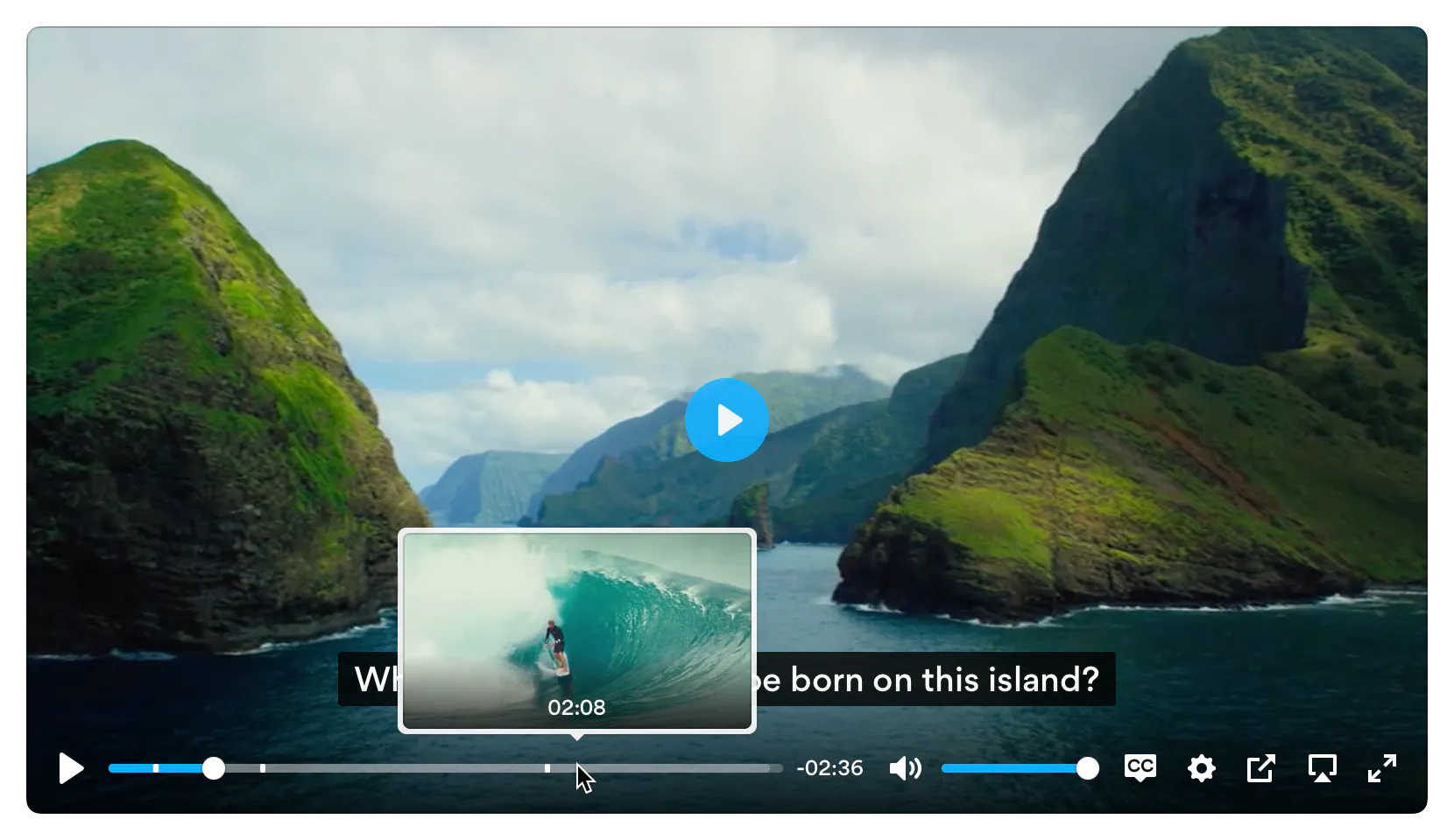
Plyr is a simple, lightweight, accessible and customizable HTML5, YouTube and Vimeo media player that supports modern browsers.
Checkout the demo - Donate - Slack - Video hosting
Features
- 📼 HTML Video & Audio, YouTube & Vimeo - support for the major formats
- 💪 Accessible - full support for VTT captions and screen readers
- 🔧 Customizable - make the player look how you want with the markup you want
- 😎 Clean HTML - uses the right elements.
<input type="range">for volume and<progress>for progress and well,<button>s for buttons. There's no<span>or<a href="#">button hacks - 📱 Responsive - works with any screen size
- 💵 Monetization - make money from your videos
- 📹 Streaming - support for hls.js, Shaka and dash.js streaming playback
- 🎛 API - toggle playback, volume, seeking, and more through a standardized API
- 🎤 Events - no messing around with Vimeo and YouTube APIs, all events are standardized across formats
- 🔎 Fullscreen - supports native fullscreen with fallback to "full window" modes
- ⌨️ Shortcuts - supports keyboard shortcuts
- 🖥 Picture-in-Picture - supports picture-in-picture mode
- 📱 Playsinline - supports the
playsinlineattribute - 🏎 Speed controls - adjust speed on the fly
- 📖 Multiple captions - support for multiple caption tracks
- 🌎 i18n support - support for internationalization of controls
- 👌 Preview thumbnails - support for displaying preview thumbnails
- 🤟 No frameworks - written in "vanilla" ES6 JavaScript, no jQuery required
- 💁♀️ Sass - to include in your build processes
Demos
You can try Plyr in Codepen using our minimal templates: HTML5 video, HTML5 audio, YouTube, Vimeo. For Streaming we also have example integrations with: Dash.js, Hls.js and Shaka Player
Quick setup
HTML
Plyr extends upon the standard HTML5 media element markup so that's all you need for those types.
HTML5 Video
<video id="player" playsinline controls data-poster="/path/to/poster.jpg">


  <track kind="captions" label="English captions" src="https://github.com/sampotts/plyr/raw/v3.8.4/path/to/captions.vtt" srclang="en" default />
</video>
Note: The poster image should be specified using data-poster. This is to prevent it being downloaded twice. If you're sure the image will be cached, you can still use the poster attribute for true progressive enhancement.
HTML5 Audio
<audio id="player" controls>


</audio>
For YouTube and Vimeo players, Plyr uses progressive enhancement to enhance the default <iframe> embeds. Below are some examples. The plyr__video-embed classname will make the embed responsive. You can add the autoplay, loop, hl (YouTube only) and playsinline (YouTube only) query parameters to the URL and they will be set as config options automatically. For YouTube, the origin should be updated to reflect the domain you're hosting the embed on, or you can opt to omit it.
YouTube
We recommend progressive enhancement with the embedded players. You can elect to use an <iframe> as the source element (which Plyr will progressively enhance) or a bog standard `
with two essential data attributes -data-plyr-provideranddata-plyr-embed-id`.
<iframe
src="https://www.youtube.com/embed/bTqVqk7FSmY?origin=https://plyr.io&iv_load_policy=3&modestbranding=1&playsinline=1&showinfo=0&rel=0&enablejsapi=1"
allowfullscreen
allowtransparency
allow="autoplay"
></iframe>
Note: The plyr__video-embed classname will make the player a responsive 16:9 (most common) iframe embed. When plyr itself kicks in, your custom ratio config option will be used.
Or the `
` non progressively enhanced method:
Note: The data-plyr-embed-id can either be the video ID or URL for the media.
Vimeo
Much the same as YouTube above.
<iframe
src="https://player.vimeo.com/video/76979871?loop=false&byline=false&portrait=false&title=false&speed=true&transparent=0&gesture=media"
allowfullscreen
allowtransparency
allow="autoplay"
></iframe>
Or the `
` non progressively enhanced method:
JavaScript
You can use Plyr as an ES6 module as follows:
import Plyr from 'plyr';

const player = new Plyr('#player');
Alternatively you can include the plyr.js script before the closing </body> tag and then in your JS create a new instance of Plyr as below.
<script src="https://github.com/sampotts/plyr/raw/v3.8.4/path/to/plyr.js"></script>
<script>
  const player = new Plyr('#player');
</script>
See initialising for more information on advanced setups.
You can use our CDN (provided by Cloudflare) for the JavaScript. There's 2 versions; one with and one without polyfills. My recommendation would be to manage polyfills separately as part of your application but to make life easier you can use the polyfilled build.
<script src="https://cdn.plyr.io/3.8.4/plyr.js"></script>
...or...
<script src="https://cdn.plyr.io/3.8.4/plyr.polyfilled.js"></script>
CSS
Include the plyr.css stylesheet into your <head>.
<link rel="stylesheet" href="https://github.com/sampotts/plyr/raw/v3.8.4/path/to/plyr.css" />
If you want to use our CDN (provided by Cloudflare) for the default CSS, you can use the following:
<link rel="stylesheet" href="https://cdn.plyr.io/3.8.4/plyr.css" />
SVG Sprite
The SVG sprite is loaded automatically from our CDN (provided by Cloudflare). To change this, see the options below. For
reference, the CDN hosted SVG sprite can be found at https://cdn.plyr.io/3.8.4/plyr.svg.
Self hosting
If you don't want to create a build system to include Plyr as an npm module, you can use the pre-built files. You have a few options:
- Download the files from the CDN links above, they're already minified.
- Download the files from unpkg or similar services.
- Build the project yourself using
npm i && npm run build, which installs the dependencies and spits out a build todist.
Ads
Plyr has partnered up with vi.ai to offer monetization options for your videos. Getting setup is easy:
- Sign up for a vi.ai account
- Grab your publisher ID from the code snippet
- Enable ads in the config options and enter your publisher ID
Any questions regarding the ads can be sent straight to vi.ai and any issues with rendering raised through GitHub issues.
If you do not wish to use Vi, you can set your own ads.tagUrl option.
Advanced
Customizing the CSS
If you want to change any design tokens used for the rendering of the player, you can do so using CSS Custom Properties.
Here's a list of the properties and what they are used for:
| Name | Description | Default / Fallback |
|---|---|---|
--plyr-color-main |
The primary UI color. | #00b3ff |
--plyr-video-background |
The background color of video and poster wrappers for using alpha channel videos and poster images. | rgba(0, 0, 0, 1) |
--plyr-focus-visible-color |
The color used for the focus styles when an element is :focus-visible (keyboard focused). |
--plyr-color-main |
--plyr-badge-background |
The background color for badges in the menu. | #4a5464 |
--plyr-badge-text-color |
The text color for badges. | #ffffff |
--plyr-badge-border-radius |
The border radius used for badges. | 2px |
--plyr-captions-background |
The color for the background of captions. | rgba(0, 0, 0, 0.8) |
--plyr-captions-text-color |
The color used for the captions text. | #ffffff |
--plyr-control-icon-size |
The size of the icons used in the controls. | 18px |
--plyr-control-spacing |
The space between controls (sometimes used in a multiple - e.g. 10px / 2 = 5px). |
10px |
--plyr-control-padding |
The padding inside controls. | --plyr-control-spacing * 0.7 (7px) |
--plyr-control-radius |
The border radius used on controls. | 3px |
--plyr-control-toggle-checked-background |
The background color used for checked menu items. | --plyr-color-main |
--plyr-video-controls-background |
The background for the video controls. | linear-gradient(rgba(0, 0, 0, 0), rgba(0, 0, 0, 0.75)) |
--plyr-video-control-color |
The text/icon color for video controls. | #ffffff |
--plyr-video-control-color-hover |
The text/icon color used when video controls are :hover, :focus and :focus-visible (equivalent). |
#ffffff |
--plyr-video-control-background-hover |
The background color used when video controls are :hover, :focus and :focus-visible (equivalent). |
--plyr-color-main |
--plyr-audio-controls-background |
The background for the audio controls. | #ffffff |
--plyr-audio-control-color |
The text/icon color for audio controls. | #4a5464 |
--plyr-audio-control-color-hover |
The text/icon color used when audio controls are :hover, :focus and :focus-visible (equivalent). |
#ffffff |
--plyr-audio-control-background-hover |
The background color used when video controls are :hover, :focus and `:focus-vis |