github.com/react-dates/react-dates @v21.8.0 sqlite
README
react-dates [![Version Badge][npm-version-svg]][package-url]
[![Build Status][travis-svg]][travis-url] [![dependency status][deps-svg]][deps-url] [![dev dependency status][dev-deps-svg]][dev-deps-url] [![License][license-image]][license-url] [![Downloads][downloads-image]][downloads-url]
[![npm badge][npm-badge-png]][package-url]
An easily internationalizable, accessible, mobile-friendly datepicker library for the web.
Live Playground
For examples of the datepicker in action, go to http://airbnb.io/react-dates.
OR
To run that demo on your own computer:
* Clone this repository
* npm install
* npm run storybook
* Visit http://localhost:6006/
Getting Started
Install dependencies
Ensure packages are installed with correct version numbers by running:
sh
  (
    export PKG=react-dates;
    npm info "$PKG" peerDependencies --json | command sed 's/[\{\},]//g ; s/: /@/g; s/ *//g' | xargs npm install --save "$PKG"
  )
Which produces and runs a command like:
sh
  npm install --save react-dates moment@>=#.## react@>=#.## react-dom@>=#.##
Initialize
import 'react-dates/initialize';
As of v13.0.0 of react-dates, this project relies on react-with-styles. If you want to continue using CSS stylesheets and classes, there is a little bit of extra set-up required to get things going. As such, you need to import react-dates/initialize to set up class names on our components. This import should go at the top of your application as you won't be able to import any react-dates components without it.
Note: This component assumes box-sizing: border-box is set globally in your page's CSS.
Include component
import { DateRangePicker, SingleDatePicker, DayPickerRangeController } from 'react-dates';
Webpack
Using Webpack with CSS loader, add the following import to your app:
import 'react-dates/lib/css/_datepicker.css';
Without Webpack:
Create a CSS file with the contents of require.resolve('react-dates/lib/css/_datepicker.css') and include it in your html <head> section.
To see this in action, you can check out https://github.com/majapw/react-dates-demo which adds react-dates on top of a simple create-react-app setup.
Overriding Base Class
By default react-dates will use PureComponent conditionally if it is available. However, it is possible to override this setting and use Component and shouldComponentUpdate instead. It is also possible to override the logic in build/util/baseClass if you know that you are using a React version with PureComponent.
javascript
    import React from 'react';
    export default React.PureComponent;
    export const pureComponentAvailable = true;
Overriding styles
Right now, the easiest way to tweak react-dates to your heart's content is to create another stylesheet to override the default react-dates styles. For example, you could create a file named react_dates_overrides.css with the following contents (Make sure when you import said file to your app.js, you import it after the react-dates styles):
// NOTE: the order of these styles DO matter

// Will edit everything selected including everything between a range of dates
.CalendarDay__selected_span {
  background: #82e0aa; //background
  color: white; //text
  border: 1px solid $light-red; //default styles include a border
}

// Will edit selected date or the endpoints of a range of dates
.CalendarDay__selected {
  background: $dark-red;
  color: white;
}

// Will edit when hovered over. _span style also has this property
.CalendarDay__selected:hover {
  background: orange;
  color: white;
}

// Will edit when the second date (end date) in a range of dates
// is not yet selected. Edits the dates between your mouse and said date
.CalendarDay__hovered_span:hover,
.CalendarDay__hovered_span {
  background: brown;
}
This would override the background and text colors applied to highlighted calendar days. You can use this method with the default set-up to override any aspect of the calendar to have it better fit to your particular needs. If there are any styles that you need that aren't listed here, you can always check the source css of each element.
Make some awesome datepickers
We provide a handful of components for your use. If you supply essential props to each component, you'll get a full featured interactive date picker. With additional optional props, you can customize the look and feel of the inputs, calendar, etc. You can see what each of the props do in the live demo or explore how to properly wrap the pickers in the examples folder.
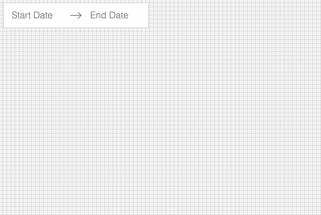
DateRangePicker
The DateRangePicker is a fully controlled component that allows users to select a date range. You can control the selected
dates using the startDate, endDate, and onDatesChange props as shown below. The DateRangePicker also manages internal
state for partial dates entered by typing (although onDatesChange will not trigger until a date has been entered
completely in that case). Similarly, you can control which input is focused as well as calendar visibility (the calendar is
only visible if focusedInput is defined) with the focusedInput and onFocusChange props as shown below.
Here is the minimum REQUIRED setup you need to get the DateRangePicker working:
<DateRangePicker
  startDate={this.state.startDate} // momentPropTypes.momentObj or null,
  startDateId="your_unique_start_date_id" // PropTypes.string.isRequired,
  endDate={this.state.endDate} // momentPropTypes.momentObj or null,
  endDateId="your_unique_end_date_id" // PropTypes.string.isRequired,
  onDatesChange={({ startDate, endDate }) => this.setState({ startDate, endDate })} // PropTypes.func.isRequired,
  focusedInput={this.state.focusedInput} // PropTypes.oneOf([START_DATE, END_DATE]) or null,
  onFocusChange={focusedInput => this.setState({ focusedInput })} // PropTypes.func.isRequired,
/>
The following is a list of other OPTIONAL props you may provide to the DateRangePicker to customize appearance and behavior to your heart's desire. All constants (indicated by ALL_CAPS) are provided as named exports in react-dates/constants. Please explore the storybook for more information on what each of these props do.
// input related props
startDatePlaceholderText: PropTypes.string,
endDatePlaceholderText: PropTypes.string,
startDateAriaLabel: PropTypes.string,
endDateAriaLabel: PropTypes.string,
disabled: PropTypes.oneOfType([PropTypes.bool, PropTypes.oneOf([START_DATE, END_DATE])]),
required: PropTypes.bool,
readOnly: PropTypes.bool,
screenReaderInputMessage: PropTypes.string,
showClearDates: PropTypes.bool,
showDefaultInputIcon: PropTypes.bool,
customInputIcon: PropTypes.node,
customArrowIcon: PropTypes.node,
customCloseIcon: PropTypes.node,
inputIconPosition: PropTypes.oneOf([ICON_BEFORE_POSITION, ICON_AFTER_POSITION]),
noBorder: PropTypes.bool,
block: PropTypes.bool,
small: PropTypes.bool,
regular: PropTypes.bool,

// calendar presentation and interaction related props
renderMonthText: mutuallyExclusiveProps(PropTypes.func, 'renderMonthText', 'renderMonthElement'), // (month) => PropTypes.string,
orientation: PropTypes.oneOf([HORIZONTAL_ORIENTATION, VERTICAL_ORIENTATION]),
anchorDirection: PropTypes.oneOf([ANCHOR_LEFT, ANCHOR_RIGHT]),
openDirection: PropTypes.oneOf([OPEN_DOWN, OPEN_UP]),
horizontalMargin: PropTypes.number,
withPortal: PropTypes.bool,
withFullScreenPortal: PropTypes.bool,
appendToBody: PropTypes.bool,
disableScroll: PropTypes.bool,
daySize: nonNegativeInteger,
isRTL: PropTypes.bool,
initialVisibleMonth: PropTypes.func,
firstDayOfWeek: PropTypes.oneOf([0, 1, 2, 3, 4, 5, 6]),
numberOfMonths: PropTypes.number,
keepOpenOnDateSelect: PropTypes.bool,
reopenPickerOnClearDates: PropTypes.bool,
renderCalendarInfo: PropTypes.func,
renderMonthElement: mutuallyExclusiveProps(PropTypes.func, 'renderMonthText', 'renderMonthElement'), PropTypes.func, // ({ month, onMonthSelect, onYearSelect, isVisible }) => PropTypes.node,
hideKeyboardShortcutsPanel: PropTypes.bool,

// navigation related props
navPrev: PropTypes.node,
navNext: PropTypes.node,
onPrevMonthClick: PropTypes.func,
onNextMonthClick: PropTypes.func,
onClose: PropTypes.func,
transitionDuration: nonNegativeInteger, // milliseconds

// day presentation and interaction related props
renderCalendarDay: PropTypes.func,
renderDayContents: PropTypes.func,
minimumNights: PropTypes.number,
minDate: momentPropTypes.momentObj,
maxDate: momentPropTypes.momentObj,
enableOutsideDays: PropTypes.bool,
isDayBlocked: PropTypes.func,
isOutsideRange: PropTypes.func,
isDayHighlighted: PropTypes.func,

// internationalization props
displayFormat: PropTypes.oneOfType([PropTypes.string, PropTypes.func]),
monthFormat: PropTypes.string,
weekDayFormat: PropTypes.string,
phrases: PropTypes.shape(getPhrasePropTypes(DateRangePickerPhrases)),
dayAriaLabelFormat: PropTypes.string,
SingleDatePicker
The SingleDatePicker is a fully controlled component that allows users to select a single date. You can control the selected
date using the date and onDateChange props as shown below. The SingleDatePicker also manages internal
state for partial dates entered by typing (although onDateChange will not trigger until a date has been entered
completely in that case). Similarly, you can control whether or not the input is focused (calendar visibility is also
controlled with the same props) with the focused and onFocusChange props as shown below.
Here is the minimum REQUIRED setup you need to get the SingleDatePicker working:
<SingleDatePicker
  date={this.state.date} // momentPropTypes.momentObj or null
  onDateChange={date => this.setState({ date })} // PropTypes.func.isRequired
  focused={this.state.focused} // PropTypes.bool
  onFocusChange={({ focused }) => this.setState({ focused })} // PropTypes.func.isRequired
  id="your_unique_id" // PropTypes.string.isRequired,
/>
The following is a list of other OPTIONAL props you may provide to the SingleDatePicker to customize appearance and behavior to your heart's desire. All constants (indicated by ALL_CAPS) are provided as named exports in react-dates/constants. Please explore the storybook for more information on what each of these props do.
// input related props
placeholder: PropTypes.string,
ariaLabel: PropTypes.string,
disabled: PropTypes.bool,
required: PropTypes.bool,
readOnly: PropTypes.bool,
screenReaderInputMessage: PropTypes.string,
showClearDate: PropTypes.bool,
customCloseIcon: PropTypes.node,
showDefaultInputIcon: PropTypes.bool,
customInputIcon: PropTypes.node,
inputIconPosition: PropTypes.oneOf([ICON_BEFORE_POSITION, ICON_AFTER_POSITION]),
noBorder: PropTypes.bool,
block: PropTypes.bool,
small: PropTypes.bool,
regular: PropTypes.bool,

// calendar presentation and interaction related props
renderMonthText: mutuallyExclusiveProps(PropTypes.func, 'renderMonthText', 'renderMonthElement'), // (month) => PropTypes.string,
orientation: PropTypes.oneOf([HORIZONTAL_ORIENTATION, VERTICAL_ORIENTATION]),
anchorDirection: PropTypes.oneOf([ANCHOR_LEFT, ANCHOR_RIGHT]),
openDirection: PropTypes.oneOf([OPEN_DOWN, OPEN_UP]),
horizontalMargin: PropTypes.number,
withPortal: PropTypes.bool,
withFullScreenPortal: PropTypes.bool,
appendToBody: PropTypes.bool,
disableScroll: PropTypes.bool,
initialVisibleMonth: PropTypes.func,
firstDayOfWeek: PropTypes.oneOf([0, 1, 2, 3, 4, 5, 6]),
numberOfMonths: PropTypes.number,
keepOpenOnDateSelect: PropTypes.bool,
reopenPickerOnClearDate: PropTypes.bool,
renderCalendarInfo: PropTypes.func,
renderMonthElement: mutuallyExclusiveProps(PropTypes.func, 'renderMonthText', 'renderMonthElement'), // ({ month, onMonthSelect, onYearSelect, isVisible }) => PropTypes.node,
hideKeyboardShortcutsPanel: PropTypes.bool,
daySize: nonNegativeInteger,
isRTL: PropTypes.bool,

// navigation related props
navPrev: PropTypes.node,
navNext: PropTypes.node,
onPrevMonthClick: PropTypes.func,
onNextMonthClick: PropTypes.func,
onClose: PropTypes.func,
transitionDuration: nonNegativeInteger, // milliseconds

// day presentation and interaction related props
renderCalendarDay: PropTypes.func,
renderDayContents: PropTypes.func,
enableOutsideDays: PropTypes.bool,
isDayBlocked: PropTypes.func,
isOutsideRange: PropTypes.func,
isDayHighlighted: PropTypes.func,

// internationalization props
displayFormat: PropTypes.oneOfType([PropTypes.string, PropTypes.func]),
monthFormat: PropTypes.string,
weekDayFormat: PropTypes.string,
phrases: PropTypes.shape(getPhrasePropTypes(SingleDatePickerPhrases)),
dayAriaLabelFormat: PropTypes.string,
DayPickerRangeController
The DayPickerRangeController is a calendar-only version of the DateRangePicker. There are no inputs (which also means
that currently, it is not keyboard accessible) and the calendar is always visible, but you can select a date range much in the same way you would with the DateRangePicker. You can control the selected
dates using the startDate, endDate, and onDatesChange props as shown below. Similarly, you can control which input is focused with the focusedInput and onFocusChange props as shown below. The user will only be able to select a date if focusedInput is provided.
Here is the minimum REQUIRED setup you need to get the DayPickerRangeController working:
Core symbols most depended-on inside this repo
componentWillReceivePropsShape
Languages
Modules by API surface
Used by 1 indexed graphs manifest dependencies, hub-wide
Dependencies from manifests, versioned
For agents
$ claude mcp add react-dates \
  -- python -m otcore.mcp_server <graph>