github.com/expo/react-native-action-sheet @v4.1.1
Chat with this repoWhat it actually does AI analysis from the code graph — generated when you open this
README
@expo/react-native-action-sheet



React Native Action Sheet is a cross-platform React Native component that uses the native UIActionSheet on iOS and a pure JS implementation on Android.
| iOS | Android | Web |
|---|---|---|
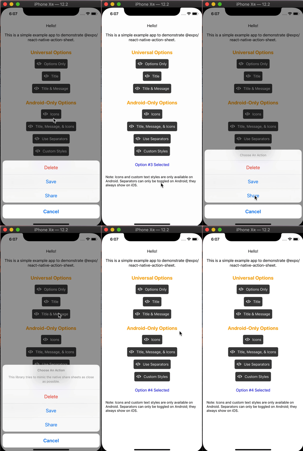 |
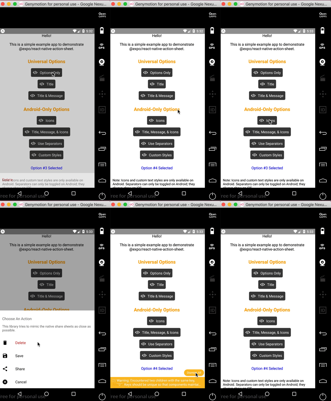 |
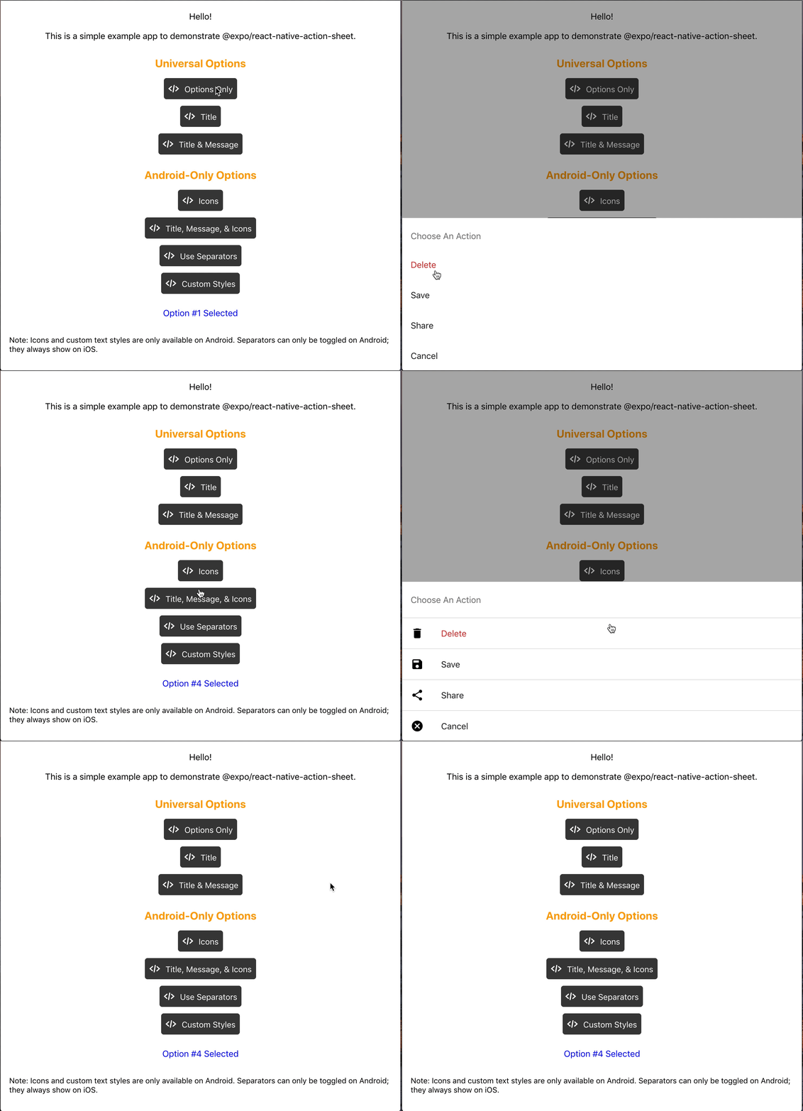 |
Check out the example snack here!
Installation
npm install @expo/react-native-action-sheet
or
yarn add @expo/react-native-action-sheet
A basic ActionSheet Setup
1. Wrap your top-level component with <ActionSheetProvider />
ReactNativeActionSheet uses React context to allow your components to invoke the menu. This means your app needs to be wrapped with the ActionSheetProvider component first.
import { ActionSheetProvider } from '@expo/react-native-action-sheet';

export default function AppContainer() {
  return (
    <ActionSheetProvider>
      <App />
    </ActionSheetProvider>
  );
}
2. Call the showActionSheetWithOptions method with a hook or a higher order component.
// Using the provided hook
import { useActionSheet } from '@expo/react-native-action-sheet';

export default Menu() {
  const { showActionSheetWithOptions } = useActionSheet();

  const onPress = () => {
    const options = ['Delete', 'Save', 'Cancel'];
    const destructiveButtonIndex = 0;
    const cancelButtonIndex = 2;

    showActionSheetWithOptions({
      options,
      cancelButtonIndex,
      destructiveButtonIndex
    }, (selectedIndex: number) => {
      switch (selectedIndex) {
        case 1:
          // Save
          break;

        case destructiveButtonIndex:
          // Delete
          break;

        case cancelButtonIndex:
          // Canceled
      }});
  }

  return (
    <Button title="Menu" onPress={onPress}/>
  )
};
Alternatively, any component can use the higher order component to access the context and pass the showActionSheetWithOptions as a prop.
// Using a Higher Order Component to wrap your component
import { connectActionSheet } from '@expo/react-native-action-sheet';

function Menu({ showActionSheetWithOptions }) {
  /* ... */
}

export default connectActionSheet(Menu);
Menu component can now access the actionSheet prop as showActionSheetWithOptions.
Options
The goal of this library is to mimic the native iOS and Android ActionSheets as closely as possible.
This library can also be used in the browser with Expo for web.
Universal Props
| Name | Type | Description |
|---|---|---|
options |
array of strings | A list of button titles (required) |
cancelButtonIndex |
number | Index of cancel button in options |
cancelButtonTintColor |
string | Color used for the change the text color of the cancel button |
destructiveButtonIndex |
number or array of numbers | Indices of destructive buttons in options |
title |
string | Title to show above the action sheet |
message |
string | Message to show below the title |
tintColor |
string | Color used for non-destructive button titles |
disabledButtonIndices |
array of numbers | Indices of disabled buttons in options |
iOS Only Props
| Name | Type | Description |
|---|---|---|
anchor |
number | iPad only option that allows for docking the action sheet to a node. See ShowActionSheetButton.tsx for an example on how to implement this. |
userInterfaceStyle |
string | The interface style used for the action sheet, can be set to light or dark, otherwise the default system style will be used. |
Custom Action Sheet Only (Android/Web) Props
The below props allow modification of the Android ActionSheet. They have no effect on the look on iOS as the native iOS Action Sheet does not have options for modifying these options.
| Name | Type | Description |
|---|---|---|
icons |
array of required images or icons | Show icons to go along with each option. If image source paths are provided via require, images will be rendered for you. Alternatively, you can provide an array of elements such as vector icons, pre-rendered Images, etc. |
tintIcons |
boolean | Icons by default will be tinted to match the text color. When set to false, the icons will be the color of the source image. This is useful if you want to use multicolor icons. If you provide your own nodes/pre-rendered icons rather than required images in the icons array, you will need to tint them appropriately before providing them in the array of icons; tintColor will not be applied to icons unless they are images from a required source. |
textStyle |
TextStyle | Apply any text style props to the options. If the tintColor option is provided, it takes precedence over a color text style prop. |
titleTextStyle |
TextStyle | Apply any text style props to the title if present. |
messageTextStyle |
TextStyle | Apply any text style props to the message if present. |
autoFocus |
boolean | If true, this will give the first option screen reader focus automatically when the action sheet becomes visible. On iOS, this is the default behavior of the native action sheet. |
showSeparators |
boolean | Show separators between items. On iOS, separators always show so this prop has no effect. |
containerStyle |
ViewStyle | Apply any view style props to the container rather than use the default look (e.g. dark mode). |
separatorStyle |
ViewStyle | Modify the look of the separators rather than use the default look. |
useModal |
boolean | Defaults to false (true if autoFocus is also true) Wraps the ActionSheet with a Modal, in order to show in front of other Modals that were already opened (issue reference). |
destructiveColor |
string | Modify color for text of destructive option. Defaults to #d32f2f. |
ActionSheetProvider Props
The following props can be set directly on the ActionSheetProvider
| Name | Type | Description |
|---|---|---|
Extension points exported contracts — how you extend this code
State (Interface)Core symbols most depended-on inside this repo
iconShape
Languages
Modules by API surface
Used by 6 indexed graphs manifest dependencies, hub-wide
For agents
$ claude mcp add react-native-action-sheet \
  -- python -m otcore.mcp_server <graph>