github.com/edwardfxiao/react-custom-flag-select @v3.0.3
Chat with this repoWhat it actually does AI analysis from the code graph — generated when you open this
README
react-custom-flag-select






A react component for custom flag (country code) select.
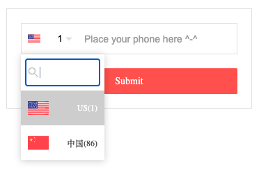
Online Demo
Codesandbox Examples
:tada: For version >= 2.0.0, please update react and react-dom to at least 16.8.6, since it is rewrited with hooks.
  "peerDependencies": {
    "react": ">= 16.8.6",
    "react-dom": ">= 16.8.6"
  }
Thanks
This project is inspired by ekwonye-richard/react-flags-select
Flag images: https://github.com/ekwonye-richard/react-flags-select/tree/master/flags
Why another flag select?
Area Code is Area Code, Phone Number is Phone Number, Flag is Flag. Easy for you to handle when they are separated.
This component supports fully customized html. It focuses on the data you provided and handles the country code or area code only. Not like react-telephone-input validate whole value along with the phone number without separation from 'area code' and 'phone number', which sometimes could be really painful when you are trying to handle them in your own way.
In case the country code or the area code or even the flags might be wrong inside a library, why don't provide them yourself?
Installation
npm install react-custom-flag-select --save
Donate
Thanks for donating me a donut! ⁄(⁄ ⁄•⁄ω⁄•⁄ ⁄)⁄
Browser support
Tested on IE9+ and Chrome and Safari(10.0.3)
Docs Link
ReactCustomFlagSelect
| Props | Type | Description | Default | |
|---|---|---|---|---|
| attributesWrapper | Req | Obj | Modify wrapper general attributes. If tabIndex not provided, the keydown may not working **{ |
id: 'myWrapperId',
tabIndex: '1'
...
}. | {} | |attributesButton | Opt | Obj |Modify button general attributes. {
id: 'myButtonId'
...
} | {} | |attributesInput | Opt | Obj |Modify hidden input general attributes. {
id: 'myInputId'
name: 'myInputName'
...
} | {} | |value | Opt | Str | | "" | |disabled | Opt | Bool | | false | |showSearch | Opt | Bool |Show a search box in order to find option quickly. | false | |fields | Opt | Array |Fields for search filtering. | ['name'] | |keyword | Opt | Str |Show a keyword for search box. | '' | |showArrow | Opt | Bool | | true | |animate | Opt | Bool | | false | |optionList |Req|Array|[{id: "1", name: "United States", displayText: "US(1)", flag: "us.svg"}, {id: "86", name: "中国", displayText: "中国(86)", flag: "cn.svg"}] |[] | |classNameSelect | Opt | Str | | "" | |classNameWrapper | Opt | Str | | "" | |classNameContainer | Opt | Str | | "" | |classNameButton | Opt | Str | | "" | |classNameOptionListContainer | Opt | Str | | "" | |classNameOptionListItem | Opt | Str | | "" | |customStyleSelect | Opt | Obj | | {} | |customStyleButton | Opt | Obj | | {} | |customStyleWrapper | Opt | Obj | | {} | |customStyleContainer | Opt | Obj | | {} | |customStyleOptionListContainer | Opt | Obj | | {} | |customStyleOptionListItem | Opt | Obj | | {} | |onChange |Req|Func| |(val, e) => {}| |onBlur |Opt|Func| |none | |onFocus | Opt | Func | | none | |onClick | Opt | Func | | none | |selectHtml |Opt|Html|The custom html that will display when user choose. Use it if you think the default html is ugly.|none | |selectOptionListItemHtml |Opt|Html|The custom select options item html that will display in dropdown list. Use it if you think the default html is ugly.|none** |
import ReactCustomFlagSelect from 'react-custom-flag-select';
import "react-custom-flag-select/lib/react-custom-flag-select.min.css";

const find = (arr, obj) => {
  const res = [];
  arr.forEach(o => {
    let match = false;
    Object.keys(obj).forEach(i => {
      if (obj[i] == o[i]) {
        match = true;
      }
    });
    if (match) {
      res.push(o);
    }
  });
  return res;
};

const FLAG_SELECTOR_OPTION_LIST = [
  { id: '1', name: 'US', displayText: 'US(1)', locale: 'en-US', flag: require('../src/image/flags/us.svg') },
  { id: '86', name: '中国', displayText: '中国(86)', locale: 'zh-CN', flag: require('../src/image/flags/cn.svg') }
];

const { areaCode, phone, validate } = this.state;
const currentItem = find(FLAG_SELECTOR_OPTION_LIST, { id: areaCode })[0];

 <ReactCustomFlagSelect
   attributesWrapper={{ id: 'areaCodeWrapper', tabIndex: '1' }} //Optional.[Object].Modify wrapper general attributes.
   attributesButton={{ id: 'areaCodeButton' }} //Optional.[Object].Modify button general attributes.
   attributesInput={{ id: 'areaCode', name: 'areaCode' }} //Optional.[Object].Modify hidden input general attributes.
   value={currentItem.id} //Optional.[String].Default: "".
   disabled={false} //Optional.[Bool].Default: false.
   showSearch={true} // Optional.[Bool].Default: false. Show a search box in order to find option quickly.
   fields={['name', 'locale']} // Optional.[array].Default: ['name']. Fields for search filtering.
   // keyword={''} // Optional.[String].Default: ''. Show a keyword for search box.
   showArrow={true} //Optional.[Bool].Default: true.
   animate={true} //Optional.[Bool].Default: false.
   optionList={FLAG_SELECTOR_OPTION_LIST} //Required.[Array of Object(s)].Default: [].
   // selectOptionListItemHtml={

us

} //Optional.[Html].Default: none. The custom select options item html that will display in dropdown list. Use it if you think the default html is ugly.
   // selectHtml={

us

} //Optional.[Html].Default: none. The custom html that will display when user choose. Use it if you think the default html is ugly.
   classNameWrapper="" //Optional.[String].Default: "".
   classNameContainer="" //Optional.[String].Default: "".
   classNameOptionListContainer="" //Optional.[String].Default: "".
   classNameOptionListItem="" //Optional.[String].Default: "".
   classNameDropdownIconOptionListItem={''} //Optional.[String].Default: "".
   customStyleWrapper={{}} //Optional.[Object].Default: {}.
   customStyleContainer={{ border: 'none', fontSize: '12px' }} //Optional.[Object].Default: {}.
   customStyleSelect={{ width: '100px' }} //Optional.[Object].Default: {}.
   customStyleOptionListItem={{}} //Optional.[Object].Default: {}.
   customStyleOptionListContainer={{ maxHeight: '100px', overflow: 'auto', width: '120px', marginTop: '11px' }} //Optional.[Object].Default: {}.
   onChange={areaCode => {
     this.setState({ areaCode: areaCode }, () => {
       this.handlePhoneChange(phone);
     });
   }}
   // onBlur={() => {}} //Optional.[Func].Default: none.
   // onFocus={(e) => {console.log(e)}} //Optional.[Func].Default: none.
   // onClick={(e) => {console.log(e)}} //Optional.[Func].Default: none.
 />
Contributors ✨
Thanks goes to these wonderful people (emoji key):
 Edward Xiao
💻 📖 🚇 ⚠️ 👀
Edward Xiao
💻 📖 🚇 ⚠️ 👀 |
This project follows the all-contributors specification. Contributions of any kind welcome!
Extension points exported contracts — how you extend this code
IClassNames (Interface)Core symbols most depended-on inside this repo
cxShape
Languages
Modules by API surface
For agents
$ claude mcp add react-custom-flag-select \
  -- python -m otcore.mcp_server <graph>