hub / github.com/douglasjunior/react-native-simple-dialogs
github.com/douglasjunior/react-native-simple-dialogs @3.0.1
Chat with this repo
42 symbols
87 edges
21 files
4 documented · 10%
What it actually does AI analysis from the code graph — generated when you open this
loading…
README
React Native Simple Dialogs



⚛ Cross-platform React Native dialogs based on the Modal component.
Features
Expo Snack
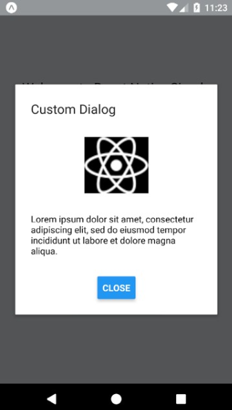
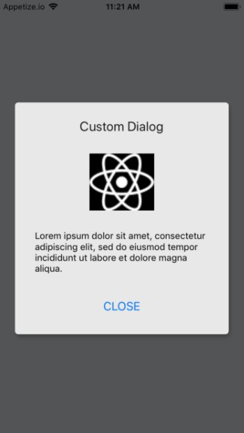
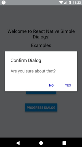
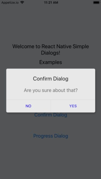
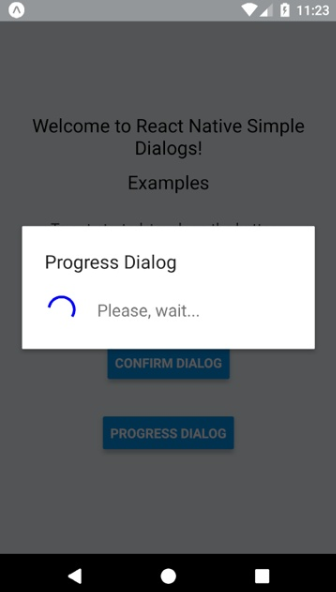
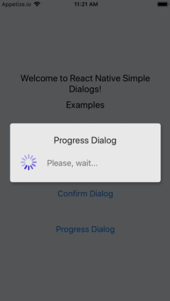
Screenshots
| Android | iOS |
|---|---|
 |
 |
 |
 |
 |
 |
Requirements
- React Native >= 0.44.0
NOTES
- for RN 0.58.0 or later use react-native-simple-dialogs@latest
- for RN 0.56.0 ... 0.57.8 use react-native-simple-dialogs@1.0.0
- for RN 0.44.0 ... 0.55.4, use react-native-simple-dialogs@0.3.1
Install
yarn add react-native-simple-dialogs
Or
npm i -S react-native-simple-dialogs
Use
Custom Dialog
import { Dialog } from 'react-native-simple-dialogs';

<Dialog
    visible={this.state.dialogVisible}
    title="Custom Dialog"
    onTouchOutside={() => this.setState({dialogVisible: false})} >
    <View>
        // your content here
    </View>
</Dialog>
Available props
| Name | Type | Default | Description |
|---|---|---|---|
| visible | Boolean | false | Show the modal? |
| onRequestClose | Function | null | Callback that's called when users taps the hardware back button on Android |
| animationType | Enum('none', 'slide', 'fade') | 'none' | Controls how the modal animates |
| onShow | Function | null | Callback that's called once the modal has been shown |
| onOrientationChange | Function | null | Callback that's called when the orientation change while the modal is being displayed on iOS |
| supportedOrientations | Array of Enum('portrait', 'portrait-upside-down', 'landscape', 'landscape-left', 'landscape-right') | 'portrait' | Allowed orientation while modals is being shown. More info at react-native docs |
| statusBarTranslucent | Boolean | null | Determines whether your modal should go under the system statusbar. More info at react-native docs. |
| onTouchOutside | Function | null | Callbac that's called when users tap outside the shown modal |
| title | String | null | Modal's title |
| titleStyle | Text StyleSheet | null | Custom text style object for modal's title |
| dialogStyle | View StyleSheet | null | Custom view style for dialog box |
| contentStyle | View StyleSheet | null | Custom view style for dialog content wrapper |
| buttonsStyle | View StyleSheet | null | Custom view style for dialog button wrapper |
| overlayStyle | View StyleSheet | null | Custom view style for dialog overlay |
| buttons | React Node | null | Modal button component |
| keyboardDismissMode | Enum('none', 'on-drag', 'interactive') | null | Determines whether the keyboard gets dismissed in response to a drag. |
| keyboardShouldPersistTaps | Enum('always', 'never', 'handled', false, true) | null | Determines when the keyboard should stay visible after a tap. |
| safeAreaInsets | Object{top: number, bottom: number, left: number, right: number} | null | Insets to apply to the dialog to avoid notches and other screen insets. Can be used with react-native-safe-area-context. |
Confirm Dialog
import { ConfirmDialog } from 'react-native-simple-dialogs';

// with message
<ConfirmDialog
    title="Confirm Dialog"
    message="Are you sure about that?"
    visible={this.state.dialogVisible}
    onTouchOutside={() => this.setState({dialogVisible: false})}
    positiveButton={{
        title: "YES",
        onPress: () => alert("Yes touched!")
    }}
    negativeButton={{
        title: "NO",
        onPress: () => alert("No touched!")
    }}
/>

// with custom content
<ConfirmDialog
    title="Confirm Dialog"
    visible={this.state.dialogVisible}
    onTouchOutside={() => this.setState({dialogVisible: false})}
    positiveButton={{
        title: "OK",
        onPress: () => alert("Ok touched!")
    }} >
    <View>
        // your content here
    </View>
</ConfirmDialog>
Available props
| Name | Type | Default | Description |
|---|---|---|---|
| ...{Dialog.props} | Dialog Props | null | Same props as Dialog Component |
| message | String | null | Message shown in the confirm dialog |
| messageStyle | Text StyleSheet | null | Custom text style for message |
| negativeButton | Button Props | null | Button element object to describe the negative button. See below for detailed shape of button |
| positiveButton | Button Props | REQUIRED | Button element object to describe the positive button. See below for detailed shape of button |
Button props
| Name | Type | Default |
|---|---|---|
| title | String | REQUIRED |
| onPress | Function | REQUIRED |
| disabled | Boolean | null |
| titleStyle | Text StyleSheet | null |
| style | View StyleSheet | null |
Progress Dialog
import { ProgressDialog } from 'react-native-simple-dialogs';

<ProgressDialog
    visible={this.state.progressVisible}
    title="Progress Dialog"
    message="Please, wait..."
/>
Available props
| Name | Type | Default | Description |
|---|---|---|---|
| ...{Dialog.props} | Dialog Props | null | Same props as Dialog Component |
| message | String | null | Message shown in the progress dialog |
| messageStyle | Text StyleSheet | null | Custom text style for message |
| activityIndicatorColor | color | null | The foreground color of the spinner |
| activityIndicatorSize | enum('small', 'large'), number | null | Size of the indicator. Number only supported on Android |
| activityIndicatorStyle | View StyleSheet | null | Custom style for the activity indicator |
Safe Area
Due to RN SafeAreaView deprecation, the Dialog component now accepts a safeAreaInsets prop to handle notches and screen insets.
You can use it like this:
import { useSafeAreaInsets } from 'react-native-safe-area-context';
import { Dialog } from 'react-native-simple-dialogs';

const insets = useSafeAreaInsets();

<Dialog
    visible={this.state.dialogVisible}
    title="Custom Dialog"
    safeAreaInsets={insets}
    onTouchOutside={() => this.setState({dialogVisible: false})} >
    <View>
        // your content here
    </View>
</Dialog>
More info on the [sample project](h
Extension points exported contracts — how you extend this code
EdgeInsets (Interface)(no doc)
src/Dialog.tsx
Core symbols most depended-on inside this repo
openConfirmcalled by 4
Sample/src/App.tsx
applySafeAreaInset
called by 4
src/Dialog.tsx
openDialog
called by 3
Sample/src/App.tsx
renderOutsideTouchable
called by 2
src/Dialog.tsx
renderButton
called by 2
src/ConfirmDialog.tsx
getMainComponentName
called by 1
Sample/android/app/src/main/java/com/sample/MainActivity.java
getReactNativeHost
called by 1
Sample/android/app/src/main/java/com/sample/MainApplication.java
initializeFlipper
called by 1
Sample/android/app/src/debug/java/com/sample/ReactNativeFlipper.java
Shape
Languages
TypeScript57%
Java43%
Modules by API surface
src/ConfirmDialog.tsx9 symbols
Sample/android/app/src/main/java/com/sample/MainApplication.java8 symbols
src/Dialog.tsx7 symbols
Sample/src/App.tsx6 symbols
Sample/android/app/src/debug/java/com/sample/ReactNativeFlipper.java5 symbols
Sample/android/app/src/main/java/com/sample/MainActivity.java3 symbols
Sample/android/app/src/release/java/com/sample/ReactNativeFlipper.java2 symbols
src/TouchableEffect.tsx1 symbols
src/ProgressDialog.tsx1 symbols
For agents
$ claude mcp add react-native-simple-dialogs \
  -- python -m otcore.mcp_server <graph>