github.com/djorg83/react-bootstrap-sweetalert @v5.2.0
Chat with this repoWhat it actually does AI analysis from the code graph — generated when you open this
README
react-bootstrap-sweetalert




 Openbase Dashboard
SweetAlert for React/Bootstrap
An awesome replacement for JavaScript's alert.
Support
If you think I've done a good job, consider showing your support by buying me a beer. Cheers! :beers:

Demo & Examples
See the demo with examples of common use cases and a live editor.
:alien: TAKE ME TO YOUR DEMO :alien:
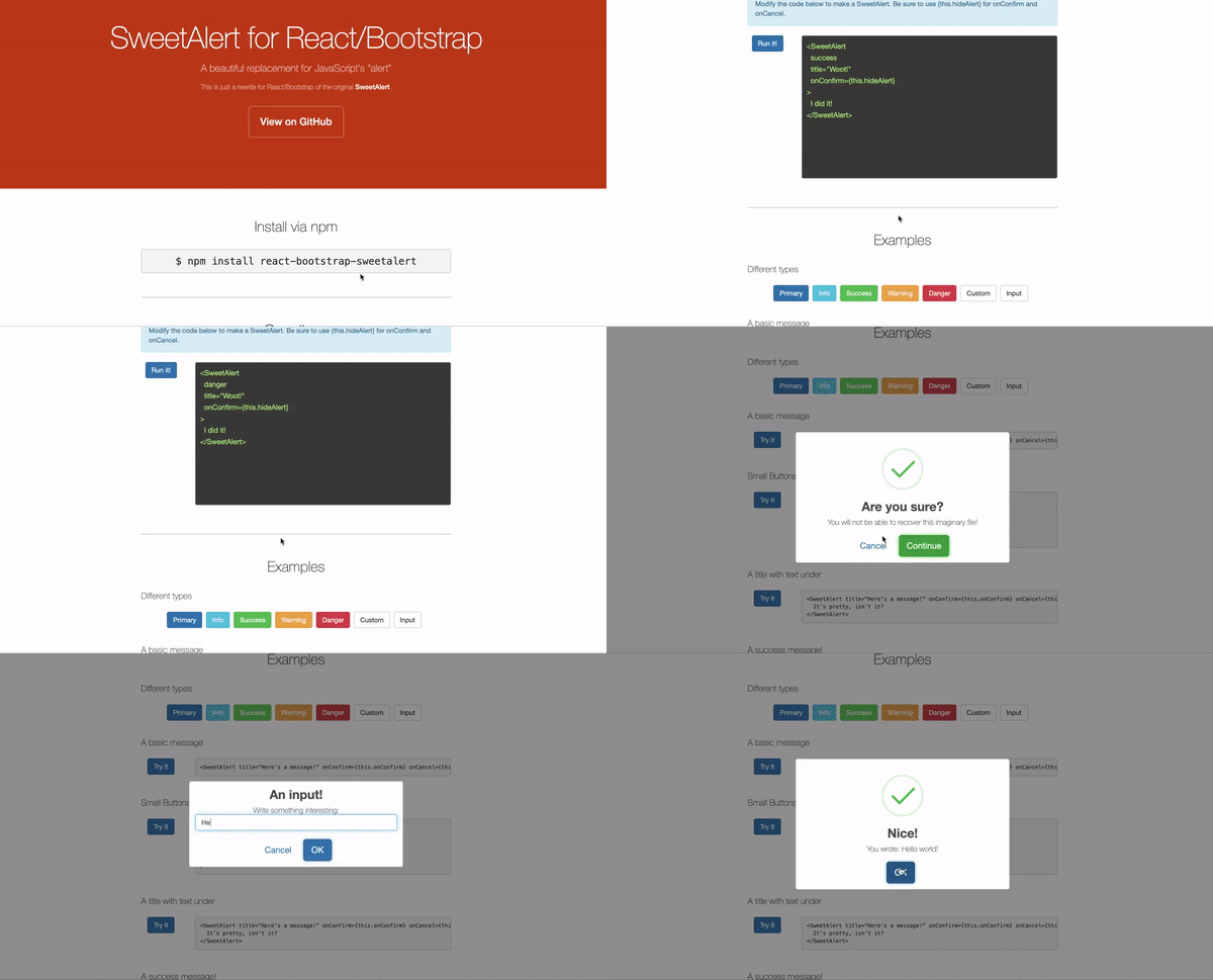
Getting Started
Installation
$ npm i react-bootstrap-sweetalert
or
$ yarn add react-bootstrap-sweetalert
Import
const SweetAlert = require('react-bootstrap-sweetalert');
or
import SweetAlert from 'react-bootstrap-sweetalert';
Recommended Usage
It is recommended that you keep an alert in your state, and remove it when the onConfirm or onCancel callbacks are invoked.
You can have stackable alerts by keeping an array of alerts in your data store, and always providing the first alert in the array as the visible alert. When an alert is closed, remove it from the store.
See examples/redux for a working example of how to implement stackable alerts with a Redux store.
Tip: Receiving an input value
If you're using input type, the value of the input will be sent to the onConfirm callback as the first argument.
onConfirm={(response) => this.onRecieveInput(response)}
Custom Forms / Using Render Props
If you want to build an alert that re-renders based on external state changes, or simply want to build a custom form, then you will find the render props pattern to be your best option.
- For re-rendering based on external state changes, use props.dependencies
- See the
SweetAlertRenderPropsinterface in types.ts for some information on the available render props.
```typescript jsx <SweetAlert title={"Uses render props"} onConfirm={this.onConfirm} onCancel={this.onCancel} dependencies={[this.state.firstName, this.state.lastName]}
{(renderProps: SweetAlertRenderProps) => (
Your name is: {this.state.firstName} {this.state.lastName}
this.setState({ firstName: e.target.value })} placeholder={'First name'} />
  <input
    type={'text'}
    className="form-control"
    value={this.state.lastName}
    onKeyDown={renderProps.onEnterKeyDownConfirm}
    onChange={(e) => this.setState({ lastName: e.target.value })}
    placeholder={'Last name'}
  />
  <hr/>
</form>
)}
## Changes in version 5.2

* Added `props.dependencies` that re-renders the alert whenever the provided Array of `dependencies` value changes.
* Added new supported value of `'controlled'` for `props.type`.  If `props.type === 'controlled'` then `props.onConfirm` will return `props.dependencies`.
* Added support for using a function as your alert content/children, aka render props.

For more see [CHANGE_LOG.md](https://github.com/djorg83/react-bootstrap-sweetalert/blob/master/CHANGE_LOG.md)

## Props

- [title](#propstitle) (required)
- [type](#propstype)
- [onConfirm](#propsonconfirm) (required)
- [onCancel](#propsoncancel)
- [customIcon](#propscustomicon)
- [allowEscape](#propsallowescape)
- [closeOnClickOutside](#propscloseonclickoutside)
- [hideOverlay](#propshideoverlay)
- [timeout](#propstimeout)
- [show](#propsshow)
- [dependencies](#propsdependencies)

##### Buttons

- [btnSize](#propsbtnsize)
- [confirmBtnText](#propsconfirmbtntext)
- [confirmBtnBsStyle](#propsconfirmbtnbsstyle)
- [confirmBtnCssClass](#propsconfirmbtncssclass)
- [confirmBtnStyle](#propsconfirmbtnstyle)
- [cancelBtnText](#propscancelbtntext)
- [cancelBtnBsStyle](#propscancelbtnbsstyle)
- [cancelBtnCssClass](#propscancelbtncssclass)
- [cancelBtnStyle](#propscancelbtnstyle)
- [showCloseButton](#propsshowclosebutton)
- [reverseButtons](#propsreversebuttons)
- [customButtons](#propscustombuttons)
- [focusConfirmBtn](#propsfocusconfirmbtn)
- [focusCancelBtn](#propsfocuscancelbtn)
- [closeBtnStyle](#propsclosebtnstyle)
- [showConfirm](#propsshowconfirm)
- [showCancel](#propsshowcancel)
- [disabled](#propsdisabled)

##### Input

- [placeholder](#propsplaceholder)
- [required](#propsrequired)
- [validationMsg](#propsvalidationmsg)
- [validationRegex](#propsvalidationregex)
- [defaultValue](#propsdefaultvalue)
- [inputType](#propsinputtype)

##### Hooks

- [beforeMount](#propsbeforemount)
- [afterMount](#propsaftermount)
- [afterUpdate](#propsafterupdate)
- [beforeUnmount](#propsbeforeunmount)

##### Styling

- [style](#propsstyle)
- [customClass](#propscustomclass)

##### Animations

- [openAnim](#propsopenanim)
- [closeAnim](#propscloseanim)

----

### `props.title`
The text to display for the title. JSX/ReactNode allowed.
- Type: `ReactNode|string`
- Default: `undefined`
----
### `props.onConfirm`
Invoked when user clicks confirm button. Also invoked if user hits ENTER key.
- Type: `(response?: any) => any`
- Default: `undefined`
----
### `props.onCancel`
Invoked when user clicks cancel button. Also invoked if allowEscape is true and user hits ESCAPE key.
- Type: `() => any`
- Default: `undefined`
----
### `props.type`
The type of alert to display.
- Type: `'default'|'info'|'success'|'warning'|'danger'|'error'|'input'|'custom'|'controlled'`
- Default: `'default'`

> NOTE
> - If `props.type === 'controlled'` then `props.onConfirm` will receive `props.dependencies` as its first argument.
> - If `props.type === 'input'` then `props.onConfirm` will receive `props.dependencies` as its first argument.
----
### `props.btnSize`
The type of alert to display.
- Type: `'lg'|'sm'|'xs'`
- Default: `'lg'`
- Allowed values: `'lg'`, `'sm'`, `'xs'`
----
### `props.confirmBtnText`
Content of confirm button, or JSX/ReactNode.
- Type: `ReactNode|string`
- Default: `'OK'`
----
### `props.confirmBtnBsStyle`
Bootstrap style of confirm button.
- Type: `'default'|'primary'|'link'|'info'|'success'|'warning'|'danger'|'secondary'|'outline-{variant}'`
- Default: `'primary'`
----
### `props.confirmBtnCssClass`
CSS class added to confirm button.
- Type: `string`
- Default: `''`
----
### `props.confirmBtnStyle`
Inline style added to confirm button.
- Type: `CSSProperties`
- Default: `{}`
----
### `props.cancelBtnText`
Content of cancel button, or JSX/ReactNode.
- Type: `ReactNode|string`
- Default: `'Cancel'`
----
### `props.cancelBtnBsStyle`
Text of cancel button, or JSX/ReactNode.
- Type: `string`
- Default: `'link'`
- Recommended values: `'default'|'primary'|'link'|'info'|'success'|'warning'|'danger'|'secondary'|'outline-{variant}'`
----
### `props.cancelBtnCssClass`
CSS class added to cancel button.
- Type: `string`
- Default: `''`
----
### `props.cancelBtnStyle`
Inline style added to cancel button.
- Type: `CSSProperties`
- Default: `{}`
----
### `props.showCloseButton`
If set to true, then an X close button will be shown in the top right of the alert.

> NOTE: You must also implement `props.onCancel` in order for this props to work. This is because visibility of the
> component is controlled externally through either `props.show` or by removing the `<SweetAlert />` in your render method.

- Type: `boolean`
- Default: `false`
----
### `props.reverseButtons`
Reverses the order of the Confirm and Cancel buttons. Default positioning is [Cancel] [Confirm]
- Type: `boolean`
- Default: `false`
----
### `props.customButtons`
Custom buttons to use in place of the default Confirm and Cancel buttons. Can render any JSX/ReactNodes here.
- Type: `ReactNode`
- Default: `undefined`
----
### `props.customIcon`
Either a string url for an image to use as the icon, or JSX/ReactNode.
- Type: `ReactNode|string`
- Default: `undefined`
----
### `props.placeholder`
If `props.type` is `'input'`, this is the placeholder for the input field.
- Type: `string`
- Default: `undefined`
----
### `props.show`
If false, the alert will not be rendered.
Warning: Using this option should be a last resort, and is somewhat of an anti-pattern for this library.
The recommended way to control visibility is to only render a `<SweetAlert/>` element when you want one to be displayed,
and remove it when the `onConfirm` or `onCancel` methods are called.
- Type: `boolean`
- Default: `true`
----
### `props.dependencies`
If you have external state that should trigger your alert to re-render it's content, you can provide an `Array` of `dependencies`.
Whenever the dependencies are changed, using `===` comparision, the content of the alert will be re-rendered.
- Type: `any[]`
- Default: `true`

Example
```typescript jsx
const [firstName, setFirstName] = useState('');
const [lastName, setLastName] = useState('');

<SweetAlert dependencies={[firstName, lastName]}>


    <h4>Hello {{firstName}} {{lastName}}</h4>
    <input value={firstName} onChange={(e) => setFirstName(e.target.value)} />
    <input value={lastName} onChange={(e) => setLastName(e.target.value)} />


</SweetAlert>
props.focusConfirmBtn
If true the Confirm button will receive focus automatically. NOTE: Does not apply when props.type is 'input'
- Type: boolean
- Default: true
props.focusCancelBtn
If true the Cancel button will receive focus automatically. NOTE: Does not apply when props.type is 'input'
- Type: boolean
- Default: false
props.required
If props.type is 'input', this prop controls whether the input field is required to have a value.
- Type: boolean
- Default: true
props.validationMsg
If props.type is 'input' and props.required is true, this is the message to display when the user clicks confirm without entering a value.
- Type: string
- Default: 'Please enter a response!'
props.validationRegex
If props.type is 'input' and props.required is true, this Regex is used to validate input value.
- Type: RegExp
- Default: /^.+$/
props.defaultValue
If props.type is 'input', this is the default value for the input field.
- Type: number|string
- Default: undefined
props.inputType
If props.type is 'input', this is the default value for the input field.
- Type: string
- Default: 'text'
- Recommended values: 'text'|'password'|'number'|'textarea'
props.style
Style overrides applied to the sweetalert wrapper.
- Type: CSSProperties
- Default: {}
props.closeBtnStyle
Style overrides applied to the X close button.
- Type: CSSProperties
- Default: {}
props.customClass
Custom CSS class applied to the sweetalert wrapper.
- Type: string
- Default: ''
props.showConfirm
If true, the Confirm button will show.
- Type: boolean
- Default: true
props.showCancel
If true, the Cancel button will show.
- Type: boolean
- Default: false
props.allowEscape
If true, the onCancel function will be invoked when the user hits the ESCAPE key.
- Type: boolean
- Default: true
props.closeOnClickOutside
If true, the onCancel function will be invoked when clicking outside the modal.
- Type: boolean
- Default: true
props.hideOverlay
If true, then the modal overlay will not be rendered.
- Type: boolean
- Default: false
props.disabled
If true, then the Confirm button will be disabled. (NOTE: This does not effect the props.allowEscape behavior.)
If you set disabled to true but do not provide an onCancel function, then the disabled property will not be honored.
- Type: boolean
- Default: false
props.beforeMount
Hook which is invoked at the end of the component constructor function.
- Type: () => any
- Default: () => {}
props.afterMount
Hook which is invoked at the end of the componentDidMount method.
- Type: () => any
- Default: () => {}
props.afterUpdate
Hook which is invoked at the end of the componentDidUpdate method.
- Type: () => any
- Default: () => {}
props.beforeUnmount
Hook which is invoked at the end of the componentWillUnmount method.
- Type: () => any
- Default: () => {}
props.timeout
Extension points exported contracts — how you extend this code
SweetAlertAnimationProps (Interface)Core symbols most depended-on inside this repo
debugLoggerShape
Languages
Modules by API surface
For agents
$ claude mcp add react-bootstrap-sweetalert \
  -- python -m otcore.mcp_server <graph>