github.com/diegohaz/reuse @v2.0.0
Chat with this repoWhat it actually does AI analysis from the code graph — generated when you open this
README

Reuse different React components to create new ones




Installation
npm i reuse
Thanks to @eldargab for the package name on npm.
Why
This enables (sub)atomic design approach.
When using classic CSS, we have a powerful way to compose "stylesheet components" by applying multiple class names to our HTML elements (.btn, .large, .rounded etc.). But, by doing that in React, which has its own component structure, we'll have conflicting component structures.
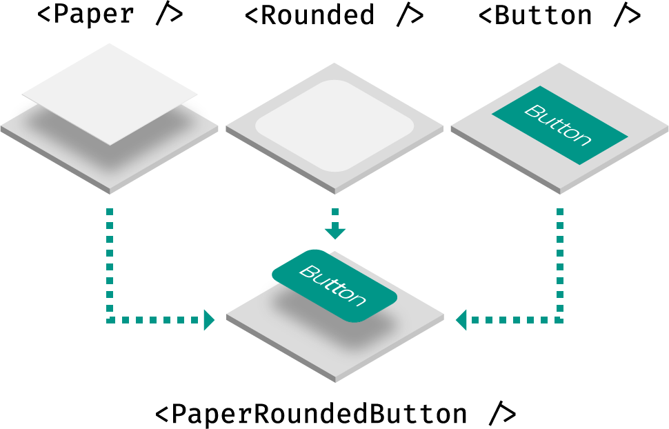
Reuse solves it by combining React components together as if they were CSS classes. This also means that not only style will be composed, but also JavaScript behavior, like React lifecycle methods and event handlers.
Usage
Reuse simply exports a factory method that returns a React component. You can leverage that method in two ways: augmentation and combination.
Examples
Augmentation
The component returned by the use factory will expect a use prop:
import use from "reuse";

const Box = use();

<Box />; // null
<Box use="div" />; //


<Box use={Link} />; // <Link />
You can create the component with a default element:
const Box = use("div");

<Box />; //


<Box use="span" />; // <span />
You can create the component with another component. Just make sure to render the use prop as the underlying element and pass the other props down (at least, when use isn't a string – HTML element):
import React from "react";
import use from "reuse";

// grab the `use` prop and pass down other props
const Base = ({ use: T = "div", ...props }) => <T {...props} />;

const Box = use(Base);

<Box />; //


<Box use="span" />; // <span />

const BoxSpan = use(Box, "span");
<BoxSpan />; // <span />
You can use
Baseto filter custom props whenuseis a string using @emotion/is-prop-valid, for example.
Combination
Let's create some components:
// Using styled-components
const Paper = styled(use("div"))`
  box-shadow: 0 2px 4px rgba(0, 0, 0, 0.30);
`;

// Using class names
const Rounded = use(({ use: T, ...props }) => (
  <T
    {...props}
    className={`rounded ${props.className}`}
  />
), "div");

// Using inline styles
const Button = use(({ use: T, ...props }) => (
  <T
    {...props}
    style={{
      padding: "0 1em",
      lineHeight: "2.5em",
      background: "#3f51b5",
      color: "white",
      ...props.style
    }}
  />
), "button");
Once you have a few of those components, you can combine them using the same use methods:
import use from "reuse";
import { Rounded, Paper, Button } from "../components";

// with factory
const RoundedPaperButton = use(Rounded, Paper, Button);
<RoundedPaperButton />; // <button style="..." class="..." />
<RoundedPaperButton use="div" />; //


// with prop
<Rounded use={[Paper, Button]} /> // <button style="..." class="..." />
<Rounded use={[Paper, Button, "div"]} /> //
Note that the underlying HTML element will always be based on the last component you pass to use.
FAQ
How does this compare to render props and HOCs?
These are equivalent implementations:
Render props
<Paper>
  {paperProps => (
    <Rounded {...paperProps}>
      {roundedProps => (
        <Button {...roundedProps}>
          {buttonProps => (
            <button {...buttonProps}>Button</button>
          )}
        </Button>
      )}
    </Rounded>
  )}
</Paper>
High-order components
withPaper(withRounded(withButton(props => <button {...props}>Button</button>)));
Reuse
use(Paper, Rounded, Button);
// or
<Paper use={[Rounded, Button]} />
When using render props or HOCs, you have to stick with their static (HOC) or dynamic implementation (render prop). With Reuse, besides simplicity, you can use both depending on your needs.
License
MIT © Haz
Core symbols most depended-on inside this repo
useShape
Languages
Modules by API surface
For agents
$ claude mcp add reuse \
  -- python -m otcore.mcp_server <graph>