github.com/brianvoe/slim-select @v4.0.3
Chat with this repoWhat it actually does AI analysis from the code graph — generated when you open this
README
Slim Select
The select dropdown, reimagined.
A lightweight, dependency-free replacement for the native <select> — single and multi-select, search, optgroups,
remote data, modal mode on mobile, and full theming through CSS variables. Drop it into any stack, or use the official
Vue and React wrappers.
slimselectjs.com



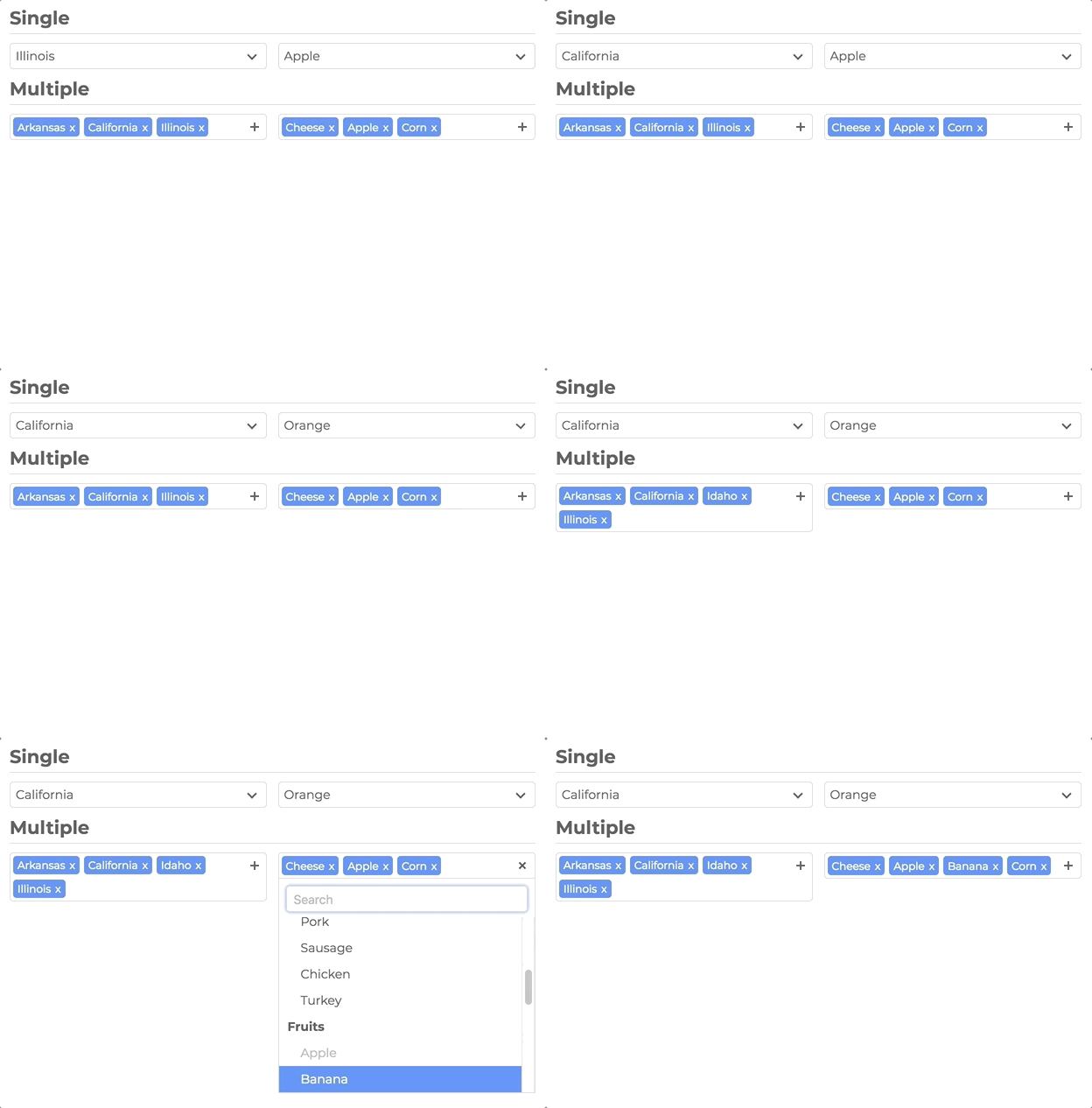
Documentation
Full docs, live demos, and copy-paste examples: slimselectjs.com
Features
Select, upgraded
- Single and multi-select with tags, placeholders, and deselect
- Search with highlighting, remote/API search, and user-addable options
- Optgroups with select-all and closable accordion groups
- HTML options, tooltips, min/max selection limits, and disabled options
- Modal mode (
off|on|mobile) — centered panel with backdrop; mobile-friendly by default
Looks like your product
- Theme entirely with
--ss-*CSS custom properties — no fighting class specificity - Import plain CSS or SCSS; inherit styles and classes from the native
<select>
Built to ship
- Zero runtime dependencies
- ~66KB JS (~16KB gzip) · ~12KB CSS (~2KB gzip)
- TypeScript types included
- WCAG 2.1 Level AA accessibility (ARIA, keyboard, screen reader support)
prefers-reduced-motionrespected- 477 unit tests + 46 Playwright E2E tests
Framework ready
Installation
npm install slim-select
CDN
<script src="https://unpkg.com/slim-select@latest/dist/slimselect.js"></script>
<link rel="stylesheet" href="https://unpkg.com/slim-select@latest/dist/slimselect.css" />
Quick start
import SlimSelect from 'slim-select'
import 'slim-select/styles' // or: import 'slim-select/scss'

new SlimSelect({
  select: '#selectElement'
})
<select id="selectElement">
  <option value="value1">Value 1</option>
</select>
Styling
Slim Select is styled with CSS variables. Set them on a wrapper around your select (or on :root for a global theme):
.my-form {
  --ss-primary-color: #2563eb;
  --ss-bg-color: #ffffff;
  --ss-font-color: #1e293b;
  --ss-border-color: #e2e8f0;
  --ss-border-radius: 8px;
  --ss-main-height: 44px;
}
See the full token list and live themes on the Style docs.
Data
Pass an array of options and optgroups instead of (or in addition to) native <option> elements:
new SlimSelect({
  select: '#selectElement',

  data: [
    { text: 'Value 1', value: 'value1' },
    {
      label: 'Group label',
      options: [
        { text: 'Value 2', value: 'value2' },
        { text: 'Value 3', value: 'value3' }
      ]
    }
  ]
})
Data types
// <optgroup>
const optgroup = {
  label: 'label', // Required
  selectAll: false, // Optional — default false
  closable: 'off', // Optional — 'off' | 'open' | 'close'
  options: [] // Required — array of options
}

// <option>
const option = {
  text: 'text', // Required
  value: 'value', // Optional — defaults to text
  html: '<b>Html</b>', // Optional — used for display when set
  selected: false,
  display: true,
  disabled: false,
  mandatory: false,
  placeholder: false,
  class: '',
  style: '',
  data: {} // Plain object for data-* attributes
}
Settings
All fields are optional. Values shown are defaults.
new SlimSelect({
  select: '#selectElement',

  settings: {
    disabled: false,
    alwaysOpen: false,
    showSearch: true,
    focusSearch: true,
    keepSearch: false,
    ariaLabel: 'Combobox',
    searchPlaceholder: 'Search...',
    searchText: 'No Results',
    searchingText: 'Searching...',
    resultsText: '{count} results available',
    deselectText: 'Clear',
    removeText: 'Remove',
    searchHighlight: false,
    closeOnSelect: true,
    contentLocation: document.body,
    contentPosition: 'absolute', // 'absolute' | 'relative' | 'fixed'
    contentWidth: '', // e.g. '500px', '>500px', '<500px'
    openPosition: 'auto', // 'auto' | 'up' | 'down'
    placeholderText: 'Select Value',
    allowDeselect: false,
    hideSelected: false,
    multiString: false,
    keepOrder: false,
    showOptionTooltips: false,
    minSelected: 0,
    maxSelected: 1000,
    timeoutDelay: 200,
    maxValuesShown: 20,
    maxValuesMessage: '{number} selected',
    addableText: 'Press "Enter" to add {value}',
    modal: 'mobile', // 'off' | 'on' | 'mobile'
    modalTitle: '' // Header above the option list in modal view
  }
})
Events
new SlimSelect({
  select: '#selectElement',

  events: {
    // Remote/API search — return a Promise or data array
    // searchValue: current input text
    // selected: currently selected Option[]
    // catalog: baseline list restored when search clears
    search: (
      searchValue: string,
      selected: Option[],
      catalog?: (Option | Optgroup)[]
    ) =>
      Promise<(Partial<Option> | Partial<Optgroup>)[]> |
      (Partial<Option> | Partial<Optgroup>)[],

    // Local filter when events.search is not set
    searchFilter: (option: Option, search: string) => boolean,

    // User-added options — return the new option or an Error
    addable: (value: string) => Promise<Partial<Option> | string> | Partial<Option> | string | Error,

    beforeChange: (newVal: Option[], oldVal: Option[]) => boolean | void,
    afterChange: (newVal: Option[]) => void,
    beforeOpen: () => void,
    afterOpen: () => void,
    beforeClose: () => void,
    afterClose: () => void,
    error: (err: Error) => void
  }
})
Methods
const slim = new SlimSelect({ select: '#selectElement' })

slim.enable()
slim.disable()
slim.getData()
slim.setData(data)
slim.getSelected() // string[]
slim.setSelected(['value1', 'value2'])
slim.addOption(option)
slim.open()
slim.close()
slim.search('searchValue')
slim.destroy()
Vue
Official Vue 3 component with v-model and full TypeScript support.
npm install slim-select
<script lang="ts">
import SlimSelect from 'slim-select/vue'
import 'slim-select/styles'

export default {
  components: { SlimSelect },
  data() {
    return {
      selected: 'value2',
      options: [
        { text: 'Value 1', value: 'value1' },
        { text: 'Value 2', value: 'value2' },
        { text: 'Value 3', value: 'value3' }
      ]
    }
  }
}
</script>

<template>
  <SlimSelect v-model="selected" :data="options" />
</template>
Note: Pass options via the
:dataprop. Native<option>slot children are not supported in the Vue wrapper.
React
Official React component with hooks and ref access to the underlying instance.
npm install slim-select
import { useState } from 'react'
import SlimSelect from 'slim-select/react'
import 'slim-select/styles'

function MyComponent() {
  const [selected, setSelected] = useState('value2')
  const options = [
    { text: 'Value 1', value: 'value1' },
    { text: 'Value 2', value: 'value2' },
    { text: 'Value 3', value: 'value3' }
  ]

  return <SlimSelect data={options} value={selected} onChange={setSelected} />
}
Note: Pass options via the
dataprop. Native<option>children are not supported in the React wrapper.
Ref access
import { useRef } from 'react'
import SlimSelect, { SlimSelectRef } from 'slim-select/react'
import 'slim-select/styles'

function MyComponent() {
  const slimRef = useRef<SlimSelectRef>(null)

  return (
    <>
      <SlimSelect ref={slimRef} data={options} />
      <button onClick={() => slimRef.current?.slimSelect?.open()}>Open</button>
    </>
  )
}
Support


Extension points exported contracts — how you extend this code
NavLink (Interface)Core symbols most depended-on inside this repo
getSelectedShape
Languages
Modules by API surface
Used by 1 indexed graphs manifest dependencies, hub-wide
For agents
$ claude mcp add slim-select \
  -- python -m otcore.mcp_server <graph>