github.com/braiekhazem/react-kanban-kit @main
Chat with this repoBrowse by type
What it actually does AI analysis from the code graph — generated when you open this
README
React Kanban Kit
A flexible and customizable Kanban board component for React applications, built with TypeScript and modern drag-and-drop functionality powered by Atlassian's pragmatic-drag-and-drop.
Demo
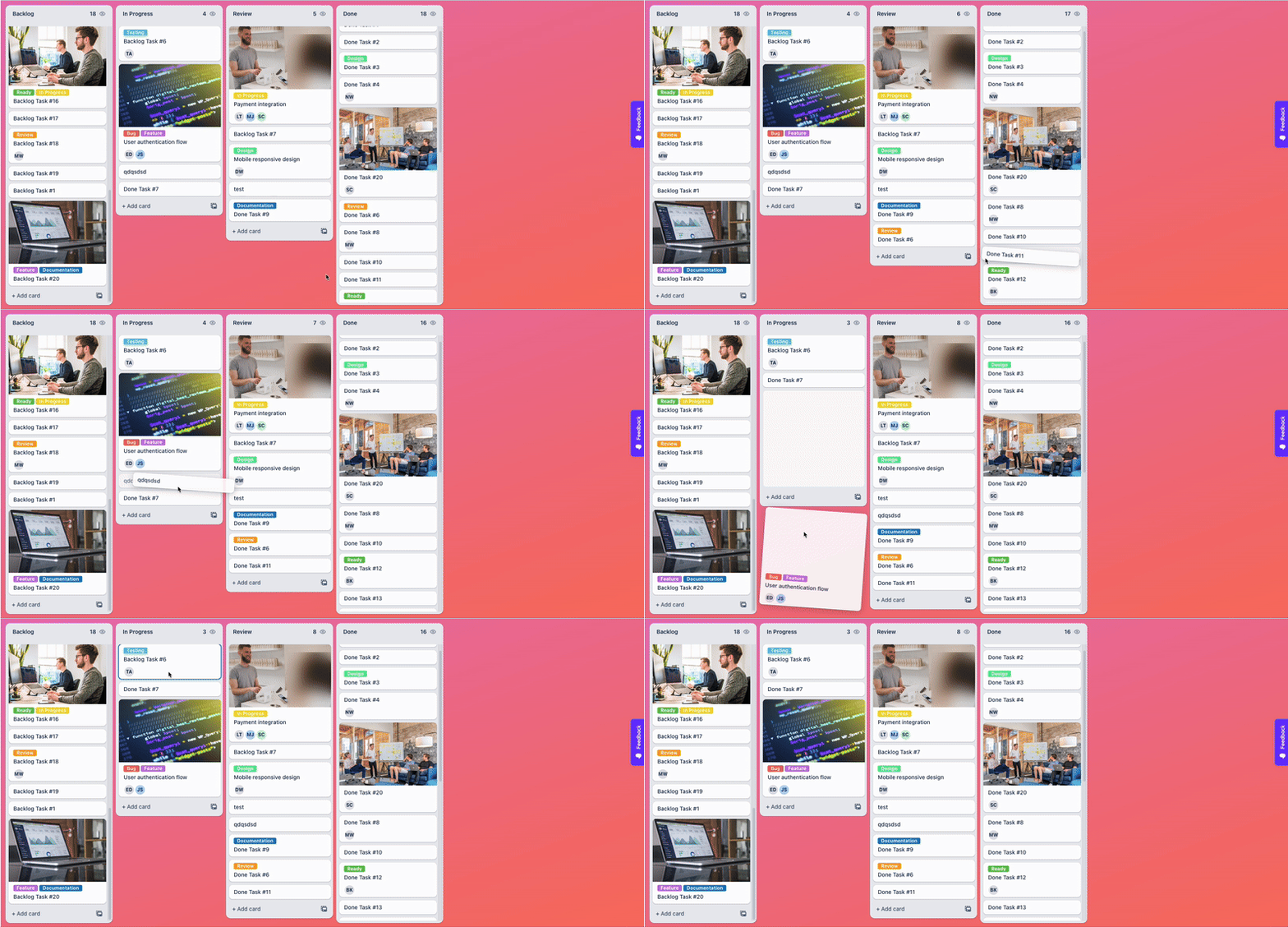
Check out the live demo: https://react-kanban-kit.netlify.app/
Features
- 🎯 Drag and Drop: Cards and columns with smooth animations
- 📱 Responsive Design: Works on desktop, tablet, and mobile
- 🎨 Highly Customizable: Custom renderers for cards, headers, footers, and more
- 🔄 Virtual Scrolling: Optimized performance for large datasets
- 📦 TypeScript Support: Full type safety and IntelliSense
- 🎮 View-Only Mode: Disable interactions when needed
- 🎯 Skeleton Loading: Built-in loading states with animations
- 🎨 Custom Styling: Function-based styling with access to data context
- 🔥 Modern Architecture: Built with React hooks and clean separation of concerns
Installation
npm install react-kanban-kit
# or
yarn add react-kanban-kit
# or
pnpm add react-kanban-kit
Basic Usage
import { Kanban, dropHandler } from "react-kanban-kit";
import type { BoardData } from "react-kanban-kit";

const MyKanbanBoard = () => {
  const [dataSource, setDataSource] = useState<BoardData>({
    root: {
      id: "root",
      title: "Root",
      children: ["col-1", "col-2", "col-3"],
      totalChildrenCount: 3,
      parentId: null,
    },
    "col-1": {
      id: "col-1",
      title: "To Do",
      children: ["task-1", "task-2"],
      totalChildrenCount: 2,
      parentId: "root",
    },
    "col-2": {
      id: "col-2",
      title: "In Progress",
      children: ["task-3"],
      totalChildrenCount: 1,
      parentId: "root",
    },
    "col-3": {
      id: "col-3",
      title: "Done",
      children: ["task-4"],
      totalChildrenCount: 1,
      parentId: "root",
    },
    "task-1": {
      id: "task-1",
      title: "Design Homepage",
      parentId: "col-1",
      children: [],
      totalChildrenCount: 0,
      type: "card",
      content: {
        description: "Create wireframes and mockups for the homepage",
        priority: "high",
      },
    },
    "task-2": {
      id: "task-2",
      title: "Setup Database",
      parentId: "col-1",
      children: [],
      totalChildrenCount: 0,
      type: "card",
    },
    "task-3": {
      id: "task-3",
      title: "Build Auth Flow",
      parentId: "col-2",
      children: [],
      totalChildrenCount: 0,
      type: "card",
    },
    "task-4": {
      id: "task-4",
      title: "Deploy to Production",
      parentId: "col-3",
      children: [],
      totalChildrenCount: 0,
      type: "card",
    },
  });

  const configMap = {
    card: {
      render: ({ data }) => (


          <h3>{data.title}</h3>
          {data.content?.description &&

{data.content.description}

}
          {data.content?.priority && (
            <span className={`priority ${data.content.priority}`}>
              {data.content.priority}
            </span>
          )}


      ),
      isDraggable: true,
    },
  };

  return (
    <Kanban
      dataSource={dataSource}
      configMap={configMap}
      onCardMove={(move) => {
        setDataSource(dropHandler(move, dataSource, () => {}));
      }}
    />
  );
};
Advanced Usage
Custom Card Types and Renderers
const configMap = {
  card: {
    render: ({ data, column, index, isDraggable }) => (


        <h4>{data.title}</h4>


{data.content?.description}


          <span className="assignee">{data.content?.assignee}</span>
          <span className="due-date">{data.content?.dueDate}</span>


    ),
    isDraggable: true,
  },

  divider: {
    render: ({ data }) => (


        <hr />
        <span>{data.title}</span>


    ),
    isDraggable: false,
  },

  footer: {
    render: ({ data, column }) => (
      <button className="add-card-btn">+ Add card to {column.title}</button>
    ),
    isDraggable: false,
  },
};
Custom Column Headers and Footers
<Kanban
  dataSource={dataSource}
  configMap={configMap}
  renderColumnHeader={(column) => (


      <h3>{column.title}</h3>
      <span className="count">{column.totalChildrenCount}</span>
      <button className="column-menu">⋯</button>


  )}
  renderColumnFooter={(column) => (


      <button>Add New Card</button>


  )}
  // Column adder
  allowColumnAdder={true}
  renderColumnAdder={() => (
    <button className="add-column-btn">+ Add Column</button>
  )}
  // List footer (shown at the bottom of each column's card list)
  allowListFooter={(column) => column.id !== "done"}
  renderListFooter={(column) => (


      <button>+ Add another card</button>


  )}
/>
Column Drag and Drop
Enable column reordering by dragging column headers. Columns are dragged by their header element and show a placeholder indicator at the drop position.
import { Kanban, dropColumnHandler } from "react-kanban-kit";

<Kanban
  dataSource={dataSource}
  configMap={configMap}
  allowColumnDrag
  onColumnMove={(move) => {
    setDataSource(dropColumnHandler(move, dataSource));
  }}
  renderColumnHeader={(column) => (


      <h3>{column.title}</h3>


  )}
/>;
How it works
- The column header is the drag handle users grab the header to drag the entire column
- While dragging, the source column dims (40% opacity), then hides once the cursor leaves it
- A drop indicator (column-sized placeholder) appears between columns to show the landing position
- On drop,
onColumnMovefires with{ columnId, fromIndex, toIndex } - Use the
dropColumnHandlerutility to produce the updateddataSource
Custom Column Drag Preview
By default, the drag preview is a DOM clone of the column. Override it with renderColumnDragPreview:
<Kanban
  allowColumnDrag
  renderColumnDragPreview={(column, info) => (


      <strong>{column.title}</strong>


{column.totalChildrenCount} cards


  )}
/>
Custom Column Drop Indicator
By default, the drop indicator is a column-sized placeholder box. Override it with renderColumnDragIndicator:
<Kanban
  allowColumnDrag
  renderColumnDragIndicator={(column, info) => (


  )}
/>
The info object provides { width, height, edge } where edge is "left" or "right" indicating which side of the target column the indicator appears on.
Disable Drag for Specific Columns
Set isDraggable: false on individual BoardItem entries to lock specific columns in place:
const dataSource = {
  // ...
  "col-1": {
    id: "col-1",
    title: "Backlog",
    isDraggable: false, // This column cannot be dragged
    // ...
  },
};
Card Drag and Drop Customization
<Kanban
  renderCardDragPreview={(card, info) => (


      <h4>{card.title}</h4>


  )}
  renderCardDragIndicator={(card, info) => (


  )}
  onCardDndStateChange={(info) => {
    if (info.state.type === "is-dragging") {
      // Card is being dragged
    }
  }}
  onColumnDndStateChange={(info) => {
    if (info.state.type === "is-card-over") {
      // A card is being dragged over this column
    }
  }}
/>
Advanced Styling
<Kanban
  rootClassName="my-kanban-board"
  rootStyle={{ backgroundColor: "#f5f5f5", padding: "20px" }}
  columnWrapperStyle={(column) => ({
    border: `2px solid ${column.content?.color || "#ddd"}`,
  })}
  columnWrapperClassName={(column) =>
    `column-wrapper ${column.content?.theme || "default"}`
  }
  columnHeaderStyle={(column) => ({
    backgroundColor: column.content?.headerColor || "#f8f9fa",
  })}
  columnStyle={(column) => ({
    minHeight: column.totalChildrenCount > 10 ? "800px" : "400px",
  })}
  columnClassName={(column) =>
    column.totalChildrenCount === 0 ? "empty-column" : "has-items"
  }
  cardWrapperStyle={(card, column) => ({
    opacity: card.content?.archived ? 0.5 : 1,
  })}
  cardWrapperClassName="custom-card-wrapper"
  cardsGap={12}
  columnListContentStyle={(column) => ({
    padding: column.totalChildrenCount === 0 ? "40px 16px" : "8px",
  })}
  columnListContentClassName={(column) =>
    `column-content ${column.totalChildrenCount === 0 ? "empty" : "filled"}`
  }
/>
View-Only Mode
<Kanban dataSource={dataSource} configMap={configMap} viewOnly={true} />
Infinite Scroll
Infinite scroll lets each column load cards on demand as the user scrolls, instead of loading everything upfront.
How it works
The library uses totalChildrenCount and the actual children array to determine how many skeleton placeholders to render. When totalChildrenCount > children.length, the board renders skeleton cards to fill the gap. As the user scrolls and those skeletons become visible in the viewport, the library automatically calls your loadMore(columnId) callback.
For a full working implementation, see the Infinite Scroll example in the demo or try it live at react-kanban-kit.netlify.app.
dropHandler utility
When a card is dropped, onCardMove gives you the move details. Use dropHandler to produce the updated dataSource:
import { dropHandler } from "react-kanban-kit";

onCardMove={(move) => {
  setDataSource(
    dropHandler(
      move,
      dataSource,
      () => {},             // called with the moved card (optional)
      (targetColumn) => ({  // optional: update the target column
        ...targetColumn,
        totalChildrenCount: targetColumn.totalChildrenCount + 1,
      }),
      (sourceColumn) => ({  // optional: update the source column
        ...sourceColumn,
        totalChildrenCount: sourceColumn.totalChildrenCount - 1,
      })
    )
  );
}}
dropColumnHandler utility
When a column is dropped, onColumnMove gives you the move details. Use dropColumnHandler to produce the updated dataSource:
import { dropColumnHandler } from "react-kanban-kit";

onColumnMove={(move) => {
  setDataSource(dropColumnHandler(move, dataSource));
}}
dropColumnHandler reorders the root.children array to move the column from fromIndex to toIndex.
Props Reference
Core Props
| Prop | Type | Description |
|---|---|---|
dataSource |
BoardData |
Required. The data structure for the board |
configMap |
ConfigMap |
Required. Configuration for different card types |
viewOnly |
boolean |
Disable all drag and drop interactions |
Data Loading
| Prop | Type | Description |
|---|---|---|
loadMore |
(columnId: string) => void |
Called automatically when skeleton cards scroll into view for that column |
renderSkeletonCard |
({ index, column }) => ReactNode |
Custom skeleton card rendered for items not yet loaded |
Drag and Drop Events
| Prop | Type | Description |
|---|---|---|
onCardMove |
(move: CardMove) => void |
Fired when a card is dropped |
onColumnMove |
(move: ColumnMove) => void |
Fired when a column is dropped |
onCardDndStateChange |
(info: DndState) => void |
Card drag state changes |
onColumnDndStateChange |
(info: DndState) => void |
Column drag state changes |
Drag and Drop Customization
| Prop | Type | Description |
|---|---|---|
allowColumnDrag |
boolean |
Enable column reordering |
renderCardDragPreview |
(card, info) => ReactNode |
Custom card drag preview |
renderCardDragIndicator |
(card, info) => ReactNode |
Custom card drop indicator |
renderColumnDragPreview |
(column, info) => ReactNode |
Custom column drag preview |
renderColumnDragIndicator |
(column, info) => ReactNode |
Custom column drop indicator |
Column Customization
| Prop | Type | Description |
|---|---|---|
renderColumnHeader |
(column: BoardItem) => ReactNode |
Custom colum |
Extension points exported contracts — how you extend this code
browse all types & interfaces →
Core symbols most depended-on inside this repo
Shape
Languages
Modules by API surface
For agents
$ claude mcp add react-kanban-kit \
  -- python -m otcore.mcp_server <graph>