hub / github.com/bokuweb/react-sortable-pane
github.com/bokuweb/react-sortable-pane @v1.0.2
Chat with this repo
75 symbols
138 edges
28 files
1 documented · 1%
What it actually does AI analysis from the code graph — generated when you open this
loading…
README

Sortable and resizable pane component for react.





Table of Contents
- Screenshot
- Live Demo
- Storybook
- CodeSandbox
- Install
- Usage
- uncontrolled
- controlled
- Props
- SortablePaneComponent
- PaneComponent
- Test
- Changelog
- License
Screenshot
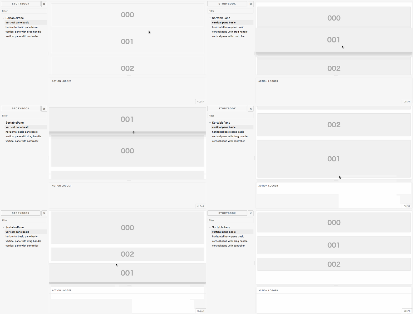
Live Demo
Storybook
CodeSandbox
Install
npm i react-sortable-pane
or
yarn add react-sortable-pane
Usage
Uncontrolled
If you need not to control SortablePane state, please use defaultSize and defaultOrder.
import * as React from 'react';
import { SortablePane, Pane } from 'react-sortable-pane';

export default function SimpleUncontrolledExample() {
  const panes = [0, 1, 2].map(key => (
    <Pane key={key} defaultSize={{ width: '100%', height: 120 }}>
      00{key}
    </Pane>
  ));
  return (


      <SortablePane direction="vertical" margin={20} defaultOrder={['0', '1', '2']}>
        {panes}
      </SortablePane>


  );
}
Controlled
If you need to control SortablePanestate by yourself, please use size and order.
import * as React from 'react';
import { SortablePane, Pane } from 'react-sortable-pane';

type State = {
  order: string[];
  panes: { [key: string]: { height: number } };
};

export default class SimpleControlledFullExample extends React.Component<{}, State> {
  state = {
    order: ['2', '1', '0'],
    panes: { '0': { height: 100 }, '1': { height: 200 }, '2': { height: 300 } },
  };

  render() {
    const panes = [0, 1, 2].map(key => (
      <Pane key={key} size={{ width: '100%', height: this.state.panes[key].height }}>
        00{key}
      </Pane>
    ));
    return (


        <SortablePane
          direction="vertical"
          margin={20}
          order={this.state.order}
          onOrderChange={order => {
            this.setState({ order });
          }}
          onResizeStop={(e, key, dir, ref, d) => {
            this.setState({
              panes: { ...this.state.panes, [key]: { height: this.state.panes[key].height + d.height } },
            });
          }}
        >
          {panes}
        </SortablePane>


    );
  }
}
Props
SortablePaneComponent
| Props | Required | Type | Default | Description |
|---|---|---|---|---|
className |
string |
undefined |
Specify className of component. |
|
style |
React.CssProperties |
{} |
Original style of component. | |
direction |
'horizontal' | 'vertical' |
horizontal |
The direction is used to set the direction of a component. |
|
order |
string[] |
undefined |
The order is used to control Pane order. If you need not to control Pane state, you can omit this property. (See also, controlled) |
|
defaultOrder |
string[] |
undefined |
The defaultOrder is used to set default Pane order. If you need to control Pane state, please use order property. (See also, uncontrolled) |
|
margin |
number |
0 |
The margin is used to set the margin between Pane component. |
|
isSortable |
boolean |
true |
The isSortable is used to control whether panes can be dragged or not. |
|
disableEffect |
boolean |
false |
The disableEffect is used to disable floating effect. |
|
dragHandleClassName |
string |
undefined |
The dragHandleClassName is a class name of an element which should handle drag events for panes. |
|
onOrderChange |
(order: string[]) => void |
undefined |
It is called when Pane component order changed. The argument order is array of react element's key. |
|
onResizeStart |
(e: React.MouseEvent | React.TouchEvent, key: string, dir: PaneResizeDirection) => void |
undefined |
It is called when Pane component resize start. |
|
onResize |
(e: MouseEvent | TouchEvent, key: string, dir: PaneResizeDirection, elementRef: HTMLElement, delta: PaneSize) => void |
undefined |
It is called when Pane component resize. |
|
onResizeStop |
(e: MouseEvent | TouchEvent, key: string, dir: PaneResizeDirection, elementRef: HTMLElement, delta: PaneSize) => void |
undefined |
It is called when Pane component resize stop. |
|
onDragStart |
(e: React.MouseEvent | React.TouchEvent, key: string, elementRef: HTMLElement) => void |
undefined |
It is called when Pane component dragging starts. |
|
onDragStop |
(e: MouseEvent | TouchEvent, key: PaneKey, elementRef: HTMLElement) => void |
undefined |
It is called when Pane component dragging stop. |
PaneComponent
| Props | Required | Type | Default | Description |
|---|---|---|---|---|
className |
string |
undefined |
Specify className of component. |
|
style |
React.CssProperties |
{} |
Original style of component. | |
defaultSize |
{ width?: (number | string), height?: (number | string) } |
auto |
Specifies the width and height that the dragged item should start at. For example, you can set 300, '300px', 50%. | |
size |
{ width?: (number | string), height?: (number | string) } |
auto |
The size property is used to set the size of the component. For example, you can set 300, '300px', '50%'. | |
minWidth |
number | string |
10px |
The minWidth is used to set the minimum width of a Pane component. |
|
minHeight |
number | string |
10px |
The minHeight is used to set the minimum height of a Pane component. |
|
maxWidth |
number | string |
undefined |
The maxWidth is used to set the maximum width of a Pane component. |
|
maxHeight |
number | string |
undefined |
The maxHeight is used to set the maximum height of a Pane component. |
|
grid |
[number, number] |
[1, 1] |
The maxHeight is used to set the maximum height of a Pane component. |
|
resizable |
Extension points exported contracts — how you extend this code
Window (Interface)(no doc)
src/index.tsx
Core symbols most depended-on inside this repo
addcalled by 15
stories/add_remove/controllable-order.tsx
isHorizontal
called by 9
src/index.tsx
iget
called by 4
cypress/integration/simple/vertical.ts
iget
called by 4
cypress/integration/simple/horizontal.ts
getPaneSizeList
called by 2
src/index.tsx
getItemPositionByIndex
called by 2
src/index.tsx
reinsert
called by 1
src/index.tsx
clamp
called by 1
src/index.tsx
Shape
Languages
TypeScript100%
Modules by API surface
src/index.tsx28 symbols
stories/add_remove/uncontrollable-order.tsx6 symbols
stories/add_remove/controllable-order.tsx6 symbols
src/pane.tsx5 symbols
stories/rotation/vertical.tsx4 symbols
stories/rotation/horizontal.tsx4 symbols
stories/size_up_down/horizontal.tsx3 symbols
stories/controlled/size.tsx3 symbols
stories/controlled/order.tsx3 symbols
stories/controlled/full.tsx3 symbols
cypress/integration/simple/vertical.ts2 symbols
cypress/integration/simple/horizontal.ts2 symbols
For agents
$ claude mcp add react-sortable-pane \
  -- python -m otcore.mcp_server <graph>