hub / github.com/artyhoo/shadcn-glass-ui-library
github.com/artyhoo/shadcn-glass-ui-library @v2.11.2
Chat with this repo
747 symbols
2,007 edges
348 files
59 documented · 8%
● updated 6mo agov2.11.2 · 2025-12-25★ 331 open issues
What it actually does AI analysis from the code graph — generated when you open this
loading…
README
shadcn-glass-ui




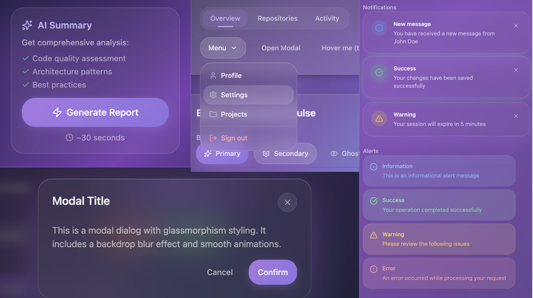
Glassmorphism components for React — drop-in compatible with shadcn/ui. 59 components, 3 themes, zero migration.
Quick Start
npm install shadcn-glass-ui
import { ButtonGlass, ThemeProvider } from 'shadcn-glass-ui';
import 'shadcn-glass-ui/styles.css';

export default function App() {
  return (
    <ThemeProvider defaultTheme="glass">
      <ButtonGlass variant="default">Click me</ButtonGlass>
    </ThemeProvider>
  );
}
Or via shadcn CLI — add to components.json:
{
  "registries": {
    "@shadcn-glass-ui": {
      "url": "https://raw.githubusercontent.com/Yhooi2/shadcn-glass-ui-library/main/public/r"
    }
  }
}
npx shadcn@latest add @shadcn-glass-ui/button-glass
Choose Your Path
| Goal | Resource |
|---|---|
| Get started | Getting Started Guide |
| Browse components | Storybook |
| Use with AI | AI Usage Guide |
| Create custom theme | Theme Guide |
| Migrate from v1.x | Breaking Changes |
Why shadcn-glass-ui?
| shadcn-glass-ui | shadcn/ui | |
|---|---|---|
| Themes | 3 built-in (Glass/Light/Aurora) | 1 base |
| Glass effects | Native blur, glow, transparency | Manual CSS |
| Components | 59 specialized | ~40 base |
| Custom theme | 15 lines CSS | Full rewrite |
| AI docs | Context7, Claude Code, Copilot | Basic |
Works alongside shadcn/ui — same API, same CLI, no migration:
import { Button } from '@/components/ui/button';           // shadcn/ui
import { ButtonGlass } from '@/components/glass/ui/button-glass';  // Glass variant

<Button variant="outline">Standard</Button>
<ButtonGlass variant="default">Glassmorphism</ButtonGlass>
Components
| Category | Count | Examples |
|---|---|---|
| Core UI | 22 | ButtonGlass, InputGlass, ModalGlass, SidebarGlass |
| Composite | 14 | MetricCardGlass, SplitLayoutGlass, AICardGlass |
| Specialized | 9 | StepperGlass, SparklineGlass, RainbowProgressGlass |
| Sections | 7 | HeaderNavGlass, ProfileHeaderGlass |
| Atomic | 7 | SearchBoxGlass, ThemeToggleGlass |
Themes
Three built-in themes with instant switching:
- Glass — Dark glassmorphism with purple accents
- Light — Clean minimal with subtle glass
- Aurora — Gradient glow effects
const { theme, cycleTheme } = useTheme();
<button onClick={cycleTheme}>Theme: {theme}</button>;
Create custom themes in ~15 lines — Theme Guide
AI-Optimized
Built for AI coding assistants:
| Tool | Integration |
|---|---|
| Context7 MCP | Auto-indexed — 63 rules |
| Claude Code | CLAUDE.md — 365 lines of context |
| Copilot | TypeScript strict + JSDoc |
Documentation
| Resource | Description |
|---|---|
| Storybook | Interactive demos |
| Getting Started | Installation & setup |
| Component Catalog | All 57 components |
| Theme Guide | Custom themes |
| Token Architecture | 3-layer CSS system |
| AI Usage | Claude, Copilot, GPT |
| Breaking Changes | v1.x → v2.0 migration |
Requirements
- React 18+ or 19+
- Tailwind CSS 4.1+
- Node.js 20.16+
Contributing
Contributions welcome! See CONTRIBUTING.md.
License
MIT — LICENSE
Built with shadcn/ui · Radix UI · Tailwind CSS
Star on GitHub if you find this useful!
Extension points exported contracts — how you extend this code
PopoverGlassContentProps (Interface)* Props for PopoverGlassContent component. * * @example * ```tsx * const props: PopoverGlassContentProps = { * si
src/components/glass/ui/popover-glass.tsx
ThemeConfig (Interface)
(no doc)
src/lib/theme-context.tsx
ComponentExport (Interface)
(no doc)
src/cli/utils/load-exports.ts
SpacingViolation (Interface)
(no doc)
src/test/utils/spacing-validator.ts
PersonalInfo (Interface)
(no doc)
src/stories/use-cases/form-wizard.stories.tsx
RegistryItem (Interface)
(no doc)
scripts/generate-registry.ts
StepperRootProps (Interface)
* Props for StepperGlass.Root component. * * @example * ```tsx * const props: StepperRootProps = { * value: 'step
src/components/glass/ui/stepper-glass.tsx
ThemeContextValue (Interface)
(no doc)
src/lib/theme-context.tsx
Core symbols most depended-on inside this repo
cncalled by 314
src/lib/utils.ts
getComputedStyleSnapshot
called by 42
src/test/utils/computed-style-reader.ts
parsePixelValue
called by 36
src/test/utils/spacing-validator.ts
useTheme
called by 32
src/lib/theme-context.tsx
dim
called by 25
src/cli/utils/format.ts
useResponsive
called by 22
src/lib/hooks/use-responsive.ts
getDropdownItemClasses
called by 21
src/lib/variants/dropdown-content-styles.ts
parseColor
called by 21
src/test/utils/contrast-checker.ts
Shape
Languages
TypeScript100%
Modules by API surface
src/lib/hooks.ts23 symbols
src/test/utils/computed-style-reader.ts22 symbols
src/components/glass/composite/repository-card-glass/repository-card-glass.tsx22 symbols
src/components/glass/composite/year-card-glass/year-card-glass.tsx19 symbols
src/test/utils/blur-validator.ts17 symbols
src/test/utils/contrast-checker.ts16 symbols
src/components/ui/dropdown-menu.tsx15 symbols
src/components/glass/ui/sidebar-glass/sidebar-menu.tsx15 symbols
src/test/compliance/__setup__/compliance-setup.ts14 symbols
src/stories/use-cases/notifications-center.stories.tsx14 symbols
src/test/utils/spacing-validator.ts12 symbols
src/components/glass/ui/stepper-glass.tsx12 symbols
For agents
$ claude mcp add shadcn-glass-ui-library \
  -- python -m otcore.mcp_server <graph>