github.com/alexZajac/react-native-skeleton-content @v1.0.28
Chat with this repoWhat it actually does AI analysis from the code graph — generated when you open this
README
React Native Skeleton Content
If you are not using expo, please head up to this page instead.

React native Skeleton Content, a simple yet fully customizable component made to achieve loading animation in a Skeleton-style. Works in both iOS and Android.
New Features
- The package has been rewritten to Hooks and is using the declarative react-native-reanimated package for animations
- It now supports nested layouts for children bones, see an example on this snack
- It finally supports percentages dimensions for bones, for any type of animation!


Installation
npm install react-native-skeleton-content
Usage
- Import react-native-skeleton-content:
import SkeletonContent from 'react-native-skeleton-content';
-
Once you create the SkeletonContent, you have two options:
-
Child Layout : The component will figure out the layout of its bones with the dimensions of its direct children.
- Custom Layout : You provide a prop
layoutto the component specifying the size of the bones (see the Examples section below). Below is an example with a custom layout. A key prop for each child is optional but highly recommended.
export default function Placeholder() {
  return (
    <SkeletonContent
      containerStyle={{ flex: 1, width: 300 }}
      isLoading={false}
      layout={[
        { key: 'someId', width: 220, height: 20, marginBottom: 6 },
        { key: 'someOtherId', width: 180, height: 20, marginBottom: 6 }
      ]}
    >
      <Text style={styles.normalText}>Your content</Text>
      <Text style={styles.bigText}>Other content</Text>
    </SkeletonContent>
  );
}
- Then simply sync the prop
isLoadingto your state to show/hide the SkeletonContent when the assets/data are available to the user.
export default function Placeholder () {
  const [loading, setLoading] = useState(true);
  return (
    <SkeletonContent
       containerStyle={{flex: 1, width: 300}}
        isLoading={isLoading}>
        {...otherProps}
    />
  )
}
Props
| Name | Type | Default | Description |
|---|---|---|---|
| isLoading | bool | required | Shows the Skeleton bones when true |
| layout | array of objects | [] | A custom layout for the Skeleton bones |
| duration | number | 1200 ms | Duration of one cycle of animation |
| containerStyle | object | flex: 1 | The style applied to the View containing the bones |
| easing | Easing | bezier(0.5, 0, 0.25, 1) | Easing of the bones animation |
| animationType | string | "shiver" | The animation to be used for animating the bones (see demos below) |
| animationDirection | string | "horizontalRight" | Used only for shiver animation, describes the direction and end-point (ex: horizontalRight goes on the x-axis from left to right) |
| boneColor | string | "#E1E9EE" | Color of the bones |
| highlightColor | string | "#F2F8FC" | Color of the highlight of the bones |
Note: The Easing type function is the one provided by react-native-reanimated, so if you want to change the default you will have to install it as a dependency.
Examples
See the playground section to experiment : 1 - Changing the direction of the animation (animationDirection prop) :

export default function Placeholder () {
  return (
    <SkeletonContent
        containerStyle={{flex: 1, width: 300}}
        animationDirection="horizontalLeft"
        isLoading={true}>
        ...
    />
  )
}
2 - Changing the colors and switching to "pulse" animation (boneColor, highlightColor and animationType prop) :
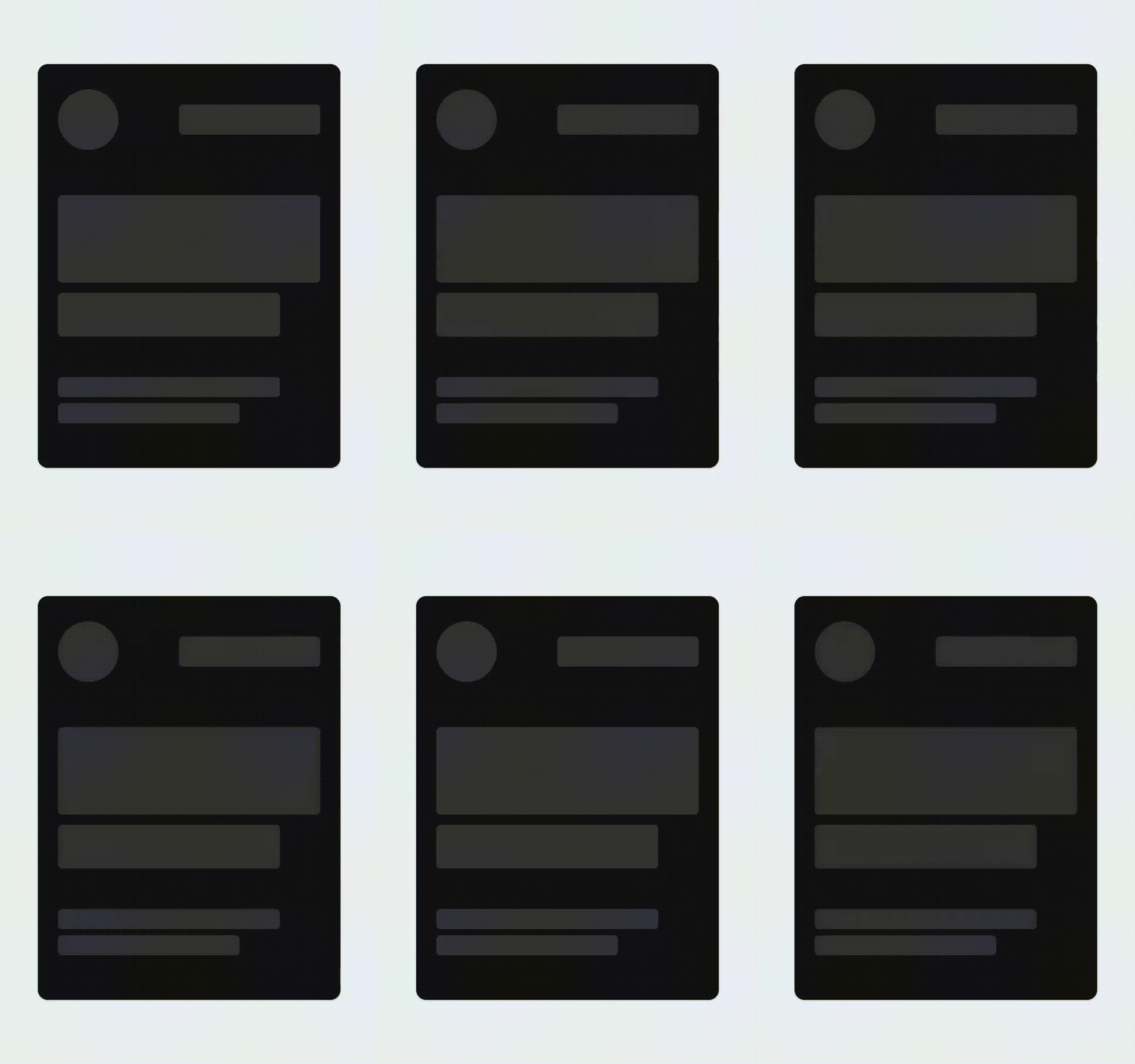
export default function Placeholder () {
  return (
    <SkeletonContent
        containerStyle={{flex: 1, width: 300}}
        boneColor="#121212"
        highlightColor="#333333"
        animationType="pulse"
        isLoading={true}>
        ...
    />
  )
}
3 - Customizing the layout of the bones (layout prop) :

export default function Placeholder () {
  return (
    <SkeletonContent
        containerStyle={{flex: 1, width: 300}}
        animationDirection="horizontalLeft"
        layout={[
        // long line
        { width: 220, height: 20, marginBottom: 6 },
        // short line
        { width: 180, height: 20, marginBottom: 6 },
        ...
        ]}
        isLoading={true}>
        ...
    />
  )
}
Playground
You can test out the features and different props easily on Snack. Don't hesitate to take contact if anything is unclear !
Extension points exported contracts — how you extend this code
ICustomViewStyle (Interface)Core symbols most depended-on inside this repo
getBoneWidthShape
Languages
Modules by API surface
For agents
$ claude mcp add react-native-skeleton-content \
  -- python -m otcore.mcp_server <graph>