github.com/agoberg85/home-assistant-simple-tabs @v1.5.0
Chat with this repoBrowse by type
What it actually does AI analysis from the code graph — generated when you open this
README
Simple Tabs Card
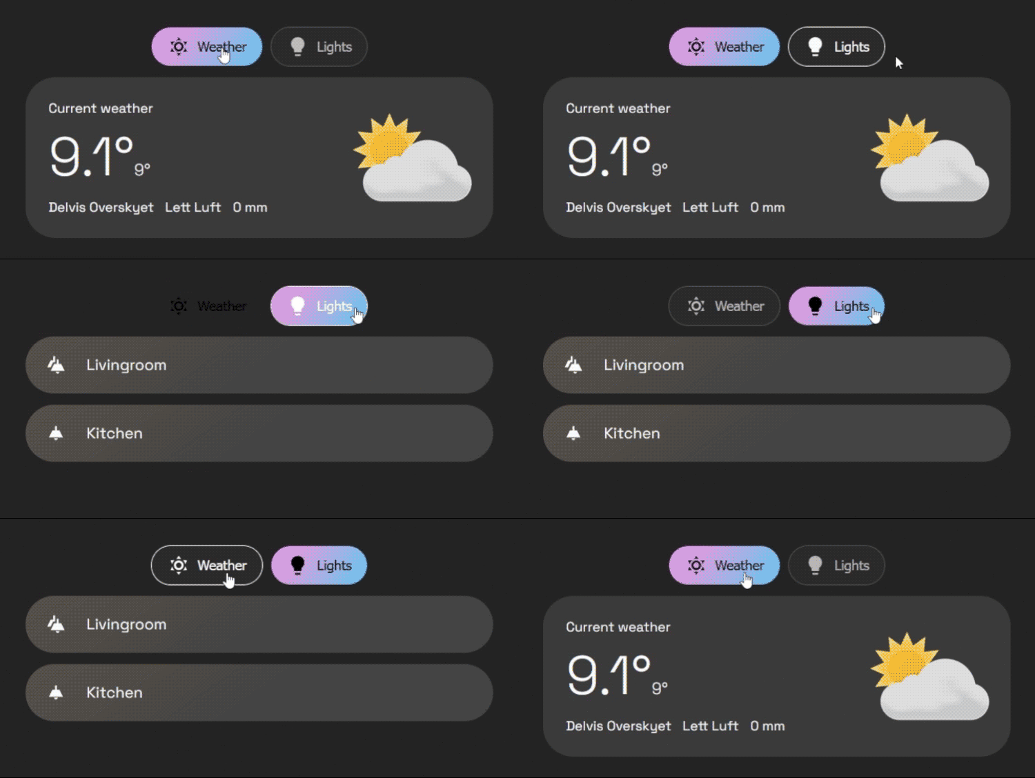
A clean and configurable tabs card for Home Assistant Dashboards.
Support development
Buy me a coffee: https://buymeacoffee.com/mysmarthomeblog
Subscribe to Youtube channel: https://www.youtube.com/@My_Smart_Home
Features
- Organize any cards into a clean tabbed layout
- Top or bottom tab positioning
- Start/center/end placement for the outer tab bar
- Per-tab icon, title, badge rules, badge display mode, and deep-link
id - Dynamic tab visibility with
entity,template, anduserconditions - Dynamic default tab rules
- Swipe navigation with automatic nested horizontal-scroll detection
- Optional swipe animations
- Optional tab memory (
false,true,per_device) - Optional haptic feedback on supported devices
- Fixed outer tab bar with horizontal scrolling inside when needed
- Extensive style options for the card, tab bar, and individual buttons
- Visual editor with:
- Card list management (move/edit/delete)
- Card picker for adding cards to a tab
- Per-card inline editing via Home Assistant card editor
Installation
HACS (Recommended)
- Go to the HACS page in your Home Assistant instance.
- Click the three-dot menu in the top right.
- Select "Custom repositories".
- In the "Repository" field, paste the URL of this repository (https://github.com/agoberg85/home-assistant-simple-tabs).
- For "Category", select "Dashboard".
- Click "Add".
- The
simple-tabs-cardwill now appear in the HACS Frontend list. Click "Install".
Manual Installation
- Download the
simple-tabs.jsfile from the latest release. - Copy the file to the
wwwdirectory in your Home Assistantconfigfolder. - In your Lovelace dashboard, go to "Manage Resources" and add a new resource:
- URL:
/local/simple-tabs.js - Resource Type:
JavaScript Module
- URL:
Quick Start
type: custom:simple-tabs
tabs:
  - title: Home
    icon: mdi:home
    card:
      type: markdown
      content: Home content
  - title: Climate
    icon: mdi:thermometer
    card:
      type: thermostat
      entity: climate.living_room
Multiple Cards Per Tab
You can provide either:
- card (single card)
- cards (list of cards)
When cards is used, Simple Tabs wraps them as a 1-column grid automatically.
tabs:
  - title: Living Room
    icon: mdi:sofa
    cards:
      - type: entity
        entity: light.living_room
      - type: thermostat
        entity: climate.living_room
Visual Editor Notes
- The editor now shows a card list for each tab.
- Use the picker under the list to add cards.
- Use the edit icon to open an inline Home Assistant card editor under each card.
- Manual YAML mode is still fully supported in dashboard YAML view.
Configuration
Main Options
| Name | Type | Required? | Description | Default |
|---|---|---|---|---|
type |
string | Required | custom:simple-tabs |
|
tabs |
list | Required | A list of tab objects to display. See below. | |
tabs_alignment |
string | Optional | Positions the tab bar within the card. (start, center, end) |
'center' |
default_tab |
number/list | Optional | Defines the default tab. Can be a static number (1-based) or a list of conditional rules (see Advanced Configuration). | 1 |
hide_inactive_tab_titles |
boolean | Optional | If true, hides the title text on tabs that are not currently active (showing only the icon). |
false |
pre-load |
boolean | Optional | If true, renders all tab content on load for faster switching. |
false |
button_background |
string | Optional | CSS color/gradient for each tab button background. | none |
button_border_color |
string | Optional | Border color for each tab button. | Your theme's divider-color |
button_text_color |
string | Optional | Text/icon color for each tab button. | Your theme's secondary-text-color |
button_hover_color |
string | Optional | Text/icon color for a hovered button. | Your theme's primary-text-color |
button_hover_border_color |
string | Optional | Border color for a hovered button. | Follows button_hover_color by default |
button_active_text_color |
string | Optional | Text/icon color for the active button. | Your theme's text-primary-color |
button_active_background |
string | Optional | CSS color/gradient for the active button background. | Your theme's primary-color |
card_background |
string | Optional | Background for the overall card wrapper. | none |
card_padding |
string | Optional | Padding for the overall card wrapper. | 12px |
card_border_radius |
string | Optional | Border radius of the overall card wrapper. | 32px |
bar_background |
string | Optional | Background for the outer tab bar shell. | transparent |
bar_border |
string | Optional | Full CSS border for the outer tab bar shell. | none |
bar_padding |
string | Optional | Padding between the tab bar shell and the button strip. | 1px 2px |
bar_border_radius |
string | Optional | Border radius for the outer tab bar shell. | 0 |
tabs_gap |
string | Optional | Gap between buttons | 6px |
button_padding |
string | Optional | Padding inside each button | 12px |
tab_position |
string | Optional | Position of tabs. (top, bottom) |
'top' |
enable_swipe |
boolean | Optional | Enable swipe gestures to switch tabs on mobile. | true |
swipe_animation |
boolean | Optional | Enable animated transitions for swipe gestures. | true |
tab_click_animation |
boolean | Optional | Enable animated transitions when changing tabs by clicking the tab buttons. | true |
swipe_threshold |
number | Optional | Pixels of movement required to trigger a swipe. | 50 |
remember_tab |
boolean/string | Optional | Remember last selected tab. (false, true, 'per_device') |
false |
haptic_feedback |
boolean | Optional | Vibration feedback on tab change (mobile only). | false |
1.5.0 Migration Notes
Breaking changes in 1.5.0:
- The visual editor and docs now use the clearer tabs_alignment, card_*, bar_*, and button_* option names.
- show_fade has been removed from the visual editor and no longer does anything.
- The tab bar layout now treats the outer bar as a stable shell and scrolls the buttons inside it.
Legacy styling aliases are still accepted for now: alignment, background-color, border-color, text-color, hover-color, hover-border-color, active-text-color, active-background, container_*, and tab_buttons_*. New configs should use the clearer names above.
Styling Layers
card_*: styles the overall card wrapper around the tab row and content.bar_*: styles the fixed outer tab bar shell.button_*: styles each individual tab button inside the bar.
tabs_alignment moves the whole tab bar left, center, or right. If the bar already fills the available width, alignment has no visible effect.
Pill Bar Example
type: custom:simple-tabs
tabs_alignment: center
card_background: transparent
card_padding: 0 0 12px 0
bar_background: "#2f2f2f"
bar_border: "1px solid rgba(255,255,255,0.12)"
bar_padding: 12px
bar_border_radius: 999px
button_background: transparent
button_border_color: transparent
button_active_background: "linear-gradient(90deg, #e59bc2, #f6c7a8)"
button_active_text_color: "#222"
tabs:
  - title: Lys
    icon: mdi:home
    card:
      type: markdown
      content: Lighting
  - title: Gardiner
    icon: mdi:flower
    card:
      type: markdown
      content: Blinds
  - title: Klima
    icon: mdi:thermometer
    card:
      type: markdown
      content: Climate
Tab Object Options
Each entry in the tabs list is an object with the following properties:
| Name | Type | Required? | Description |
|---|---|---|---|
title |
string | Optional* | The text to display on the tab. Can be jinja template |
icon |
string | Optional* | An MDI icon to display next to the title (e.g., mdi:lightbulb). Can be jinja template |
card |
object | Conditionally required | A standard Lovelace card configuration (single-card mode). |
cards |
list | Conditionally required | List of Lovelace card configurations (multi-card mode). |
conditions |
list | Optional | A list of conditions (entity, template, or user) that must be met to show the tab. |
badge |
string | Optional* | Legacy single Jinja template that outputs true/false |
badge_templates |
list | Optional | List of Jinja templates. If any evaluate truthy, the badge is shown. |
badge_display |
string | Optional | Badge display mode: dot, count, or exclamation. |
id |
string | Optional | ID of tab, for deeplinking |
Either title or icon should be defined.
Use either card or cards.
Conditional Tabs
You can dynamically show or hide a tab by adding a conditions list to its configuration. The tab will only be visible if all conditions in the list are met (this is an "AND" relationship).
Each condition in the list must be an object of one of the following types:
State Condition
This condition checks if a specific entity has a specific state. It also supports numeric comparisons for sensor-like entities.
| Key | Type | Description |
|---|---|---|
entity |
string | The entity ID to check. |
state |
string | The state the entity must have for the condition to be true. Supports exact matches like 'on' or '0', and numeric comparisons like '> 0', '>= 10', '< 5', '<= 5', '= 3', or '== 3'. |
Example: Show a "Security" tab only if an input_boolean is on.
tabs:
  - title: Security
    icon: mdi:shield-lock
    conditions:
      - entity: input_boolean.show_security_tab
        state: 'on'
    card:
      type: alarm-panel
      entity: alarm_control_panel.home
Example: Show an "Alerts" tab only if a numeric sensor is above zero.
tabs:
  - title: Alerts
    icon: mdi:alert
    conditions:
      - entity: sensor.unusual_temperature_alert
        state: '> 0'
    card:
      type: markdown
      content: There are active temperature alerts.
Template Condition
This condition evaluates a Home Assistant template in real-time. The tab will be shown if the template's result is "truthy" (e.g., true, a non-zero number, or a non-empty string like "show"). For clarity, it's best to have your template explicitly return true or false.
| Key | Type | Description |
|---|---|---|
template |
string | The Home Assistant template to evaluate. |
Example: Only show a "Guest Mode" tab if the guest_mode input boolean is on.
tabs:
  - title: Guest Mode
    icon: mdi:account-star
    conditions:
      - template: "{{ is_state('input_boolean.guest_mode', 'on') }}"
    card:
      # ... card config for guests
Simple example: Show a tab when the outside temperature is above freezing.
tabs:
  - title: Outdoor Climate
    conditions:
      - template: "{{ states('sensor.outdoor_temperature') | float(0) > 0 }}"
    card:
      type: markdown
      content: It is above freezing outside.
Combining Conditions
You can add multiple condition objects to the list to create more specific rules.
Example: Show a "Good Morning" tab only if a specific person is home and it is between 6 AM and 11 AM.
tabs:
  - title: Good Morning
    icon: mdi:weather-sunset-up
    conditions:
      # Condition 1: Person must be home
      - entity: person.jane_doe
        state: 'home'
      # AND Condition 2: Must be morning
      - template: "{{ now().hour >= 6 and now().hour < 11 }}"
    card:
      # ... card showing morning routine info
Badge Configuration
Badges can be configured in two ways:
badge: a legacy single Jinja template that shows the badge when the result is truthy.badge_templates: a list of Jinja templates. If any of them evaluate truthy, the badge is shown.badge_display: controls the badge style. Usedot,count, orexclamation.
A result is treated as truthy when it returns values such as true, on, or a number greater than 0.
Example with a single badge rule:
tabs:
  - title: Kitchen
    badge: "{{ is_state('light.kitchen', 'on') }}"
    card:
      type: markdown
      content: Kitchen
Example with multiple badge rules and a counted badge:
tabs:
  - title: Alerts
    badge_display: count
    badge_templates:
      - "{{ is_state('binary_sensor.front_door', 'on') }}"
      - "{{ is_state('binary_sensor.back_door', 'on') }}"
      - "{{ states('sensor.unread_notifications') | int > 0 }}"
    card:
      type: markdown
      content: Alerts overview
Advanced Configuration
Dynamic Default Tab
Instead of a static number, default_tab can be a list of rules. The card will check them from top to bottom and select the first one that matches.
Note: It is recommended to use entity state checks here rather than template for faster initial loading.
default_tab:
  # 1. If TV is on, open Tab 2 (Controls)
  - tab: 2
    conditions:
      - entity: media_player.tv
        state: 'on'
  # 2. If it is night time, open Tab 3 (Bedroom)
  - tab: 3
    conditions:
      - entity: sun.sun
        state: 'below_horizon'
      # 3. Fallback to Tab 1
      - tab: 1
Deep Linking
Set a tab id and open the dashboard URL with #<id>.
tabs:
  - title: Overview
    id: overview
    card:
      type: markdown
      content: Overview
URL example:
/dashboard-main/home#overview
User Visibility (Privacy)
You can hide specific tabs from specific users by adding a user condition. You will need the long User ID string (found in HA Settings -> People -> Users -> Click User ->
Extension points exported contracts — how you extend this code
Core symbols most depended-on inside this repo
Shape
Languages
Modules by API surface
For agents
$ claude mcp add home-assistant-simple-tabs \
  -- python -m otcore.mcp_server <graph>