github.com/afcapel/stimulus-autocomplete @v3.1.0
Chat with this repoWhat it actually does AI analysis from the code graph — generated when you open this
README
Stimulus Autocomplete controller
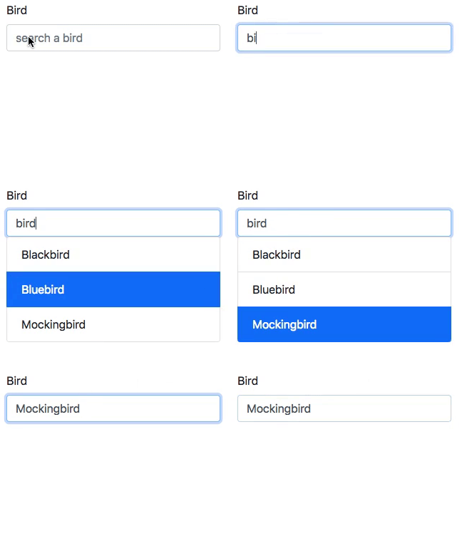
This is a tiny stimulus controller (1.5kB gzipped) to make a selection from a list of results fetched from the server. See it in action.
Installation
If you are using a js bundler with node_modules support (such as esbuild, rollup.js or Webpack) install the package from npm:
yarn add stimulus-autocomplete
If you're using importmap-rails, you'll need to pin stimulus-autocomplete:
./bin/importmap pin stimulus-autocomplete
Usage
Load your stimulus application as usual and the register the autocomplete controller with it:
import { Application } from '@hotwired/stimulus'
import { Autocomplete } from 'stimulus-autocomplete'

const application = Application.start()
application.register('autocomplete', Autocomplete)
To use the autocomplete, you need some markup as this:
  <input type="text" data-autocomplete-target="input"/>
  <input type="hidden" name="bird_id" data-autocomplete-target="hidden"/>
  <ul class="list-group" data-autocomplete-target="results"></ul>
The component makes a request to the data-autocomplete-url to fetch results for
the contents of the input field. The server must answer with an html fragment:
<li class="list-group-item" role="option" data-autocomplete-value="1">Blackbird</li>
<li class="list-group-item" role="option" data-autocomplete-value="2">Bluebird</li>
<li class="list-group-item" role="option" data-autocomplete-value="3">Mockingbird</li>
Note: class list-group on <ul> and list-group-item on <li> is required to apply the same css as displayed in the gif above.
Items can be included that are not selectable, such as help text or delimiters using aria-disabled attribute:
<li role="option" aria-disabled="true">Start typing to search...</li>
If the controller has a hidden target, that field will be updated with the value
of the selected option. Otherwise, the search text field will be updated.
The height of the result list can be limited with CSS, e.g.:
<ul class="list-group" data-autocomplete-target="results" style="max-height: 10rem; overflow-y: scroll;"></ul>
If you want a custom query parameter name, use the data-autocomplete-query-param-value attribute.
The above will setup will fetch the results from /bird/search?name=SEARCH_TEXT.
Events
Events on the main element that registered the controller:
autocomplete.changefires when the users selects a new value from the autocomplete field. The eventdetailcontains thevalueandtextValueproperties of the selected result.loadstartfires before the autocomplete fetches the results from the server.loadfires when results have been successfully loaded.errorfires when there's an error fetching the results.loadendfires when the request for results ends, successfully or not.togglefires when the results element is shown or hidden.
Events on the optional hidden input:
inputandchangedispatched to it when the users selects a new value from the autocomplete. This allows you to bind subsequent behavior directly to the<input type=hidden>element.
Optional parameters
-
autocomplete-min-lengthset the minimum number of characters required to make an autocomplete request. ```html...
* `autocomplete-submit-on-enter` submit the form after the autocomplete selection via enter keypress.html...
* `autocomplete-selected-class` Stimulus Autocomplete adds a default `.active` class to the currently selected result. You can use another class instead of `.active` with the this attribute.html
...
``
*
autocomplete-label` can be used to define the input label upon selection. That way your option elements can have more elaborate markup, i.e.:
```html
```
autocomplete-delay-valuehow long to wait since the user stops typing until the autocomplete makes a request to the server. Defaults to 300 (ms).
```html
...
```
Optional HTML configuration
- If the
<input>target has anautofocusattribute then the input will be given focus immediately so the user can start typing. This is useful if the<input>is dynamically added/morphed into the DOM (say by a "edit" button) and the user expects to start typing immediately.
Extension points
URL building
The autcomplete default behaviour is to add a q querystring parameter to the the base data-autocomplete-url. If you need a different format, you can override the controllers buildURL method.
import { Application } from '@hotwired/stimulus'
import { Autocomplete } from 'stimulus-autocomplete'

const application = Application.start()

class CustomAutocomplete extends Autocomplete {
  buildURL(query) {
    return `${new URL(this.urlValue, window.location.href).toString()}/${query}`
  }
}

application.register('autocomplete', CustomAutocomplete)
Examples
- The examples directory contains some examples of how to use the library.
- This example Rails app shows how to use it with Webpack.
- Autocomplete with StimulusJS - Drifting Ruby
- Search Autocomplete Stimulus
Credits
Heavily inspired on github's autocomplete element.
Contributing
Bug reports and pull requests are welcome on GitHub at https://github.com/afcapel/stimulus-autocomplete. This project is intended to be a safe, welcoming space for collaboration, and contributors are expected to adhere to the Contributor Covenant code of conduct.
Release a new version
To release a new version follow these steps:
-
Update the version number in
package.json. Try to follow semantic versioning guidelines as much as possible. -
Publish the package to npmjs.com with
yarn run release
License
This package is available as open source under the terms of the MIT License.
Core symbols most depended-on inside this repo
Shape
Languages
Modules by API surface
Used by 1 indexed graphs manifest dependencies, hub-wide
For agents
$ claude mcp add stimulus-autocomplete \
  -- python -m otcore.mcp_server <graph>