github.com/Michaelangel007/nanofont3x4 @1.1
Chat with this repoBrowse by type
What it actually does AI analysis from the code graph — generated when you open this
README
nanofont3x4
The world's smallest readable 3x4 font with readable lowercase! Includes:
- Upper case (3x3) plus 1 pixel leading (hence the name
3x4for honesty), - Lower case (some are 2x2!)
- All ASCII symbols
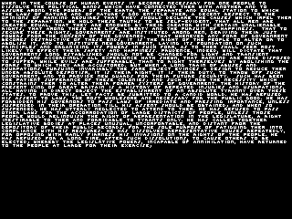
A "practical" example would be rendering "book pages" with real text instead of placeholder blurry pixels that don't even look close to being the glyphs scaled down.
Motivation
Why even attempt to do the "impossible" task of creating the worlds smallest readable lowercase font? First, what the heck does it even mean to say "world's smallest font?" Just how small can we go? 3x3? 2x2? Can we even design readable lowercase glyphs that can even fit into a 2x2 grid? What is the minimal leading? How does leading effect readability?
Why?
The short answer is: To answer the unknown.
The long answer is: Partially for the challenge, but mostly because only by pushing a craft to its maximum limits does it force oneself to take a step back and really analyze what the goal is, and think laterally on how it might even be possible. What is the "essence" of a glyph? What makes a tiny glyph readable anyways? What makes an 'a' an 'a', an 'e' an 'e', or an 's' an 's' when you only have 3x3 or 2x2 pixels to work with?
Since there are no "extraneous" pixels to "fallback" onto then every pixel becomes that much more important. Even a 1 pixel mistakes really stands out. It was this quest for self discovery and understanding this "Tao of Typography" that this project was born.
Uppercase 3x3
A 3x3 uppercase has been "solved" or "known" for sometime. This seemed like a good place to start.
If we start with a 3x3 uppercase font then does that imply that the lowercase glyph must be focused around a 2x2 cell? Let's find out!
Lowercase and 2x2
That's only 16 choices for 26 lowercase letters! In actuality readability is the most important goal so the following lowercase glyphs are not 2x2:
    `b`     `d`     `f` `g`
`h`     `j` `k` `l` `m` `n`
    `p` `q`         `t` `u`
`v` `w`     `y`
That leaves these 9 glyphs to fit inside a 2x2 cell.
- a
- c
- e
- i
- o
- r
- s
- x
- z
Here are the 2^4 = 16 permutations of a 2x2 glyph cell:
.. not usable = space
..

.. not usuable = period but wrong kerning
.x

.. not usable = period
x.

.. not usable, confused with `_`
xx

.x no meaning,  wrong kerning
..

.x not usable, wrong kerning
.x

.x chosen as `s
x.

.x chosen as `a`
xx

x. no meaning
..

x. chosen as `z`
.x

x. chosen as `i`
x.

x. chosen as `e`
xx

xx no meaning,
..

xx no meaning
.x

xx chosen as `r`
x.

xx chosen as `c` `o` and `x`
xx
Problem words
What words are difficult to read? Believe it or not, most words are actually readable (once you get used to the font.) Since we have 3 ambigious glyphs, the troublesome words are anything with a 'co' or 'x' in it such as:
- exercise
- becomes
- compliance
A quick search of frequency analysis, "frequency of letter pairs", reveals that the pairs oo and co show up often enough that they will be annoying to "decode" the context. If we could somehow distingush between c and o I estimate we could reach ~ 99% readability. Oh, what what 1 extra vertical pixel adds! But alas, we'll have to settle for "mostly readable." Still, I'm happy with this considering I thought the task was (almost) impossible when I first started.
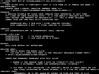
Enough already! where are the pictures? Alrighty then ...
- Texture Atlas:

- Forced upper case output:
nanofont -u
- Normal case output:
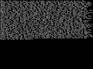
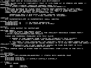
- Upper case on its own source code; with default 0 px leading:
nanofont3x4 -u nanofont3x4.cpp
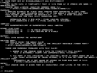
- Forced upper case with 1 px leading:
nanofont -u -1 nanofont3x4.cpp
- Forced upper case with 2 px leading:
nanofont -u -2 nanofont3x4.cpp
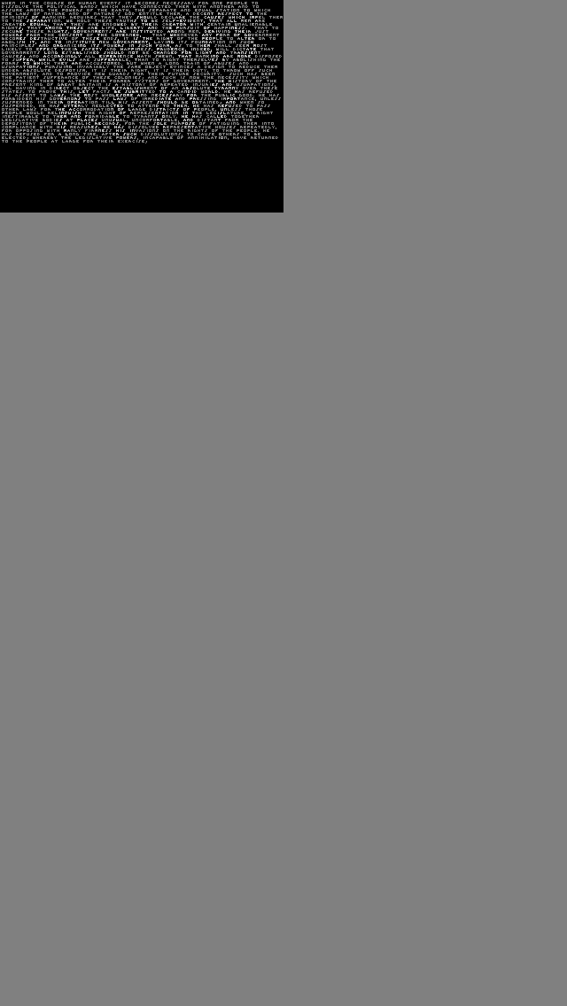
- Manual Fake Bold
You can easily do a manual fake bold by dimming the font and brightening the areas you want bolded. I regret I don't have code for this.
The reason for the funny dimensions is so that the resolution maps 1:1 on the iPhone 5.
- Italic?
The famous but annoying "Left as an exercise for the reader." :-)
One would have to do a proper greyscale anti-aliasing partial-texel offset to get italics. Maybe someone else will take up the challenge?
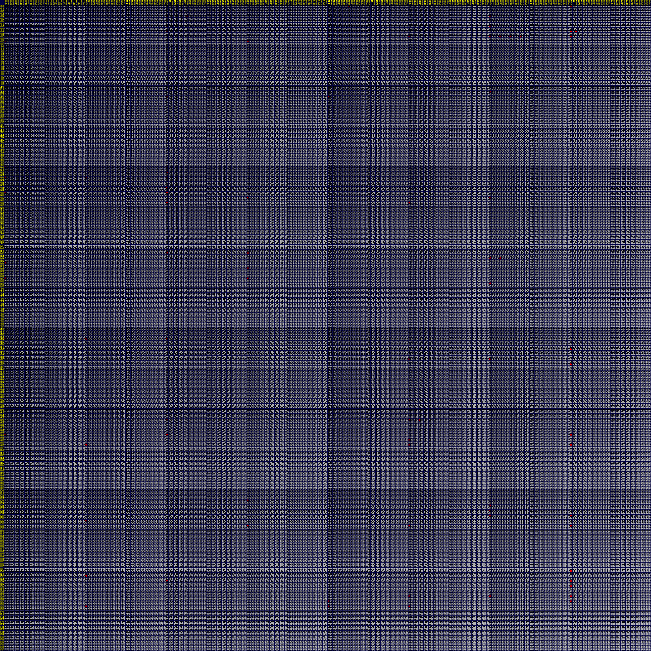
Uber 4x4 Texture Atlas All Permutations
In case you are interested, there are a total of 65,536 4x4 monochrome glyphs. Here is a uber texture atlas that shows all of them with our glyphs highlighted (red) where they are in the table. Blue borders are used to show the cell boundaries.
Related work
Simon Whitechapel, back in 2004 attempted to create a 3x3 font with lowercase.
He has lower case glyphs but note that the mid-line is all over the place for glyphs such as c and p.
- http://web.onetel.com/~amygdala/articles/scimaths/3x3.htm
Anders de Flon created a 3x3 font but it is upper case only.
- https://en.wikipedia.org/wiki/3x3
Ken Perlin provided a 4x6 tiny font (2006, and again in 2010) but didn't provide any source code! WTF? :-(
- http://mrl.nyu.edu/~perlin/homepage2006/tinyfont/
- http://blog.kenperlin.com/?p=6804
Domenico Mazza�s "Zepto" 3x5 font:
- http://makezine.com/2010/11/19/a-tiny-screen-font-you-can-actually/
"How small can you draw all 16 hex digits"; included 2x3 (!!), 2x4, 3x4 and 3x5.
- https://www.allegro.cc/forums/thread/606221
Name and Shame
To all researchers and scientists who don't make your code, and more importantly, your data available for independent verifcation -- get with the program, please.
"If I have seen further, it is by standing on the shoulders of giants" -- popularized by Isaac Newton, attributed to Bernard of Chartres.
Greetings and Thanks
To all people obsessed with pixel fonts, Thank-You for sharing your work! Your stubborness to not accept reality for what it is, but to always push the boundaries of what is thought possible is an inspiration and reminder for us all to always strive and "reach for the stars." What we learn along the way makes the journey worthwhile.
Core symbols most depended-on inside this repo
Shape
Languages
Modules by API surface
For agents
$ claude mcp add nanofont3x4 \
  -- python -m otcore.mcp_server <graph>