github.com/JavaNoober/BackgroundLibrary @1.7.6
Chat with this repoWhat it actually does AI analysis from the code graph — generated when you open this
README
BackgroudLibrary
A framework for directly generating shape through Tags, no need to write shape.xml again(通过标签直接生成shape,无需再写shape.xml)
Add this to your app's build.gradle:
allprojects {
    repositories {
        ...
        maven { url 'https://jitpack.io' }
    }
}

implementation "androidx.appcompat:appcompat:$supportVersion"
implementation 'com.github.JavaNoober.BackgroundLibrary:library:1.7.5'
if use androidx:
allprojects {
    repositories {
        ...
        maven { url 'https://jitpack.io' }
    }
}

implementation "androidx.appcompat:appcompat:$supportVersion"
implementation 'com.github.JavaNoober.BackgroundLibrary:libraryx:1.7.5'
Example effect
show more in wiki
Automatic code prompt by Live Templates
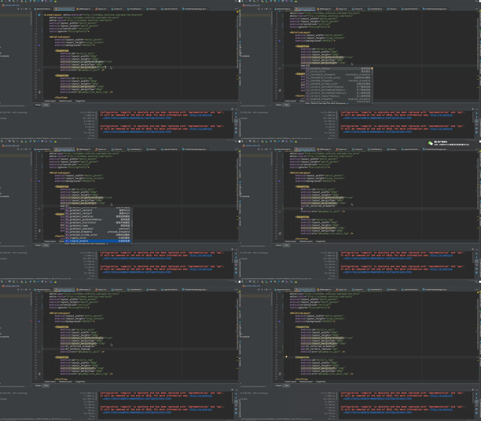
How to use
1、before version 1.5.0, Calling code before the 'super.onCreate' in BaseActivity, after 1.5.0 no need more
BackgroundLibrary.inject(context);
2、Add the attributes directly in the layout
Custom attributes supported
The following are all custom attributes that are exactly the same as shape and selector.
shape
All attributes of shape are supported. The naming rule is 'tag name'_'tag attribute name':
| name | category |
|---|---|
| bl_shape | rectangle、oval、line、ring(not support yet) |
| bl_solid_color | color |
| bl_corners_radius | dimension |
| bl_corners_bottomLeftRadius | dimension |
| bl_corners_bottomRightRadius | dimension |
| bl_corners_topLeftRadius | dimension |
| bl_corners_topRightRadius | dimension |
| bl_gradient_angle | integer |
| bl_gradient_centerX | float |
| bl_gradient_centerY | float |
| bl_gradient_centerColor | color |
| bl_gradient_endColor | color |
| bl_gradient_startColor | color |
| bl_gradient_gradientRadius | dimension |
| bl_gradient_type | linear、radial、sweep |
| bl_gradient_useLevel | boolean |
| bl_size_width | dimension |
| bl_size_height | dimension |
| bl_stroke_width | dimension |
| bl_stroke_color | color |
| bl_stroke_dashWidth | dimension |
| bl_stroke_dashGap | dimension |
| bl_position | left、right、top、bottom |
selector
All attributes of selector are supported:
| name | category |
|---|---|
| bl_checkable_drawable | color、reference |
| bl_checked_drawable | color、reference |
| bl_enabled_drawable | color、reference |
| bl_selected_drawable | color、reference |
| bl_pressed_drawable | color、reference |
| bl_focused_drawable | color、reference |
| bl_focused_hovered | color、reference |
| bl_focused_activated | color、reference |
| bl_unCheckable_drawable | color、reference |
| bl_unChecked_drawable | color、reference |
| bl_unEnabled_drawable | color、reference |
| bl_unSelected_drawable | color、reference |
| bl_unPressed_drawable | color、reference |
| bl_unFocused_drawable | color、reference |
| bl_unFocused_hovered | color、reference |
| bl_unFocused_activated | color、reference |
| setting about textColor | |
| bl_checkable_textColor | color |
| bl_checked_textColor | color |
| bl_enabled_textColor | color |
| bl_selected_textColor | color |
| bl_pressed_textColor | color |
| bl_focused_textColor | color |
| bl_activated_textColor | color |
| bl_active_textColor | color |
| bl_expanded_textColor | color |
| bl_unCheckable_textColor | color |
| bl_unChecked_textColor | color |
| bl_unEnabled_textColor | color |
| bl_unSelected_textColor | color |
| bl_unPressed_textColor | color |
| bl_unFocused_textColor | color |
| bl_unActivated_textColor | color |
| bl_unActive_textColor | color |
| bl_unExpanded_textColor | color |
| setting about buttonDrawable | |
| bl_checked_button_drawable | color、reference |
| bl_unChecked_button_drawable | color、reference |
|bl_multi_text_selector1| String| | |bl_multi_text_selector2| String| 同上| |bl_multi_text_selector3| String| 同上| |bl_multi_text_selector4| String| 同上| |bl_multi_text_selector5| String| 同上| |bl_multi_text_selector6| String| 同上|
bl_multi_text_selector的使用方法: 支持selector的一条属性设置同时设置多个状态的写法,内容规则为以", "为分隔符,最后一项为颜色资源id的名字,可选状态为state_checkable,state_checked,state_enabled,state_selected,state_pressed,state_focused,state_hovered ,state_activated,默认为true,如果为false则在前面加上"-"即可,例如-state_checkable
效果例子如下:
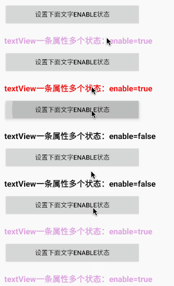
    <com.noober.background.view.BLTextView
        android:padding="0dp"
        android:layout_width="300dp"
        android:layout_height="36dp"
        android:layout_marginTop="15dp"
        android:textColor="@android:color/black"
        android:clickable="true"
        android:focusable="true"
        android:gravity="center"
        android:text="textView一条属性多个状态"
        android:textSize="18dp"
        android:textStyle="bold"
        app:bl_multi_text_selector1="state_pressed,state_enabled,#EE0000"
        app:bl_multi_text_selector2="-state_pressed,-state_enabled,#DDA0DD"
        app:bl_multi_text_selector3="-state_pressed,state_enabled,#DDA0DD"/>
attributes about anim:
| 名称 | 类型 |
|---|---|
| bl_oneshot | only show once |
| bl_anim_auto_start | auto start |
| bl_duration | The length of each animation frame |
| bl_duration_item0 | The animation duration of frame 0 |
| bl_duration_item1 | The animation duration of frame 1 |
| bl_duration_item2 | The animation duration of frame 2 |
| bl_duration_item3 | The animation duration of frame 3 |
| . | . |
| . | . |
| . | . |
| bl_duration_item12 | The animation duration of frame 12 |
| bl_duration_item13 | The animation duration of frame 13 |
| bl_duration_item14 | The animation duration of frame 14 |
| bl_frame_drawable_item0 | Frame 0 animation |
| bl_frame_drawable_item1 | Frame 1 animation |
| bl_frame_drawable_item2 | Frame 2 animation |
| bl_frame_drawable_item3 | Frame 3 animation |
| . | . |
| . | . |
| . | . |
| bl_frame_drawable_item12 | Frame 12 animation |
| bl_frame_drawable_item13 | Frame 13 animation |
| bl_frame_drawable_item14 | Frame 14 animation |
other(need sdk 27 and above)
| name | category | remark |
|---|---|---|
| bl_ripple_enable | boolean | ensure that the ripple effect is enabled |
| bl_ripple_color | color | the color of ripple |
| bl_checkable_stroke_color | color | different color when different state for stroke,need api > 21,default stroke_color |
| bl_checked_stroke_color | color | |
| bl_enabled_stroke_color | color | |
| bl_selected_stroke_color | color | |
| bl_pressed_stroke_color | color | |
| bl_focused_stroke_color | color | |
| bl_unCheckable_stroke_color | color | |
| bl_unChecked_stroke_color | color | |
| bl_unEnabled_stroke_color | color | |
| bl_unSelected_stroke_color | color | |
| bl_unPressed_stroke_color | color | |
| bl_unFocused_stroke_color | color | |
| bl_checkable_solid_color | color | different color when different state for solid,need api > 21,default solid_color |
| bl_checked_solid_color | color | |
| bl_enabled_solid_color | color | |
| bl_selected_solid_color | color | |
| bl_pressed_solid_color | color | |
| bl_focused_solid_color | color | |
| bl_unCheckable_solid_color | color | |
| bl_unChecked_solid_color | color | |
| bl_unEnabled_solid_color | color | |
| bl_unSelected_solid_color | color | |
| bl_unPressed_solid_color | color | |
| bl_unFocused_solid_color | color |
generate drawable by code(above v1.3.0)
detail see :DrawableCreator.Build example:
//设置button圆角背景
Drawable drawable = new DrawableCreator.Builder().setCornersRadius(dip2px(20))
                .setGradientAngle(0).setGradientColor(Color.parseColor("#63B8FF"), Color.parseColor("#4F94CD")).build();
btn.setBackground(drawable);
//文字点击变色
tvTest1.setClickable(true);//由于Android源码的原因,必须调用,否则不生效
ColorStateList colors = new DrawableCreator.Builder().setPressedTextColor(Color.RED).setUnPressedTextColor(Color.BLUE).buildTextColor();
tvTest1.setTextColor(colors);
bl_multi_selector属性
| 名称 | 类型 | 备注 |
|---|---|---|
| bl_multi_selector1 | String | |
| bl_multi_selector2 | String | 同上 |
| bl_multi_selector3 | String | 同上 |
| bl_multi_selector4 | String | 同上 |
| bl_multi_selector5 | String | 同上 |
| bl_multi_selector6 | String | 同上 |
Supports the selector for a property setting that sets multiple states at the same time. The content rules split with ", "For the delimiter, the last item is the name of the drawable resource id, and the optional states are state_checkable, state_checked, state_enabled, state_selected, state_pressed, state_focused, state_hointernet , the default value of state_activated is true, and "-" after false can be activated, such as -state_checkable
bl_multi_selector使用示例: In the next example, test_sel1, the item that has android:state_pressed="true" android:state_focused="true", then bl_multi_selector1=" app:bl_multi_selector1="state_pressed,state_focused,test_bg_sel"
<EditText
    android:layout_width="300dp"
    android:layout_height="36dp"
    android:layout_marginTop="15dp"
    android:gravity="center"
    android:clickable="true"
    android:text="一条属性多个状态(原生写法)"
    android:textColor="@android:color/black"
    android:textSize="18dp"
    android:textStyle="bold"
    android:background="@drawable/test_sel1"/>

test_sel1:
<selector xmlns:android="http://schemas.android.com/apk/res/android">
    <item android:state_pressed="true" android:state_focused="true"
        android:drawable="@drawable/test_bg_sel" />
    <item android:state_pressed="false" android:state_focused="false"
        android:drawable="@drawable/test_bg_sel2" />
</selector>
bl_multi_selector:Usage, up to 6

 <EditText
    android:padding="0dp"
    android:layout_width="300dp"
    android:layout_height="36dp"
    android:layout_marginTop="15dp"
    android:clickable="true"
    android:gravity="center"
    android:text="一条属性多个状态(原生写法)"
    android:textColor="@android:color/black"
    android:textSize="18dp"
    android:textStyle="bold"
    app:bl_multi_selector1="state_pressed,state_focused,test_bg_sel"
    app:bl_multi_selector2="-state_pressed,-state_focused,test_bg_sel2"/>
example
1.stroke+corner+solid
<TextView
    android:layout_width="130dp"
    android:layout_height="36dp"
    android:gravity="center"
    android:text="TextView"
    android:textColor="#8c6822"
    android:textSize="20sp"
    app:bl_corners_radius="4dp"
    app:bl_solid_color="#E3B666"
    app:bl_stroke_color="#8c6822"
    app:bl_stroke_width="2dp" />
equals to
<shape xmlns:android="http://schemas.android.com/apk/res/android">
    <corners android:radius="2dp"/>
    <solid android:color="#E3B666"/>
    <stroke android:color="#E3B666" android:width="2dp"/>
</shape>
2、gradient
<shape xmlns:android="http://schemas.android.com/apk/res/android">
    <corners android:radius="2dp"/>
    <gradient android:angle="0"
              android:startColor="#63B8FF"
              android:endColor="#4F94CD"/>
</shape>
equals to
 <Button
    android:id="@+id/btn"
    android:layout_width="130dp"
    android:layout_height="36dp"
    android:layout_marginTop="5dp"
    android:gravity="center"
    android:padding="0dp"
    android:text="跳转到列表"
    android:textColor="#4F94CD"
    android:textSize="20sp"
    app:bl_corners_radius="2dp"
    app:bl_gradient_angle="0"
    app:bl_gradient_endColor="#4F94CD"
    app:bl_gradient_startColor="#63B8FF" />
the effect of click
the first:
android:layout_width="20dp"
android:layout_height="20dp"
android:layout_marginTop="5dp"
app:bl_pressed_drawable="@drawable/circle_like_pressed"
app:bl_unPressed_drawable="@drawable/circle_like_normal" />
equals:
<selector xmlns:android="http://schemas.android.com/apk/res/android">
    <item android:state_pressed="true"
        android:drawable="@drawable/circle_like_pressed" />
    <item android:state_pressed="false"
        android:drawable="@drawable/circle_like_normal" />
</selector>
the second:
<Button
        android:layout_width="300dp"
        android:layout_height="50dp"
        android:layout_marginTop="5dp"
        android:gravity="center"
        android:padding="0dp"
        android:text="有波纹触摸反馈的按钮"
        android:textColor="@android:color/white"
        android:textSize="20sp"
        app:bl_corners_radius="20dp"
        app:bl_pressed_drawable="#71C671"
        app:bl_ripple_color="#71C671"
        app:bl_ripple_enable="true"
        app:bl_stroke_color="#8c6822"
        app:bl_stroke_width="2dp"
        app:bl_unPressed_drawable="#7CFC00" />
In fact, it is basically the same as shape and selector.
3.Click text discoloration
<Button
    android:layout_width="300dp"
    android:layout_height="50dp"
    android:layout_marginTop="5dp"
    android:gravity="center"
    android:padding="0dp"
    android:text="点击文字变色"
    app:bl_pressed_textColor="#919DAF"
    app:bl_unPressed_textColor="@android:color/holo_red_dark"/>
4.点击填充边框变色属性
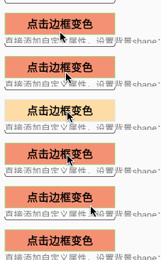
<TextView
    android:layout_width="180dp"
    android:layout_height="36dp"
    android:layout_marginTop="15dp"
    android:gravity="center"
    android:text="点击边框变色"
    android:textColor="@android:color/black"
    android:tex
Extension points exported contracts — how you extend this code
ICreateColorState (Interface)Core symbols most depended-on inside this repo
getColorShape
Languages
Modules by API surface
For agents
$ claude mcp add BackgroundLibrary \
  -- python -m otcore.mcp_server <graph>