github.com/JairajJangle/react-native-tree-multi-select @v3.0.2
Chat with this repoWhat it actually does AI analysis from the code graph — generated when you open this
README
react-native-tree-multi-select
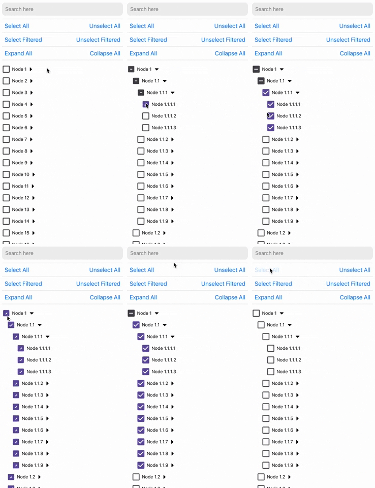
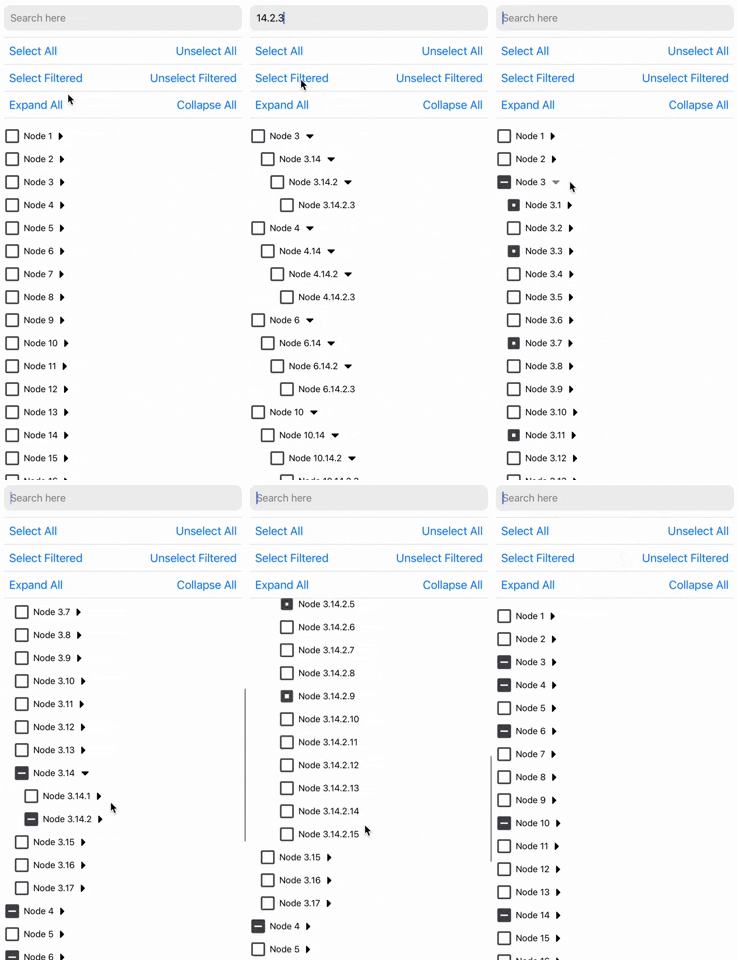
⚡️Super-fast Tree view with drag-and-drop reordering, multi-selection capabilities, using checkboxes and search filtering.










 |
 |
 |
 |
 |
 |
Installation
Using yarn:
yarn add react-native-tree-multi-select
using npm:
npm install react-native-tree-multi-select
Dependencies that need to be installed for this library to work:
- @shopify/flash-list
- Icon Library (One of the following):
- For Expo Apps (including Expo Go): No additional setup is needed. This library automatically uses
@expo/vector-icons, which is included in the Expo SDK. - For Non-Expo React Native Apps: Install react-native-vector-icons (
>=7.1.0) to enable icon support.
Make sure to follow the native-related installation instructions for these dependencies if you are using bare workflow.
Highlighted Features
- ⚡ Fast: Designed with performance in mind for smooth scrolling and quick selections.
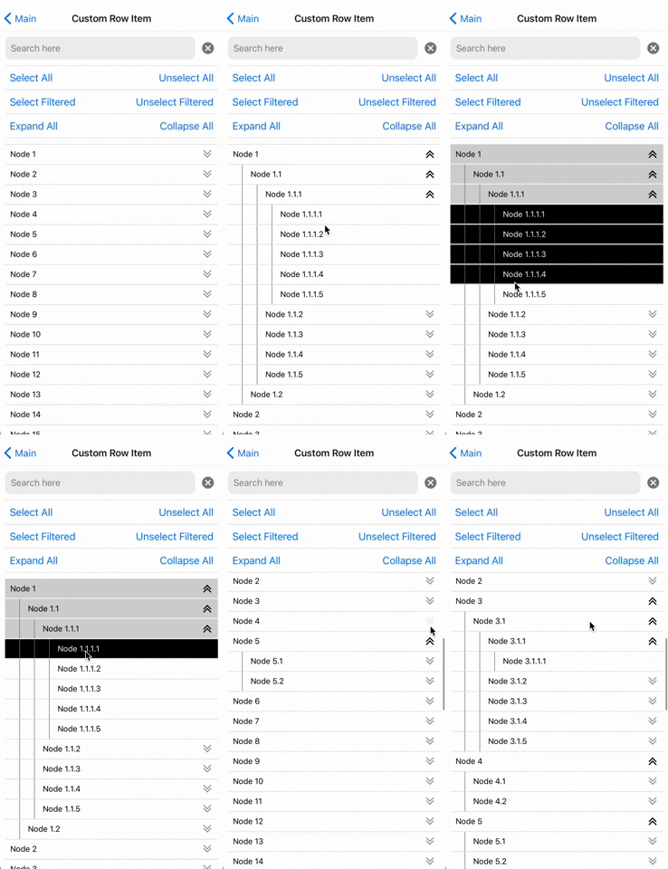
- 🛠️ Highly Customizable: Modify styles, behavior, and use your custom list component to suit your application's needs.
- 🔍 Filterable: Quickly filter through tree nodes and option to select and un-select only the filtered tree nodes.
- ✅ Well Tested: Comprehensive test coverage to ensure reliability and stability.
- 📚 Well Documented: Detailed documentation to get you started and an example app to demo all the features.
- 🌳 Multi-Level Selection: Select individual nodes or entire branches with ease.
- 📦 Supports Large Datasets: Efficiently handles large trees without much performance degradation.
- 🔒 TypeScript Support: Full TypeScript support for better developer experience.
- 🔀 Drag-and-Drop: Long-press to drag nodes and reorder or nest them anywhere in the tree.
- 💻 Cross-Platform: Works seamlessly across iOS, Android, and web (with React Native Web).
Note: Drag-and-drop is fully supported on iOS and Android. Web support is a work in progress, so drag-and-drop is disabled by default on web - pass
dragAndDrop={{ enabled: true }}to opt in there.
Usage
import {
  TreeView,
  type TreeNode,
  type TreeViewRef
} from 'react-native-tree-multi-select';

// Refer to the Properties table below or the example app for the TreeNode type
const myData: TreeNode[] = [...];

export function TreeViewUsageExample(){
  const treeViewRef = React.useRef<TreeViewRef | null>(null);

  // It's recommended to use debounce for the search function (refer to the example app)
  function triggerSearch(text: string){
    // Pass search text to the tree along with the keys on which search is to be done(optional)
    treeViewRef.current?.setSearchText(text, ["name"]);
  }

  // Callback functions for check and expand state changes:
  const handleSelectionChange = (
      _checkedIds: string[],
      _indeterminateIds: string[]
  ) => {
      // NOTE: Handle _checkedIds and _indeterminateIds here
  };
  const handleExpanded = (expandedIds: string[]) => {
    // NOTE: Do something with updated expandedIds here
  };

  // Expand collapse calls using ref
  const expandAllPress = () => treeViewRef.current?.expandAll?.();
  const collapseAllPress = () => treeViewRef.current?.collapseAll?.();
  const expandNodes = (idsToExpand: string[]) => treeViewRef.current?.expandNodes?.(
    idsToExpand
  );
  const collapseNodes = (idsToCollapse: string[]) => treeViewRef.current?.collapseNodes?.(
    idsToCollapse
  );

  // Multi-selection function calls using ref
  const onSelectAllPress = () => treeViewRef.current?.selectAll?.();
  const onUnselectAllPress = () => treeViewRef.current?.unselectAll?.();
  const onSelectAllFilteredPress = () => treeViewRef.current?.selectAllFiltered?.();
  const onUnselectAllFilteredPress = () => treeViewRef.current?.unselectAllFiltered?.();
  const selectNodes = (idsToExpand: string[]) => treeViewRef.current?.selectNodes?.(
    idsToSelect
  );
  const unselectNodes = (idsToCollapse: string[]) => treeViewRef.current?.unselectNodes?.(
    idsToUnselect
  );

  return(
    // ... Remember to keep a fixed height for the parent. Read Flash List docs to know why
    <TreeView
      ref={treeViewRef}
      data={myData}
      onCheck={handleSelectionChange}
      onExpand={handleExpanded}
    />
  );
}
Drag-and-Drop Usage
import {
  TreeView,
  moveTreeNode,
  type TreeNode,
  type TreeViewRef,
  type DragEndEvent
} from 'react-native-tree-multi-select';

const myData: TreeNode[] = [...];

export function DragDropExample(){
  const [data, setData] = React.useState<TreeNode[]>(myData);
  const treeViewRef = React.useRef<TreeViewRef | null>(null);

  const handleDragEnd = (event: DragEndEvent) => {
    // `event` is a lightweight move delta (draggedNodeId, targetNodeId, position,
    // previous/new parent + index) - not the whole tree. For a controlled tree,
    // reconstruct it with the exported `moveTreeNode` helper:
    setData(prev => moveTreeNode(prev, event.draggedNodeId, event.targetNodeId, event.position));
    // Or, if you keep the tree inside the component, read it on demand:
    // setData(treeViewRef.current?.getTreeData() ?? prev);
  };

  return(
    <TreeView
      ref={treeViewRef}
      data={data}
      onCheck={(checked, indeterminate) => { /* ... */ }}
      onExpand={(expanded) => { /* ... */ }}
      dragAndDrop={{
        onDragEnd: handleDragEnd,
      }}
    />
  );
}
Long-press a node to start dragging. Drag over other nodes to see drop indicators. Drop above/below to reorder as siblings, or drop inside a parent node to nest it. The tree auto-scrolls when dragging near the edges.
Search + drag: Drag-and-drop is disabled while a search filter is active (long-press does not initiate a drag). The filtered view hides nodes that still exist in the full tree, so a drop position that looks unambiguous on screen could land the node next to hidden siblings. Clear the search to reorder interactively, or use the imperative moveNode ref method, which works regardless of the active filter.
Accessibility: When a screen reader is active, picking up, moving, and cancelling a drag are announced (via AccessibilityInfo). For a fully assistive-tech-driven reorder (without the long-press gesture), wire your own accessibility actions to the imperative moveNode ref method.
For visual customizations (overlay styles, indicator colors, or fully custom components), see the dragAndDrop.customizations option.
Properties
TreeViewProps<ID = string>
The TreeViewProps interface defines the properties for the tree view component.
| Property | Type | Required | Description |
|---|---|---|---|
data |
TreeNode<ID = string>[] |
Yes | An array of TreeNode objects |
onCheck |
(checkedIds: ID[], indeterminateIds: ID[]) => void |
No | Callback when a checkbox state changes |
onExpand |
(expandedIds: ID[]) => void |
No | Callback when a node is expanded |
preselectedIds |
ID[] |
No | An array of ids that should be pre-selected |
preExpandedIds |
ID[] |
No | An array of ids that should be pre-expanded |
selectionPropagation |
SelectionPropagation | No | Control Selection Propagation Behavior. Choose whether you want to auto-select children or parents. |
initialScrollNodeID |
ID |
No | Set node ID to scroll to intiially on tree view render. |
indentationMultiplier |
number |
No | Indentation (marginStart) per level (defaults to 15) |
treeFlashListProps |
TreeFlatListProps | No | Props for the flash list |
checkBoxViewStyleProps |
BuiltInCheckBoxViewStyleProps | No | Props for the checkbox view |
CheckboxComponent |
ComponentType<CheckBoxViewProps> |
No | A custom checkbox component. |
ExpandCollapseIconComponent |
ComponentType<ExpandIconProps> |
No | A custom expand/collapse icon component |
ExpandCollapseTouchableComponent |
ComponentType<TouchableOpacityProps> |
No | A custom expand/collapse touchable component |
CustomNodeRowComponent |
React.ComponentType<NodeRowProps<ID>> |
No | Custom row item component |
dragAndDrop |
DragAndDropOptions<ID> |
No | Drag-and-drop configuration (see below) |
DragAndDropOptions<ID = string>
| Property | Type | Required | Description |
|---|---|---|---|
enabled |
boolean |
No | Enable drag-and-drop reordering. Default: true on iOS/Android when dragAndDrop is provided, false on web (WIP). Set explicitly to override per platform. |
onDragStart |
(event:DragStartEvent<ID>) => void |
No | Callback fired when a drag operation begins |
onDragEnd |
(event:DragEndEvent<ID>) => void |
No | Callback fired after a node is succe |
Extension points exported contracts — how you extend this code
MoveCommand (Interface)Core symbols most depended-on inside this repo
getTreeViewStoreShape
Languages
Modules by API surface
For agents
$ claude mcp add react-native-tree-multi-select \
  -- python -m otcore.mcp_server <graph>