hub / github.com/ItsMrAkhil/react-styled-carousel
github.com/ItsMrAkhil/react-styled-carousel @0.4.11
Chat with this repo
20 symbols
62 edges
27 files
0 documented · 0%
What it actually does AI analysis from the code graph — generated when you open this
loading…
README
React Styled Slider
React Styled Slider is a react and styled component slider. It is fully configurable.


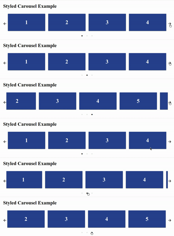
Features
- Mostly configurable
- Styled-Components
- No external CSS required.
- Server Side Rendering supported
Note: Server Side Rendering works well without the styled-components collectStyles function also. But for better user experience please use collectStyles function from styled-components
Installation
$ npm install --save react-styled-carousel
Running example in local
$ git clone github.com/itsMrAkhil/react-styled-carousel
$ npm start
It'll open localhost:9000 port, where you can see live demo.
Example
import React from 'react';
import ReactDOM from 'react-dom'
import Slider from 'react-styled-carousel';

const ExampleSlider = () => (
  <Slider>
    <h1>1</h1>
    <h1>2</h1>
    <h1>3</h1>
    <h1>4</h1>
  </Slider>
);

ReactDOM.render(<ExampleSlider />, document.getElementById('root'));
Responsive
react-styled-carousel is responsive. Below is the example configuration of responsiveness.
Note: If
responsiveprop is provided then, it'll override the cardsToShow prop. In other words cardsToShow will not work.
import React from 'react';
import ReactDOM from 'react-dom'
import Slider from 'react-styled-carousel';

const responsive = [
  { breakPoint: 1280, cardsToShow: 4 }, // this will be applied if screen size is greater than 1280px. cardsToShow will become 4.
  { breakPoint: 760, cardsToShow: 2 },
];

const ExampleSlider = () => (
  <Slider>
    <h1>1</h1>
    <h1>2</h1>
    <h1>3</h1>
    <h1>4</h1>
  </Slider>
);

ReactDOM.render(<ExampleSlider />, document.getElementById('root'));
Configurable Props
| Props | Type | Default Value | Description |
|---|---|---|---|
showArrows |
Boolean |
true |
If true then only Arrows of navigation will be shown |
showDots |
Boolean |
true |
Show navigation or pagination dots below the slider |
infinite |
Boolean |
true |
Infinitely slide cards. |
Dot |
React Node |
Default | Customized pagination button (Active slide Dot will get active as Boolean prop.) |
DotsWrapper |
Styled Element |
Default | Customized wrapper for your component to change the view of dots wrapper like position, background, etc. Note: It should be a styled ul, otherwise you may not see any Dot Components. |
LeftArrow |
React Node |
Default | Customized left arrow button. It'll get disabled Boolean prop if first Dot is active and infinite is false. |
RightArrow |
React Node |
Default | Customized right arrow button. It'll get disabled Boolean prop if last Dot is active and infinite is false. |
children |
React Node |
null | Cards are components which you want to show in the carousel |
cardsToShow |
Number |
Children length | How many cards to be shown for a single slide. |
afterSlide |
Function |
null | This function will be executed after every sliding is completed |
beforeSlide |
Function |
null | This function will be executed before starting every sliding |
responsive |
Array |
null | Use this for responsiveness Documentation |
autoSlide |
Number or Boolean |
2000 |
Used to make carousel auto slide for every given time interval. Or for 2000ms if the prop value is true. |
pauseOnMouseOver |
Boolean |
true |
Pause auto sliding on mouse over the carousel. |
hideArrowsOnNoSlides |
Boolean |
true |
Hide arrows if there is only one slide to show. |
margin |
String |
0px |
Any valid css margin value for giving margin around the slider |
padding |
String |
0px 20px |
Any valid css padding value for giving padding around the slider |
License
MIT (Free Software, Chill Yeah!)
Core symbols most depended-on inside this repo
changeInitialCardcalled by 3
src/components/Slider.js
updateResponsiveView
called by 1
src/components/Slider.js
renderDots
called by 1
src/components/Slider.js
renderRightArrow
called by 1
src/components/Slider.js
resume
called by 1
src/utils/Timer.js
start
called by 1
src/utils/Timer.js
constructor
called by 0
src/components/Slider.js
componentDidMount
called by 0
src/components/Slider.js
Shape
Languages
TypeScript100%
Modules by API surface
src/components/Slider.js14 symbols
src/utils/Timer.js6 symbols
For agents
$ claude mcp add react-styled-carousel \
  -- python -m otcore.mcp_server <graph>