github.com/Eliav2/react-xarrows @v2.0.2
Chat with this repoWhat it actually does AI analysis from the code graph — generated when you open this
README
react-xarrows
introduction
Draw arrows between components in React!




Main features
- Connect arrows/lines between components just by passing an id or ref!
- Super simple API yet fully customizable usage!
- Smart and Intuitive look and behavior!
- Smart React lifecycle, and cached parsed props for efficiency!
liked my work? star this repo.
reallyy liked my work? buy me a coffee!
this project needs funding to stay open source and free :blush:
installation
with npm npm install react-xarrows.
(or yarn add react-xarrows)
Examples
Demos
see here! codebox of few examples(in this repo at /examples).
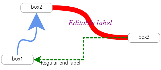
see this interactive example: https://lwwwp.csb.app/CustomizeArrow
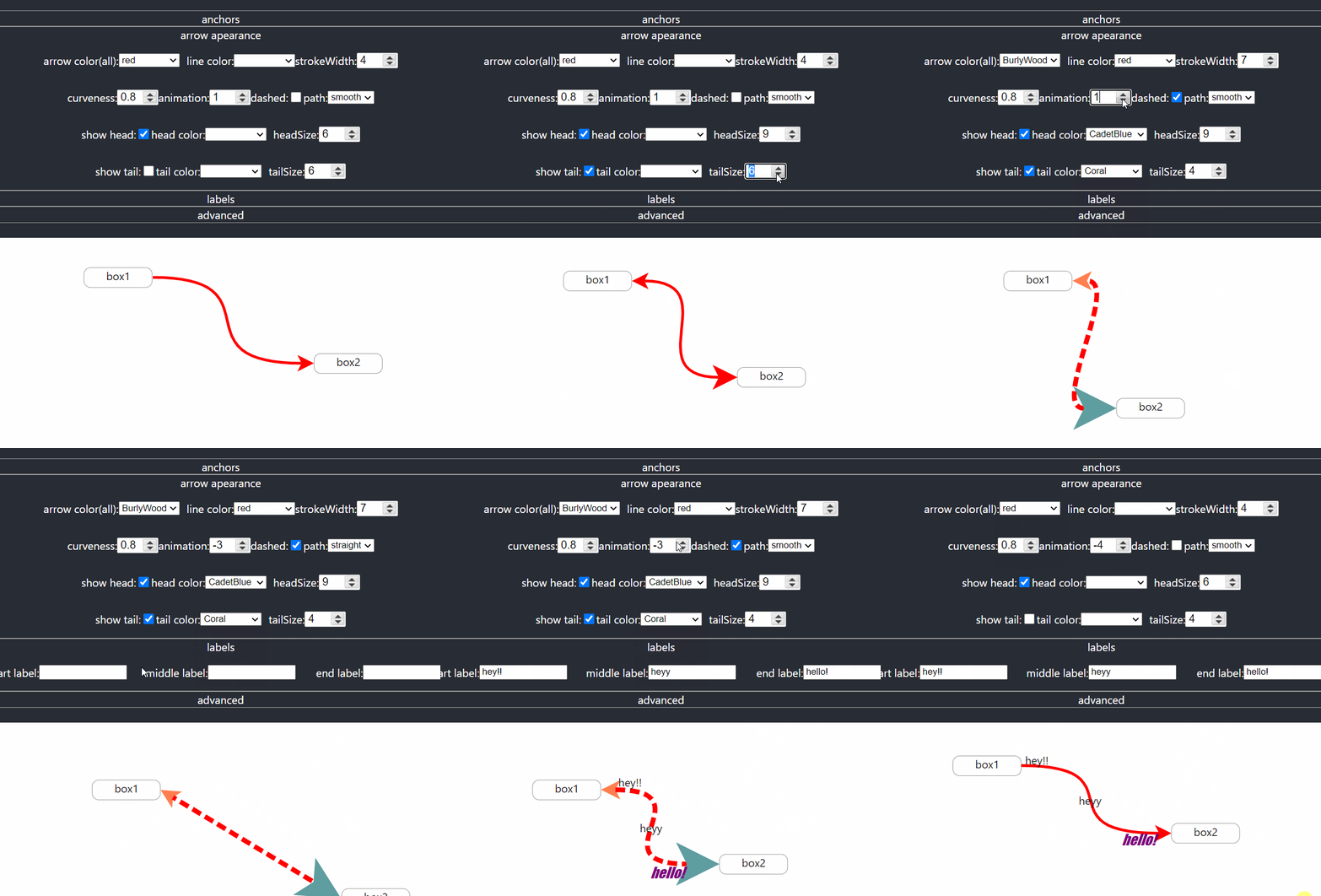
simple example:
import React, {useRef} from "react";
import Xarrow from "react-xarrows";

const boxStyle = {border: "grey solid 2px", borderRadius: "10px", padding: "5px"};

function SimpleExample() {
    const box1Ref = useRef(null);
    return (


hey


hey2


            <Xarrow
                start={box1Ref} //can be react ref
                end="elem2" //or an id
            />


    );
}

export default SimpleExample;
V2 example
in order to invoke updates on xarrows wrap your arrows and connceted elements with Xwrapper, and consume useXarrow
on connected elements.
import React from 'react';
import Xarrow, {useXarrow, Xwrapper} from 'react-xarrows';
import Draggable from 'react-draggable';

const boxStyle = {border: 'grey solid 2px', borderRadius: '10px', padding: '5px'};

const DraggableBox = ({id}) => {
    const updateXarrow = useXarrow();
    return (
        <Draggable onDrag={updateXarrow} onStop={updateXarrow}>


                {id}


        </Draggable>
    );
};

export function V2Example() {
    return (


            <Xwrapper>
                <DraggableBox id={'elem1'}/>
                <DraggableBox id={'elem2'}/>
                <Xarrow start={'elem1'} end="elem2"/>
            </Xwrapper>


    );
}
another example
import React from 'react';
import Xarrow, {useXarrow, xarrowPropsType, Xwrapper} from 'react-xarrows';
import Draggable from 'react-draggable';

const boxStyle = {
    border: '1px #999 solid',
    borderRadius: '10px',
    textAlign: 'center',
    width: '100px',
    height: '30px',
    color: 'black',
    alignItems: 'center',
    display: 'flex',
    justifyContent: 'center',
} as const;

const canvasStyle = {
    width: '100%',
    height: '100vh',
    background: 'white',
    overflow: 'auto',
    display: 'flex',
    color: 'black',
} as const;

const DraggableBox = ({box}) => {
    const updateXarrow = useXarrow();
    return (
        <Draggable onDrag={updateXarrow} onStop={updateXarrow}>


                {box.id}


        </Draggable>
    );
};

const SimpleTemplate = () => {
    const box = {id: 'box1', x: 20, y: 20};
    const box2 = {id: 'box2', x: 320, y: 120};
    const box3 = {id: 'box3', x: 50, y: 150};
    const box4 = {id: 'box4', x: 320, y: 220};
    return (


            <Xwrapper>
                <DraggableBox box={box}/>
                <DraggableBox box={box2}/>
                <Xarrow start={'box1'} end={'box2'}/>
                <Xarrow start={'box1'} end={'box2'} endAnchor={'top'}/>
                <Xarrow start={'box1'} end={'box2'} startAnchor={'bottom'}/>
            </Xwrapper>
            <Xwrapper>
                <DraggableBox box={box3}/>
                <DraggableBox box={box4}/>
                <Xarrow start={'box3'} end={'box4'}/>
            </Xwrapper>


    );
};
(will render this)
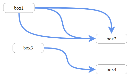
Usage
react-xarrow v2.0 released! no need to trigger render on parents anymore!
react-xarrows will smartly trigger updates on relevant elements! use Xwrapper and useXarrow hook to achieve
selective rendering!
please note that v2.0.0 is not working using react StrictMode. to fix update to v2.0.1.
breaking changes
V2.0 introduced some breaking changes, mainly related to properties naming. see CHANGELOG.md for details.
useXarrow
import {useXarrow} from "react-xarrow"

const YourComponent = ({id, ...props}) => {
    const updateXarrow = useXarrow()
    //...
    return (


            ...


    )

}
Xwrapper
const YourApp = () => {
    return (
        // ...
        <Xwrapper>
            <YourComponent id={'comp1'}/>
            <YourComponent id={'comp2'}/>
            <Xarrow start={'comp1'} end={'comp2'}/>
        </Xwrapper>
        // ...
    )
}
each time component calling useXarrow hook renders also the xarrows inside the wrapping Xwrapper wrapper will render.
receiving updateXarrow is optional. use this function only if you want to trigger a render different phase from
rendering(like click or drag event).
API
to see full typescript definition see types.ts file.
here's a summary of the all the available props:
| Properties | Description | default value | type |
|---|---|---|---|
| start | ref to start element | none(Required!) | string/ReactRef |
| end | ref to end element | none(Required!) | string/ReactRef |
| startAnchor | from which side the arrow should start from start element | 'auto' | string/object/array |
| endAnchor | at which side the arrow should end at end element | 'auto' | string/object/array |
| labels | optional labels | null | string/array |
| color | color of Xarrow(all parts) | 'CornflowerBlue' | string |
| lineColor | color of the line | null | string |
| headColor | color of the head | null | string |
| tailColor | color of the tail | null | string |
| strokeWidth | thickness of Xarrow(all parts) | 4 | number |
| headSize | thickness of head(relative to strokeWidth) | 6 | number |
| tailSize | thickness of tail(relative to strokeWidth) | 6 | number |
| path | path drawing style | 'smooth' | string |
| curveness | how much the line curveness when path='smooth' | 0.8 | number |
| gridBreak | where the line breaks in path='grid' | "50%" | string |
| dashness | should the line be dashed | false | boolean/object |
| showHead | show the arrow head? | true | boolean |
| showTail | show the arrow tail? | false | boolean |
| showXarrow | show Xarrow? | true | boolean |
| animateDrawing | animate drawing when arrow mounts? | false | boolean/object |
| headShape | shape of the arrow head | 'arrow1' | string/object |
| tailShape | shape of the arrow tail | 'arrow1' | string/object |
| zIndex | zIndex - Overlapping elements with a larger z-index cover those with a smaller one | 0 | number |
Advanced Props
| Properties | Description | default value | type |
|---|---|---|---|
| passProps | properties which will be pased to arrowBody,arrowHead,arrowTail | {} | object |
| SVGcanvasProps | properties which will be passed to svgCanvas | {} | object |
| arrowBodyProps | properties which will be passed to arrowBody | {} | object |
| arrowHeadProps | properties which will be passed to arrowHead | {} | object |
| arrowTailProps | properties which will be passed to arrowTail | {} | object |
| divContainerProps | properties which will be passed to divContainer | {} | object |
| SVGcanvasStyle | style properties which will be passed svgCanvas | 0 | object |
| divContainerStyle | style properties which will be passed divContainer | false | object |
| _extendSVGcanvas | extend svgCanas at all sides | 0 | number |
| _debug | show debug elements | 0 | boolean |
| _cpx1Offset | offset control point 1 x | 0 | number |
| _cpy1Offset | offset control point 1 y | 0 | number |
| _cpx2Offset | offset control point 2 x | 0 | number |
| _cpy2Offset | offset control point 2 x | 0 | number |
API flexibility
This API built in such way that most props can accept different types. you can keep things simple or provide more custom
props for more custom behavior(see startAnchor good example).
explore typescript for detailed descriptions of what type excepts every prop.
Properties
This documentation is examples driven.\ The examples sorted from the most common use case to the most custom one.
'start' and 'end'
required\ can be a reference to a react ref to html element or string - an id of a DOM element.
examples:
start="myid"-myidis id of a dom element.start={myRef}-myRefis a react ref.
'startAnchor' and 'endAnchor'
specify what anchors are allowed. can be a string/object/array.
type:
export type anchorType = anchorPositionType | anchorCustomPositionType;
simple usage:
type:
export const tAnchorEdge = ['middle', 'left', 'right', 'top', 'bottom', 'auto'] as const;
export type anchorPositionType = typeof tAnchorEdge[number];
one of "auto" | "middle" | "left" | "right" | "top" | "bottom"
auto will choose automatically the path with the smallest length.
example:
endAnchor="middle"will set the anchor of the end of the line to the middle of the end element.endAnchor="auto"choose the closest anchor.endAnchor="left"connect to the left.
custom usage:
type:
export type anchorCustomPositionType = {
    position: anchorPositionType;
    offset: { x?: number; y?: number };
};
example:
endAnchor= { position: "auto", offset: { x: 20 } }will choose automatic anchoring for end anchor but will offset it 20 pixels to the right after normal positioning.
if list is provided - the minimal length anchors will be chosen from the list. example:
endAnchor= ["right", {position: "left", offset: {y: -10}}]only right and left anchors will be allowed for endAnchor, and if the left side connected then it will be offset 10 pixels up.
labels
you can place up to 3 labels. see examples
labels="middleLabel"- middle label- ```labels=
styled middle label
- custom middle label
-
labels={{ start:"I'm start label",middle: "middleLabel",end:
big end label
}}``` start and middle label and custom end label
color,lineColor and headColor and tailColor
color defines color to the entire arrow. lineColor,headColor and tailColor will override color specifically for
line,tail or head. examples:
color="red"will change the color of the arrow to red(body and head).headColor="red"will change only the color of the head to red.tailColor="red"will change only the color of the tail to red.lineColor="red"will change only the color of the body to red.
strokeWidth and headSize and tailSize
strokeWidth defines the thickness of the entire arrow. headSize and tailSize defines how big will be the head or tail relative to the strokeWidth. examples:
strokeWidth={15}will make the arrow more thick(body and head).headSize={15}will make the head of the arrow more thick(relative to strokeWidth as well).tailSize={15}will make arrow's tail thicker.
path
path can be one of: "smooth" | "grid" | "straight", and it controls the path arrow is drawn, exactly how their name
suggest. examples:
path={"grid"}will draw the line in sharp curves(90 degrees) like grid.
curveness
defines how much the lines curve. makes a difference only in path='smooth'. examples:
curveness={false}will make the line straight without curves(exactly like path='straight').curveness={true}will choose default values of
Extension points exported contracts — how you extend this code
anchorCustomPositionType2 (Interface)Core symbols most depended-on inside this repo
useXarrowShape
Languages
Modules by API surface
Used by 2 indexed graphs manifest dependencies, hub-wide
For agents
$ claude mcp add react-xarrows \
  -- python -m otcore.mcp_server <graph>