github.com/BugiDev/react-native-calendar-strip @2.2.5
Chat with this repoWhat it actually does AI analysis from the code graph — generated when you open this
README
react-native-calendar-strip
Easy to use and visually stunning calendar component for React Native.









Built with ❤︎ by BugiDev and contributors
Table of Contents
Install
$ npm install react-native-calendar-strip
# OR
$ yarn add react-native-calendar-strip
Usage
Scrollable CalendarStrip — New in 2.x
The scrollable prop was introduced in 2.0.0 and features a bi-directional infinite scroller. It recycles days using RecyclerListView, shifting the dates as the ends are reached. The Chrome debugger can cause issues with this updating due to a RN setTimeout bug. To prevent date shifts at the ends of the scroller, set the minDate and maxDate range to a year or less.
The refactor to support scrollable introduced internal changes to the CalendarDay component. Users of the dayComponent prop may need to adjust their custom day component to accommodate the props passed to it.
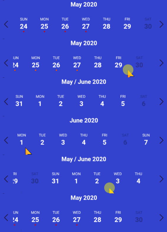
import { View, StyleSheet } from 'react-native';
import CalendarStrip from 'react-native-calendar-strip';

const Example = () => (
  <View style={styles.container}>
    <CalendarStrip
      scrollable
      style={{height:200, paddingTop: 20, paddingBottom: 10}}
      calendarColor={'#3343CE'}
      calendarHeaderStyle={{color: 'white'}}
      dateNumberStyle={{color: 'white'}}
      dateNameStyle={{color: 'white'}}
      iconContainer={{flex: 0.1}}
    />
  </View>
);

const styles = StyleSheet.create({
  container: { flex: 1 }
});
Simple "out of the box" Example
You can use this component without any styling or customization. Just import it in your project and render it:
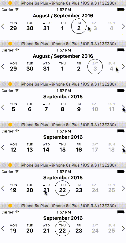
import { View, StyleSheet } from 'react-native';
import CalendarStrip from 'react-native-calendar-strip';

const Example = () => (
  <View style={styles.container}>
    <CalendarStrip
      style={{height:150, paddingTop: 20, paddingBottom: 10}}
    />
  </View>
);

const styles = StyleSheet.create({
  container: { flex: 1 }
});
Styling and animations Example
Even though this component works withouth any customization, it is possible to customize almost everything, so you can make it as beautiful as you want:
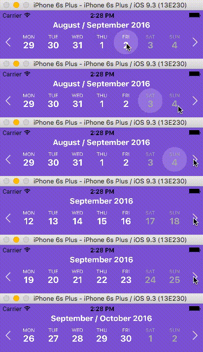
import React, {Component} from 'react';
import {
    AppRegistry,
    View
} from 'react-native';
import moment from 'moment';

import CalendarStrip from 'react-native-calendar-strip';

class Example extends Component {
    let datesWhitelist = [{
      start: moment(),
      end: moment().add(3, 'days')  // total 4 days enabled
    }];
    let datesBlacklist = [ moment().add(1, 'days') ]; // 1 day disabled

    render() {
        return (
            <View>
                <CalendarStrip
                    calendarAnimation={{type: 'sequence', duration: 30}}
                    daySelectionAnimation={{type: 'border', duration: 200, borderWidth: 1, borderHighlightColor: 'white'}}
                    style={{height: 100, paddingTop: 20, paddingBottom: 10}}
                    calendarHeaderStyle={{color: 'white'}}
                    calendarColor={'#7743CE'}
                    dateNumberStyle={{color: 'white'}}
                    dateNameStyle={{color: 'white'}}
                    highlightDateNumberStyle={{color: 'yellow'}}
                    highlightDateNameStyle={{color: 'yellow'}}
                    disabledDateNameStyle={{color: 'grey'}}
                    disabledDateNumberStyle={{color: 'grey'}}
                    datesWhitelist={datesWhitelist}
                    datesBlacklist={datesBlacklist}
                    iconLeft={require('./img/left-arrow.png')}
                    iconRight={require('./img/right-arrow.png')}
                    iconContainer={{flex: 0.1}}
                />
            </View>
        );
    }
}

AppRegistry.registerComponent('Example', () => Example);
Props
Initial data and onDateSelected handler
| Prop | Description | Type | Default |
|---|---|---|---|
numDaysInWeek |
Number of days shown in week. Applicable only when scrollable is false. | Number | 7 |
scrollable |
Dates are scrollable if true. | Bool | False |
scrollerPaging |
Dates are scrollable as a page (7 days) if true (Only works with scrollable set to true). |
Bool | False |
startingDate |
Date to be used for centering the calendar/showing the week based on that date. It is internally wrapped by moment so it accepts both Date and moment Date. |
Any | |
selectedDate |
Date to be used as pre selected Date. It is internally wrapped by moment so it accepts both Date and moment Date. |
Any | |
onDateSelected |
Function to be used as a callback when a date is selected. Receives param date Moment date. |
Function | |
onWeekChanged |
Function to be used as a callback when a week is changed. Receives params (start, end) Moment dates. |
Function | |
onWeekScrollStart |
Function to be used as a callback in scrollable mode when dates page starts gliding. Receives params (start, end) Moment dates. |
Function | |
onWeekScrollEnd |
Function to be used as a callback in scrollable mode when dates page stops gliding. Receives params (start, end) Moment dates. |
Function | |
onHeaderSelected |
Function to be used as a callback when the header is selected. Receives param object {weekStartDate, weekEndDate} Moment dates. |
Function | |
headerText |
Text to use in the header. Use with onWeekChanged to receive the visible start & end dates. |
String | |
updateWeek |
Update the week view if other props change. If false, the week view won't change when other props change, but will still respond to left/right selectors. |
Bool | True |
useIsoWeekday |
start week on ISO day of week (default true). If false, starts week on startingDate parameter. | Bool | True |
minDate |
minimum date that the calendar may navigate to. A week is allowed if minDate falls within the current week. | Any | |
maxDate |
maximum date that the calendar may navigate to. A week is allowed if maxDate falls within the current week. | Any | |
datesWhitelist |
Array of dates that are enabled, or a function callback which receives a date param and returns true if enabled. Array supports ranges specified with an object entry in the array. Check example Below | Array or Func | |
datesBlacklist |
Array of dates that are disabled, or a function callback. Same format as datesWhitelist. This overrides dates in datesWhitelist. | Array or Func | |
markedDates |
Dates that are marked with dots or lines. Format as markedDatesFormat. | Array or Func | [] |
scrollToOnSetSelectedDate |
Controls whether to reposition the scroller to the date passed to setSelectedDate. |
Bool | True |
datesWhitelist Array Example
  datesWhitelist = [
    // single date (today)
    moment(),

    // date range
    {
      start: (Date or moment Date),
      end: (Date or moment Date)
    }
  ];

  return (
    <CalendarStrip
      datesWhitelist={datesWhitelist}
    />
  );
datesBlacklist Callback Example
  const datesBlacklistFunc = date => {
    return date.isoWeekday() === 6; // disable Saturdays
  }

  return (
    <CalendarStrip
      datesBlacklist={datesBlacklistFunc}
    />
  );
markedDates Example
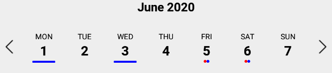
markedDates may be an array of dates with dots/lines, or a callback that returns the same shaped object for a date passed to it.
  // Marked dates array format
  markedDatesArray = [
    {
      date: '(string, Date or Moment object)',
      dots: [
        {
          color: <string>,
          selectedColor: <string> (optional),
        },
      ],
    },
    {
      date: '(string, Date or Moment object)',
      lines: [
        {
          color: <string>,
          selectedColor: <string> (optional),
        },
      ],
    },
  ];
  // Marked dates callback
  markedDatesFunc = date => {
    // Dot
    if (date.isoWeekday() === 4) { // Thursdays
      return {
        dots:[{
          color: <string>,
          selectedColor: <string> (optional),
        }]
      };
    }
    // Line
    if (date.isoWeekday() === 6) { // Saturdays
      return {
        lines:[{
          color: <string>,
          selectedColor: <string> (optional),
        }]
      };
    }
    return {};
  }
Hiding Components
| Prop | Description | Type | Default |
|---|---|---|---|
showMonth |
Show or hide the month label. | Bool | True |
showDate |
Show or hide all the dates. | Bool | True |
showDayName |
Show or hide the day name label | Bool | True |
showDayNumber |
Show or hide the day number label | Bool | True |
Styling
| Prop | Description
Extension points exported contracts — how you extend this code
Core symbols most depended-on inside this repo
Shape
Languages
Modules by API surface
For agents
$ claude mcp add react-native-calendar-strip \
  -- python -m otcore.mcp_server <graph>