github.com/Aslam97/minimal-tiptap @v2.1.0 sqlite
README
Overview
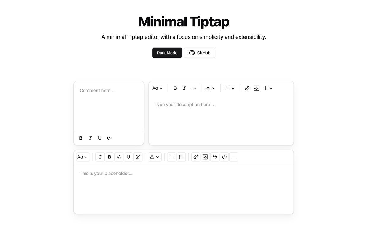
The Minimal Tiptap Editor is a lightweight, customizable rich text editor component built for Shadcn. It provides an intuitive interface for text formatting and editing.
Table of Contents
- Overview
- Table of Contents
- Installation
- Dependencies
- Usage
- Props
- Image Extension
- Customization
- Handling Image Uploads
- Error Handling
- Toolbar Customization
- Key Behaviors
- Other Projects
- License
Installation
- Install the required packages:
npm install @tiptap/extension-code-block-lowlight lowlight react-medium-image-zoom @tiptap/extension-color @tiptap/extension-heading @tiptap/extension-horizontal-rule @tiptap/extension-image @tiptap/extension-link @tiptap/extension-placeholder @tiptap/extension-text-style @tiptap/extension-typography @tiptap/pm @tiptap/react @tiptap/starter-kit @tiptap/extension-underline
- Set up the
TooltipProvider:
Add the TooltipProvider to your root component (e.g., App.tsx, main.tsx, or equivalent):
import { TooltipProvider } from '@/components/ui/tooltip'

export const App = () => {
  return (
    <TooltipProvider>
      {/* Your other components */}
      <YourComponent />
    </TooltipProvider>
  )
}
Dependencies
Ensure you have the following Shadcn components installed in your project:
Usage
- Copy the
minimal-tiptapdirectory into your project. - Import and use the component in your React application:
import { useState } from 'react'
import { Content } from '@tiptap/react'
import { MinimalTiptapEditor } from './minimal-tiptap'

export const App = () => {
  const [value, setValue] = useState<Content>('')

  return (
    <MinimalTiptapEditor
      value={value}
      onChange={setValue}
      className="w-full"
      editorContentClassName="p-5"
      output="html"
      placeholder="Type your description here..."
      autofocus={true}
      editable={true}
      editorClassName="focus:outline-none"
    />
  )
}
Props
The Minimal Tiptap Editor accepts all standard Tiptap editor props, plus these additional props:
| Prop | Type | Default | Description |
|---|---|---|---|
value |
string | - | Initial editor content |
onChange |
function | - | Callback function for content changes |
editorContentClassName |
string | - | CSS class for the EditorContent component |
output |
'html' | 'json' | 'text' | 'html' | Output format of the editor content |
placeholder |
string | - | Placeholder text for the editor |
editorClassName |
string | - | CSS class for the editor instance |
throttleDelay |
number | 0 | Delay for throttling editor updates (in ms) |
Image Extension
Customization
Customize the Image extension by passing options:
Note: The
uploadFnmust return the URL of the uploaded image. If you dont specifyuploadFn, please enable theallowBase64option.
Image.configure({
  allowedMimeTypes: ['image/jpeg', 'image/png', 'image/gif'],
  onImageRemove: handleImageRemove,
  maxFileSize: 5 * 1024 * 1024, // 5MB
  uploadFn: myCustomUploadFunction,
  onActionSuccess: handleActionSuccess,
  onActionError: handleActionError,
  onValidationError: handleValidationError
})
Handling Image Uploads
Provide a custom uploadFn to handle image uploads:
const myCustomUploadFunction = async (file: File, editor: Editor) => {
  // Implement your upload logic here
  // Return the URL of the uploaded image
  return 'https://example.com/uploaded-image.jpg'
}

Image.configure({
  uploadFn: myCustomUploadFunction
})
Error Handling
Implement error handling callbacks for a better user experience:
Image.configure({
  onActionError: (error, props) => {
    console.error('Image action failed:', error, props)
    // Show user-friendly error message
  },
  onValidationError: errors => {
    console.error('Image validation failed:', errors)
    // Show validation error to the user
  }
})
Toolbar Customization
Customize the toolbar using the activeActions, mainActionCount, size, and variant props in various sections:
<SectionOne editor={editor} activeLevels={[1, 2, 3, 4, 5, 6]} variant="outline" />

<SectionTwo
  editor={editor}
  activeActions={['bold', 'italic', 'strikethrough', 'code', 'clearFormatting']}
  mainActionCount={2}
/>

<SectionFour editor={editor} activeActions={['orderedList', 'bulletList']} mainActionCount={0} />

<SectionFive editor={editor} activeActions={['codeBlock', 'blockquote', 'horizontalRule']} mainActionCount={0} />
To prevent focusing the Dropdown Menu Trigger after clicking a menu item, add:
onCloseAutoFocus={event => event.preventDefault()}
Key Behaviors
- Pressing
Enteror creating a new block removes active formatting marks (bold, italic, strike, underline, code). - Set
shouldRerenderOnTransactiontofalsefor performance, but this may affect toolbar state updates.
Other Projects
License
This project is licensed under the MIT License. See the LICENSE file for details.
Extension points exported contracts — how you extend this code
MinimalTiptapProps (Interface)Core symbols most depended-on inside this repo
cnShape
Languages
Modules by API surface
Dependencies from manifests, versioned
For agents
$ claude mcp add minimal-tiptap \
  -- python -m otcore.mcp_server <graph>