github.com/ArthurSonzogni/FTXUI @v7.0.0
Chat with this repoBrowse by type
What it actually does AI analysis from the code graph — generated when you open this
README







Documentation · Report a Bug · Examples . Request Feature · Send a Pull Request
Doc: English | Français | Español | 繁體中文 | 简体中文 | 日本語 |
FTXUI
Functional Terminal (X) User interface
A simple cross-platform C++ library for terminal based user interfaces!
Feature
- Functional style. Inspired by 1 and React
- Simple and elegant syntax (in my opinion)
- Keyboard & mouse navigation.
- Support for UTF8 and fullwidth chars (→ 测试)
- Support for animations. Demo 1, Demo 2
- Support for drawing. Demo
- No dependencies.
- C++20 Module support
- Cross platform: Linux/MacOS (main target), WebAssembly, Windows (Thanks to contributors!).
- Learn by examples, and tutorials
- Multiple packages:
- CMake FetchContent (preferred)
- Bazel
- vcpkg
- Conan Debian package
- Ubuntu package
- Arch Linux
- OpenSUSE
- XMake repository package
- Nix
- Amalgamated (single-header/source) (from 7.0.0)
- conda-forge
- Good practices: documentation, tests, fuzzers, performance tests, automated CI, automated packaging, etc...
Documentation
- Starter CMake
- Starter Bazel
- Documentation
- Examples (WebAssembly)
- Build using CMake
- Build using Bazel
- Build using Meson
Example
#include <ftxui/ftxui.hpp>
using namespace ftxui;

int main() {
  auto document =
    vbox({
      hbox({
        text("one") | border,
        text("two") | border | flex,
        text("three") | border | flex,
      }),

      gauge(0.25) | color(Color::Red),
      gauge(0.50) | color(Color::White),
      gauge(0.75) | color(Color::Blue),
    });

  auto screen = Screen::Create(Dimension::Full());
  Render(screen, document);
  screen.Print();

  return 0;
}
Short gallery
FTXUI is organized into three modules: 1. screen: Low-level rendering (colors, pixels, terminal) 2. dom: Layout and composition (hierarchical elements) 3. component: User interaction (widgets, events, main loop)
For most users, including everything at once is the simplest way to start:
- Header: #include <ftxui/ftxui.hpp>
- CMake target: ftxui::ftxui
- Bazel target: @ftxui//:ftxui
DOM
This module defines a hierarchical set of Element. An Element manages layout and can be responsive to the terminal dimensions.
They are declared in <ftxui/dom/elements.hpp>
Layout
Element can be arranged together:
- horizontally with hbox
- vertically with vbox
- inside a grid with gridbox
- wrap along one direction using the flexbox.
Element can become flexible using the flex decorator.
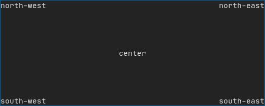
Example using hbox, vbox and filler.
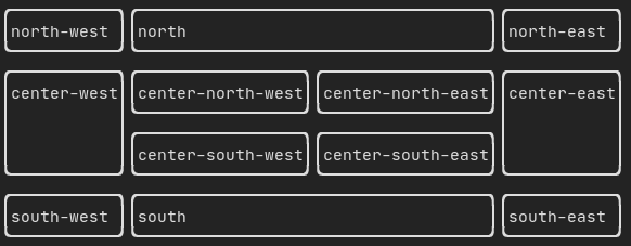
Example using gridbox:
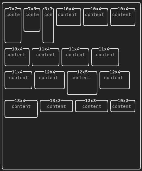
Example using flexbox:
Style
An element can be decorated using the functions:
- bold
- italic
- dim
- inverted
- underlined
- underlinedDouble
- blink
- strikethrough
- color
- bgcolor
- hyperlink

FTXUI supports the pipe operator. It means: decorator1(decorator2(element)) and element | decorator1 | decorator2 can be used.
Colors
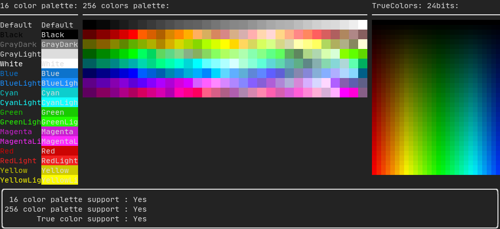
FTXUI supports every color palette:
Color gallery:
Border and separator
Use decorator border and element separator() to subdivide your UI:
Element document = vbox({
    text("top"),
    separator(),
    text("bottom"),
}) | border;
Demo:

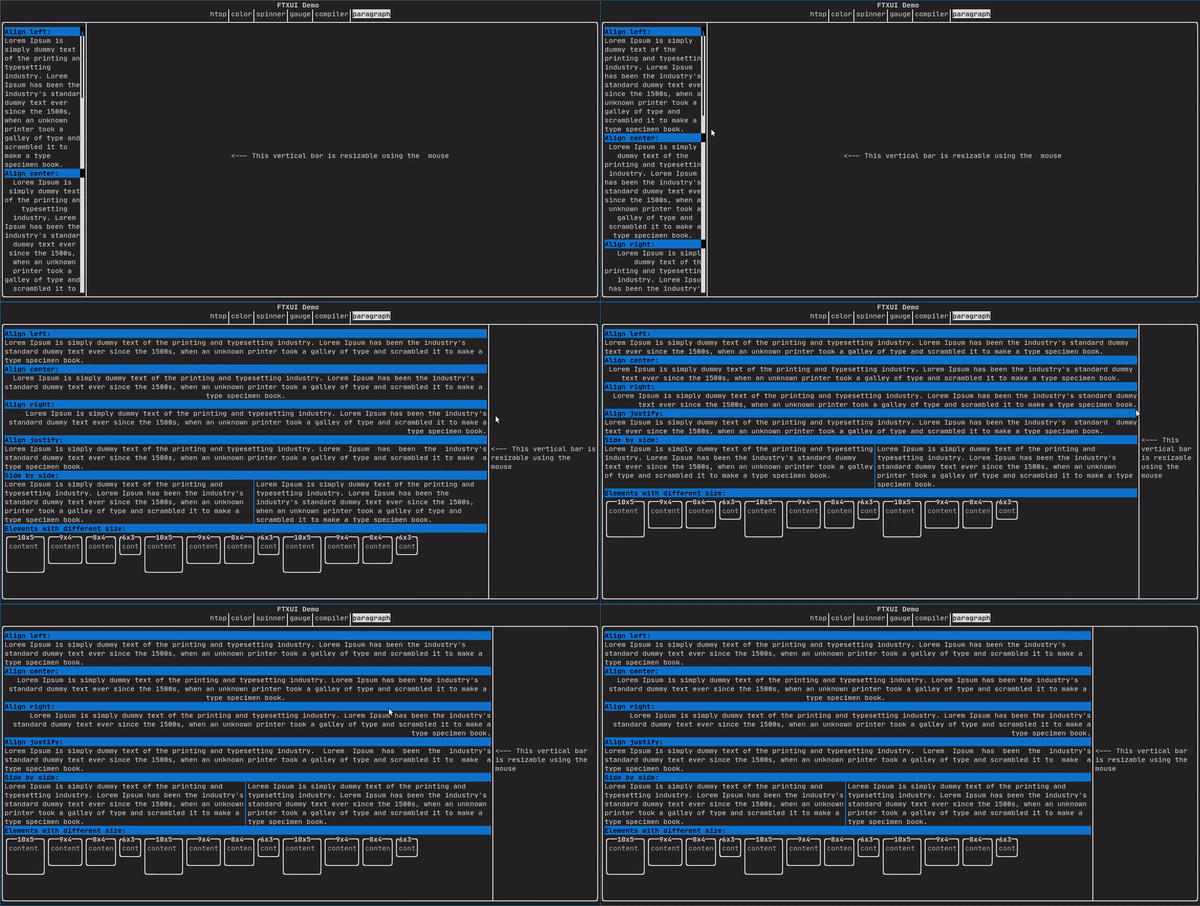
Text and paragraph
A simple piece of text is represented using text("content").
To support text wrapping following spaces the following functions are provided:
Element paragraph(string text);
Element paragraphAlignLeft(string text);
Element paragraphAlignRight(string text);
Element paragraphAlignCenter(string text);
Element paragraphAlignJustify(string text);
Table
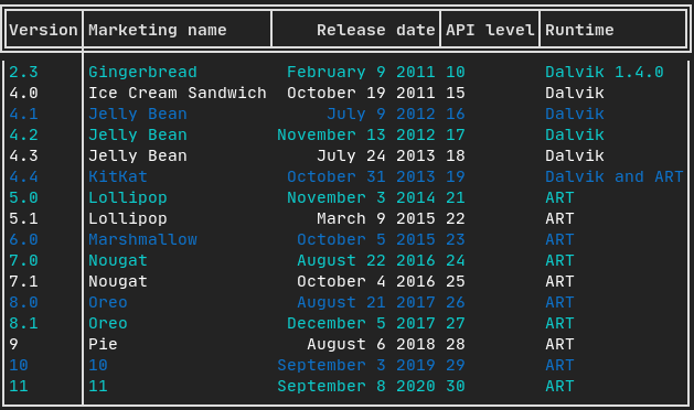
A class to easily style a table of data.
Canvas
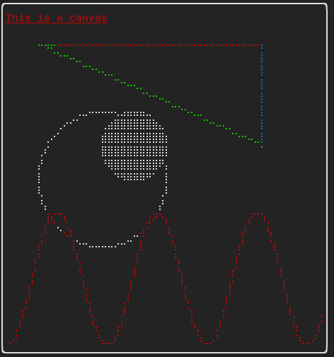
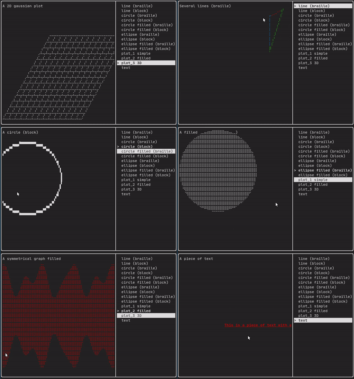
Drawing can be made on a Canvas, using braille, block, or simple characters:
Simple example:
Complex examples:
Component
ftxui/component produces dynamic UI, reactive to the user's input. It defines a set of ftxui::Component. A component reacts to Events (keyboard, mouse, resize, ...) and Renders as an Element (see previous section).
Prebuilt components are declared in <ftxui/component/component.hpp>
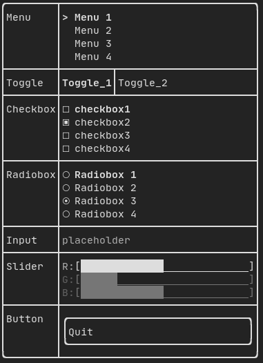
Gallery
Gallery of multiple components. (demo)
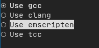
Radiobox
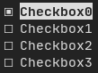
Checkbox
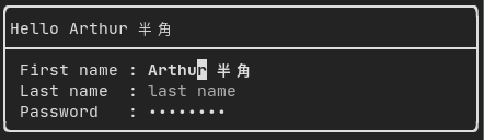
Input
Toggle

Slider
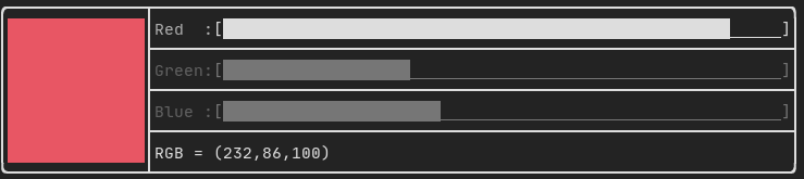
Menu

ResizableSplit
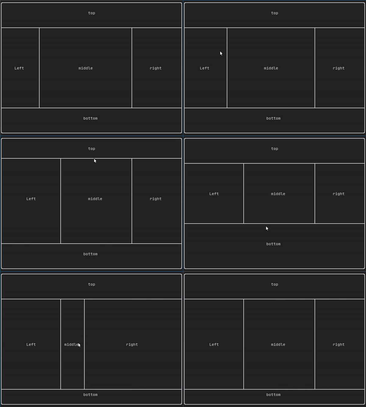
Dropdown

Tab
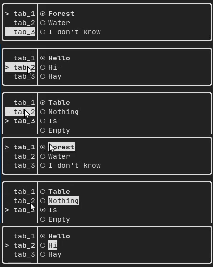
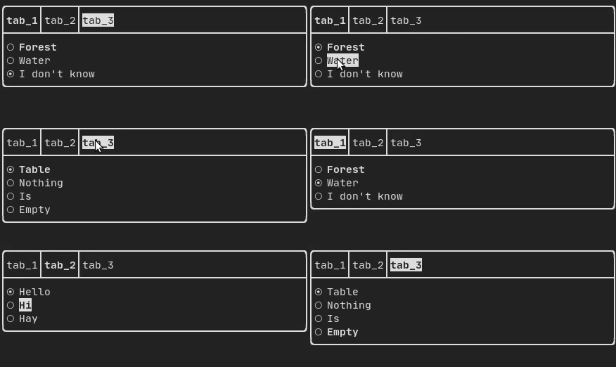
Libraries for FTXUI
- Want to share a useful Component for FTXUI? Feel free to add yours here
- ftxui-grid-container
- ftxui-ip-input
- [ftxui-image-view](https://gith
Core symbols most depended-on inside this repo
Shape
Languages
Modules by API surface
For agents
$ claude mcp add FTXUI \
  -- python -m otcore.mcp_server <graph>