github.com/AKAspanion/ui-neumorphism @v1.1.3
Chat with this repoWhat it actually does AI analysis from the code graph — generated when you open this
README
ui-neumorphism



React component library designed on the "new skeuomorphism" or "neumorphism" UI/UX trend.
All the components are designed according to the neumorphic design trend.
Library features more than 50 individual components.
Demo
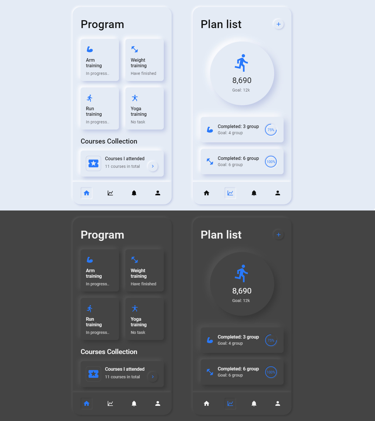
View examples here.
Documentation
Each component, and its API is well documented, with various examples along with their code and preview.
Check out the documentation here.
Install
npm install --save ui-neumorphism
Usage
import React, { Component } from 'react'

import { Button } from 'ui-neumorphism'
import 'ui-neumorphism/dist/index.css'

class Example extends Component {
  render() {
    return <Button />
  }
}
Theming
In neumorphism UI, theming is dead simple. It is accomplished by using and modifying root css variables for colors.
To change the theme, you modify the root css variables directly or with the help of overrideThemeVariables() function, like this.
import React, { Component } from 'react'

import { overrideThemeVariables } from 'ui-neumorphism'
import 'ui-neumorphism/dist/index.css'

class App extends Component {
  componentDidMount() {
    // takes an object of css variable key-value pairs
    overrideThemeVariables({
      '--light-bg': '#E9B7B9',
      '--light-bg-dark-shadow': '#ba9294',
      '--light-bg-light-shadow': '#ffdcde',
      '--dark-bg': '#292E35',
      '--dark-bg-dark-shadow': '#21252a',
      '--dark-bg-light-shadow': '#313740',
      '--primary': '#8672FB',
      '--primary-dark': '#4526f9',
      '--primary-light': '#c7befd'
    })
  }

  ...
}
Here --light-bg and --dark-bg are css variables that hold specific values of color.
Using this power of CSS variables, you can change the app theme from anywhere in the entire application.
All the css variable definition is present in root tag of index.css. These variables are used to theme the library and its available for you to modify.
License
MIT © AKAspanion
Extension points exported contracts — how you extend this code
Core symbols most depended-on inside this repo
Shape
Languages
Modules by API surface
For agents
$ claude mcp add ui-neumorphism \
  -- python -m otcore.mcp_server <graph>